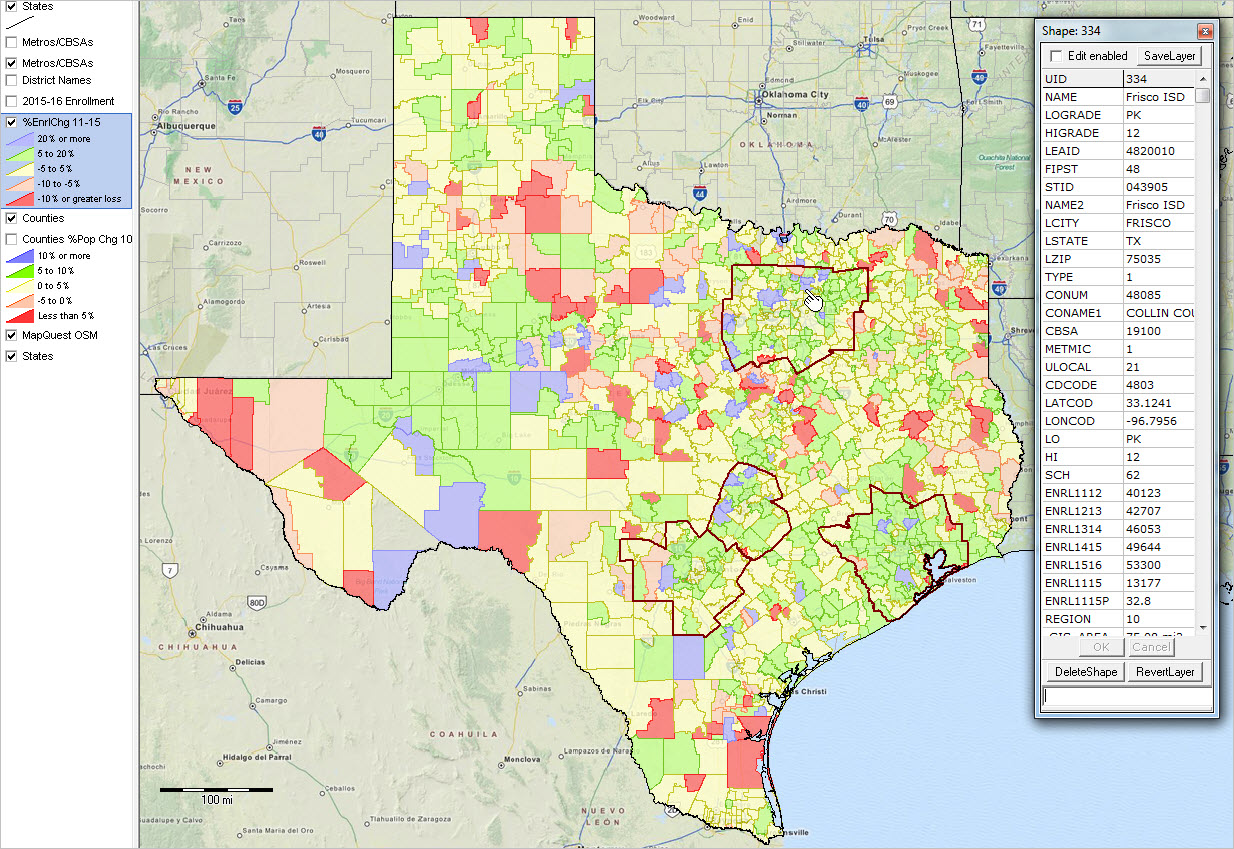
.. using GIS resources to create custom 115th Congressional District maps .. use the methods, data and tools described in this section to develop custom congressional district maps. View patterns of economic prosperity by neighborhood for one or all congressional districts. Flexibly associate a congressional district boundary with related geography and subject matter. See related Web section for more details.
Join the Congressional District-State Legislative District (CDSLD) Group .. be a part of the community. .. click here to join .. there is no cost.
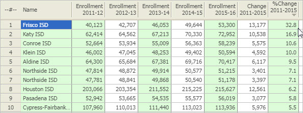
Coming up … mapping/analyzing school district finances in context of the 115th Congressional Districts (June 2017).
See the related section on Making/Using 113th Congressional District Maps.
.. view different congressional district vintages in same map.
115th Congressional Districts by Incumbent Party Affiliation
This view and related GIS project/data update when changes are made to the 115th Congressional Districts incumbents (last updated 5/10/17). Party affiliation shown in this view is also available in the related interactive table. Click graphic for larger view. Expand browser window for best quality view.
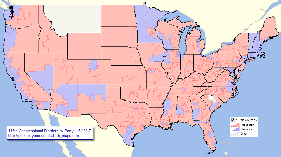
– View developed using CV XE GIS and related GIS project.
– see below in this section about using this GIS project.
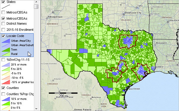
Use the Geographic Information System (GIS) tools and data to view/show congressional district in context with roads, landmarks and other geography. Flexibly add labels. Create pattern views. Add your own data.
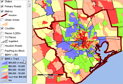
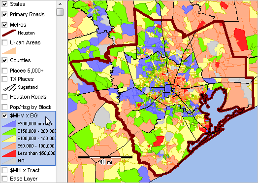
Patterns of Economic Prosperity by 115th Congressional District
The following graphic shows patterns of ACS 2015 median household income (MHI) by 115th Congressional District. Click graphic for larger view. Expand browser window for best quality view.

– View developed using CV XE GIS and related GIS project.
– use the GIS project and tools see below to create different views.
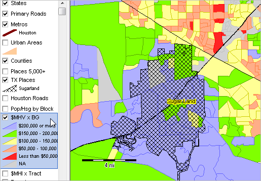
Examine Characteristics of any Congressional District
The following graphic shows patterns of ACS 2015 median household income (MHI) by census tract in context of 115th Congressional Districts in a region of North Carolina. CD 3712 (Charlotte area) is shown with bold boundary. It is easy to see which areas/tracts have different levels of economic prosperity.
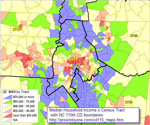
– View developed using CV XE GIS and related GIS project.
– use the GIS project and tools see below to create different views; add other layers.
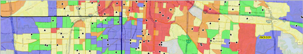
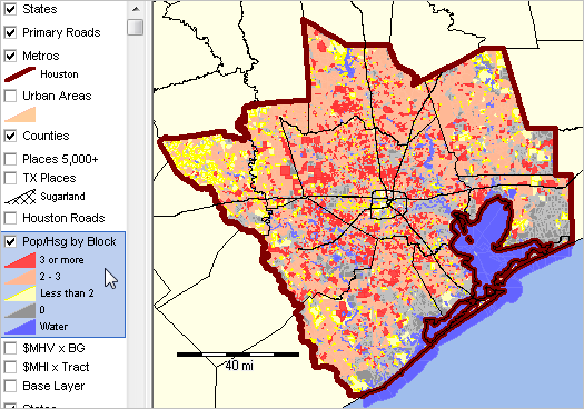
Creating congressional district maps is often specific to a particular analysis, zoom-view, labeling, combination of different geographies or other considerations. While there are no estimates of unemployment by congressional district, using GIS tools it is possible to view/geospatially analyze patterns of unemployment within congressional district by county, census tract, block group and other geography.
Join me in a Data Analytics Lab session to discuss more details about accessing and using wide-ranging demographic-economic data and data analytics. Learn more about using these data for areas and applications of interest.
About the Author
— Warren Glimpse is former senior Census Bureau statistician responsible for innovative data access and use operations. He is also the former associate director of the U.S. Office of Federal Statistical Policy and Standards for data access and use. He has more than 20 years of experience in the private sector developing data resources and tools for integration and analysis of geographic, demographic, economic and business data. Contact Warren. Join Warren on LinkedIn.


You must be logged in to post a comment.