Category Archives: Outlook

State Economic Trends

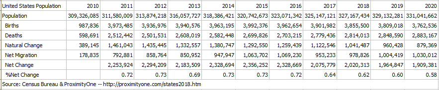
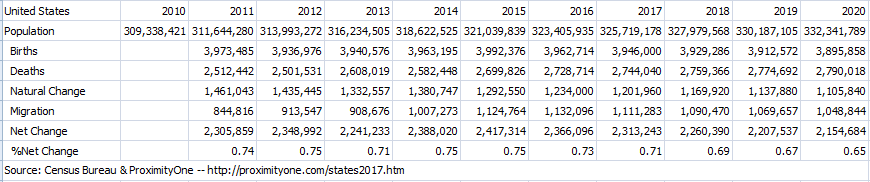
.. examining state quarterly GDP trends, 2023 update .. the BEA state quarterly Gross Domestic Product (about GDP) estimates are among the more important regional economic time series. These estimates provide a comprehensive measure of the state level economy and have only a 3-month lag between reference data and data of availability.

California had the highest real GDP among all states over the year 2022Q1-2023Q1. Texas follows close behind and experienced the highest rate of growth in real GDP among all states over the same period. Two states experienced a decline in real GDP over the year. How will state and regional GDP components change over the next five years? What policy actions might affect this and how, when? Learn more in the next blog update on predicting outcomes using statistical models.

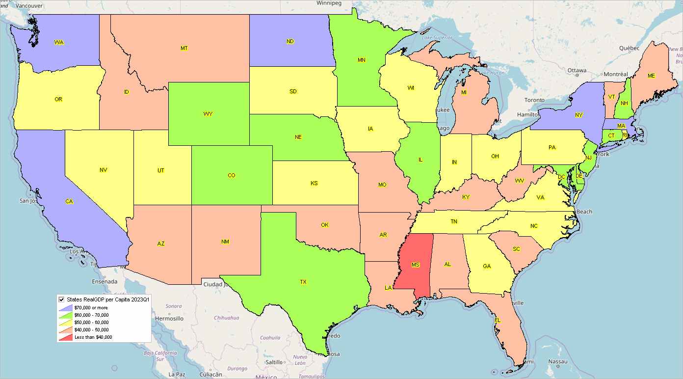
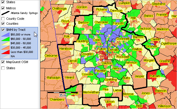
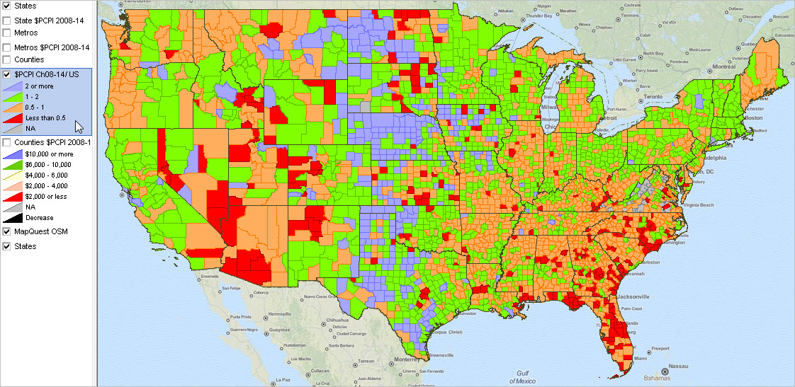
Examining Patterns of 2023Q1 per Capita Real GDP by State
Use the “no login” version of VDA Web GIS to examine patterns of 2023Q1 per capita real GDP by state as illustrated in the following graphic. Nothing to install. Start VDA Web Base here. See more about VDA Web Base. Click graphic for larger view.

How State GDP is Changing
Use this interactive table to learn more about how state GDP is changing. View, sort, examine GDP time series attributes: real GDP, real GDP indexes, current GDP. State GDP matters as it tells us about how the aggregate economy is changing by region. But stakeholders need more than just recent data. More needs to be known about the current situation, how things might change and how change might impact demographic-economic outcomes in the future.

About VDA GIS
Use VDA GIS tools to meet wide-ranging mapping needs and geospatial analysis. VDA Desktop GIS and VDA Web GIS have similar features that can be used separately or together. Each is a decision-making information resource designed to help stakeholders create and apply insight. VDA Web GIS is access/used with only a Web browser; nothing to install; GIS experience not required. VDA Desktop GIS is installed on a Windows computer and provides a broader range of capabilities compared to VDA Web GIS. VDA GIS resources have been developed and are maintained by Warren Glimpse, ProximityOne (Alexandria, VA) and Takashi Hamilton, Tsukasa Consulting (Osaka, Japan).

Data Analytics Web Sessions
Join us in the every Tuesday, Thursday Data Analytics Web Sessions. See how you can use VDA Web GIS and access different subject matter for related geography. Get your geographic, demographic, data access & use questions answered. Discuss applications with others.

About the Author
Warren Glimpse is former senior Census Bureau statistician responsible for national scope statistical programs and innovative data access and use operations. He is also the former associate director of the U.S. Office of Federal Statistical Policy and Standards for data access and use. He has more than 20 years of experience in the private sector developing data resources and tools for integration and analysis of geographic, demographic, economic and business data. Join Warren on LinkedIn.

Census 2020 – First Results

.. the first results of Census 2020, the apportionment data, were released on April 26, 2021.  Based on the decennial census, the United States total resident population increased from 308,745,538 (2010) to 331,449,281 (2020), a change of 22,703,743 (7.3%). For now, these data should be trusted and assumed accurate.  The apportionment data provide only total population counts at the state level.  More will be revealed about the accuracy of these data when the redistricting data are released in August 2021.

Apportionment of the U.S. House of Representatives
Congressional apportionment is the process of dividing the 435 members, or seats, in the House of Representatives among the 50 states based on the population data from the decennial census. See more about congressional districts and demographic-economic characteristics. See this related web section for detailed information on apportionment. Use the interactive table to view/analyze the Census 2010 and Census 2020 apportionment data. The following view shows patterns of congressional seats based on the decennial census. Labels show the number of seats based on the 2020 Census. Color patterns show the change in seats, 2010 to 2020.

Census 2020: the Process & Challenges
Counting the total population and selected population attributes in a pandemic is not only challenging but not possible.  During 2020, as the data were collected, it seemed good news that more than two-thirds of the potential respondents had completed the questionnaire.  But then the questions set in.  Bureau public announcements frequently made reference to the number or housing units and the number of households (occupied housing units) “accounted for” reaching 90 percent and progressively more.  By observation, using administrative record data, and other methods, housing units can be much more easily counted than the population and population attributes.  Likewise, determining the number households is  easier than determining the population count and characteristics.

The fact that the state population counts were unexpectedly different from the Bureau’s model based estimates is troubling.  We seek more assurance that the count of  population and population characteristics — by location — are as represented by the apportionment data.

Census Bureau 2020 Model-Based Estimates
New Census Bureau sourced U.S. by county model-based population estimates by age/gender/race-origin as of July 1, 2020 will be released by the Bureau in May 2021.  These estimates are independent of Census 2020 and make use of methods used annually throughout the 2010-2020 period.  An upcoming blog will report on ProximityOne’s analysis of these estimates in comparison with the Census 2020 data.

ProximityOne Estimates & Projections to 2060
ProximityOne annual demographic estimates and projections 2010-2060 by county will begin a new update cycle in May 2021.  The schedule is shown here.  

Starting with the May updates, two base projection series will be developed and progressively updated: one controlled to the Census 2020 data and one based on continued use of 2020 model-based estimates. As more information is released from Census 2020. Follow this blog for more information on evolving developments.

Learn more — Join me in the Data Analytics Web Sessions
Join me in a Accessing & Using GeoDemographics Web Session where we discuss topics relating to measuring and interpreting the where, what, when, how and how much demographic-economic change is occurring and it’s impact.

About the Author
— Warren Glimpse is former senior Census Bureau statistician responsible for national scope statistical programs and innovative data access and use operations. He is also the former associate director of the U.S. Office of Federal Statistical Policy and Standards for data access and use. He has more than 20 years of experience in the private sector developing data resources and tools for integration and analysis of geographic, demographic, economic and business data. Contact Warren. Join Warren on LinkedIn.

The Local Area Monthly Employment Situation

.. in June 2019, the local area unemployment rate ranged from 1.3% (Lyon County, IA) to 19.6% (Yuma County, AZ) among the lower 48 states. 133 counties had an unemployment rate of 7% or more during June 2018 through June 2019. Over the past year, as shown in the this interactive table, the unemployment rate has generally decreased among all counties. We track the local area employment situation historically and develop alternative scenario projections. See the related Web page for more information.

Patterns of Unemployment Rate by County
The following graphic shows patterns of the estimated June 2019 unemployment rate by county. Use the GIS tools and data to develop variations of this view optionally integrated with other data. Click graphic for larger view. Expand browser window for best quality view.

— view created using the ProximityOne CV XE GIS and associated GIS Project

Examine Areas of Interest
This graphic illustrates the monthly over the year employment situation for the Houston, TX metro using the interactive table.

Click graphic for larger view.

Create a similar table for any metro:
Open the interactive table (green and white table midway down).
Click ShowAll button below table.
Key in a 5-character metro code in edit box at right of FindCBSACode.
    … get from scroll list at upper right of table.
    … e.g., 19100 for Dallas, TX metro.
Click FindCBSACode; table refreshes showing only counties in this metro.
Click Current Situation button below table; table refreshes with selected columns.
Click the Pop2018 column header cell twice to rank-order the columns.
Done .. try these steps for an area of interest.

Demographic-Economic Analytics Web Sessions
Join me in a Demographics Analytics Lab session to discuss more details about accessing and using wide-ranging demographic-economic data and data analytics. Learn more about using these data for areas and applications of interest.

About the Author
— Warren Glimpse is former senior Census Bureau statistician responsible for innovative data access and use operations. He is also the former associate director of the U.S. Office of Federal Statistical Policy and Standards for data access and use. He has more than 20 years of experience in the private sector developing data resources and tools for integration and analysis of geographic, demographic, economic and business data. Contact Warren. Join Warren on LinkedIn.

County Housing Patterns & Trends

.. at a time when “housing costs are going through the roof” and “affordable housing” are topics widely in play, current housing data at the county level are essential for business and public policy planning. In this section, new Census Bureau U.S. by county 2018 housing unit estimates are viewed .. and tools to access and use these data.

Patterns of Housing Unit Percent Change by County: 2010-2018
The graphic below shows patterns of county housing unit percent change from 2010 to 2018. Click graphic for larger view showing more detail.

– view developed using CV XE GIS software and associated GIS project.
– create similar maps for counties/areas using CV XE GIS & associated GIS project.

This section reviews the new 2018 county housing unit estimates (released May 2019) and tools and applications to analyze them. See more about topics covered here in this related Web section.

The U.S. housing stock grew by more than 1.15 million from 2017 to 2018, reaching over 138.5 million units. The growth rate of 0.8 percent from 2017 to 2018. The national housing stock increased by 6.7 million units (5.1 percent) between 7/1/2010 and 7/1/2018. But housing stock change was far from even as shown in the graphic presented above.

Total housing units are the “tip of the iceberg” to examine housing market characteristics. Yet, there are no other Federal statistical data for any other housing attribute for every county more recent than circa mid-2015. Those data are from the American Community Survey 5-year estimates for the period 2013-2017 — data going on 4 years old. For example, there are no Federal statistical data for all counties for the 2018 number of households or vacant units … let alone measures that would enable computing the size and location of affordable housing, one of many important housing market attributes. Use related 2018 and projected housing market data developed by ProximityOne available as part of the Situation & Outlook demographic-economic estimates and projections. Examine these data in context with other geographic and market characteristics in the metro Situation & Outlook reports.

Using the Interactive Table
Use the interactive table to view, rank, compare states and counties based on number of units annually 2010 to 2018 and related measures. Compare counties among metros or states .. or peer groups based on size. Here are two examples of using the table.

Largest Counties based on 2018 Housing Units
.. ranked on 2018 housing units .. click for larger view

Counties with 10,000 or more 2018 Housing Units
.. ranked on percent change 2010-2018 .. click for larger view

Data Analytics Web Sessions
See these applications live/demoed. Run the applications on your own computer.
Join me in a Data Analytics Lab session to discuss more details about accessing and using wide-ranging demographic-economic data and data analytics. Learn more about using these data for areas and applications of interest.

About the Author
— Warren Glimpse is former senior Census Bureau statistician responsible for innovative data access and use operations. He is also the former associate director of the U.S. Office of Federal Statistical Policy and Standards for data access and use. He has more than 20 years of experience in the private sector developing data resources and tools for integration and analysis of geographic, demographic, economic and business data. Contact Warren. Join Warren on LinkedIn.

State of the States: 2018 Population & Components of Change

.. Welcome to 2019 .. how the U.S., states and world population are changing … the Census Bureau estimates the U.S. population is 328,231,337 as of January 1, 2019. This represents an increase of 2,013,241, or 0.62 percent, from New Year’s Day 2018 (326,218,096). The population as of Census Day (April 1) 2010, was 308,745,538 and has grown by 19,485,799, or 6.31 percent.

This section updates January 2020, with corresponding 2019 updates and additional details. Follow (click follow button at upper right) to receive updates on this and geographic, demographic and economic change with drill-down to the street intersection level.

In January 2019, the U.S. is expected to experience one birth every 8 seconds and one death every 11 seconds. Meanwhile, net international migration is expected to add one person to the U.S. population every 29 seconds. The combination of births, deaths and net international migration will increase the U.S. population by one person every 19 seconds … one net international migrant every 34 seconds.

The world population on January 1, 2019 is estimated to be 7,541,221,651. The world has experienced a population increase of 96,777,770, or 1.3 percent, from New Year’s Day 2018 (population 7,444,443,881). During January 2019, 4.8 births and 1.9 deaths are expected worldwide every second.

Patterns of Population Change by State, 2010-2018
The following graphic shows patterns of percent population change from 2010 to 2018. Use the associated GIS project to examine different years or subject matter items. Click graphic for larger view; expand browser window for best quality view.

.. view developed with ProximityOne CV XE GIS and related GIS project.

How the U.S. Population is Changing
The following graphic shows how the population of the U.S. has changed from 2010 to 2018 and how the population might change 2019 through 2020. Click graphic for larger view; opens in new page. The population is as of July 1 for each year. The components of change (birth, deaths and migration) are for the period July 1 through June 30 for that year.

Population for each year is computed by the population identity equation:
  P[t]=P[t-1] + B[t,t-1] -D[t,t-1] + M[t,t-1]
Viewing the larger image, see how each of the components of change are impacting the total population and population change.
… see more detail about these data for the U.S. and by state at http://proximityone.com/states2018.htm.

More About Population Trends, Patterns and Characteristics
See more about how population dynamics; use the interactive tables in these sections:
  • School Districts — http://proximityone.com/sdtrends.htm
  • Cities — http://proximityone.com/places2017.htm
  • Counties — http://proximityone.com/countytrends2017.htm
  • Metros — http://proximityone.com/metros.htm
  • States — http://proximityone.com/states2018.htm

Join me in a Data Analytics Lab session to discuss more details about accessing and using wide-ranging demographic-economic data and data analytics. Learn more about using these data for areas and applications of interest.

About the Author
— Warren Glimpse is former senior Census Bureau statistician responsible for innovative data access and use operations. He is also the former associate director of the U.S. Office of Federal Statistical Policy and Standards for data access and use. He has more than 20 years of experience in the private sector developing data resources and tools for integration and analysis of geographic, demographic, economic and business data. Contact Warren. Join Warren on LinkedIn.

How the New York Metro is Changing

.. or more precisely, how the New York Metropolitan Statistical Area (MSA) is changing. As of Census 2010 the New York MSA (officially the New York-Newark-Jersey City, NY-NJ-PA MSA) consisted of 20 counties. With the new OMB metropolitan statistical areas defined as of February 2013, the New York MSA became 22 counties, absorbing the Poughkeepsie, NY MSA two counties (Dutchess and Orange). The Poughkeepie MSA was removed from the official MSAs. The delineation remained that way until the new September 2018 delineations when the Census 2010 delineation was restored. Now, the Poughkeepsie, NY MSA exists as a 2 county area and the New York MSA exists as a 20 county area (both as they existed geographically in Census 2010).

These metro-county relationships are shown in the graphic presented below. The Poughkeepsie, NY MSA is shown with the blue cross-hatch to the north and the New York MSA is shown with the salmon color pattern.

– view developed using the CV XE GIS software and related GIS project.
– see the related New York Metro Situation & Outlook report.

What Difference Does it Make?
A lot! First, during the interim period 2013-2018, the Poughkeepsie, NY MSA lost the metropolitan area identity/status as conferred by the OMB delineations. It might have been omitted from size class market development and research analyses. Related, that metro was not included as a tabulation or estimation area of MSAs by Federal statistical agencies. An example of the impact is that the official demographic estimates for the Poughkeepsie, NY MSA developed by the Census Bureau were not tabulated as such and omitted from various statistical reports. Also, the removal of designation and now adding the designation back, creates a hiccup in the time series — affecting both the Poughkeepsie NY MSA and the New York MSA.

Detailed Demographic Profiles for New York MSA and Poughkeepsie, NY MSA
.. click link to view profile.

New York-Newark-Jersey City, NY-NJ-PA MSA
  Bergen County, NJ (34003)
  Essex County, NJ (34013)
  Hudson County, NJ (34017)
  Hunterdon County, NJ (34019)
  Middlesex County, NJ (34023)
  Monmouth County, NJ (34025)
  Morris County, NJ (34027)
  Ocean County, NJ (34029)
  Passaic County, NJ (34031)
  Somerset County, NJ (34035)
  Sussex County, NJ (34037)
  Union County, NJ (34039)
  Bronx County, NY (36005)
  Kings County, NY (36047)
  Nassau County, NY (36059)
  New York County, NY (36061)
  Putnam County, NY (36079)
  Queens County, NY (36081)
  Richmond County, NY (36085)
  Rockland County, NY (36087)
  Suffolk County, NY (36103)
  Westchester County, NY (36119)
  Pike County, PA (42103)

Poughkeepsie-Newburgh-Middletown, NY (CBSA 39100)
  Dutchess County, NY (36027)
  Orange County, NY (36071)

Looking Forward
The September 2018 CBSA delineations define counties that will be used for Census 2020 (likely, there could be yet further changes) — 384 MSAs in the U.S. In the cases of the New York MSA and the Poughkeepsie, NY MSA, it appears that the geography (component counties) used for Census 2010 will be the same as for Census 2020. Going forward, ProximityOne estimates and projections will use the most current vintage of CBSAs.

Data Analytics Web Sessions
Join me in a Data Analytics Lab session to discuss more details about accessing and using wide-ranging demographic-economic data and data analytics. Learn more about using these data for areas and applications of interest.

About the Author
— Warren Glimpse is former senior Census Bureau statistician responsible for innovative data access and use operations. He is also the former associate director of the U.S. Office of Federal Statistical Policy and Standards for data access and use. He has more than 20 years of experience in the private sector developing data resources and tools for integration and analysis of geographic, demographic, economic and business data. Contact Warren. Join Warren on LinkedIn.

2018 U.S. & World Population

.. Welcome to 2018 .. how the U.S. and world are changing …

This section has been updated with January 2019 data.
– see updated blog post
– see related new web page with interactive table.
Click follow button at upper right to receive updates.

The Census Bureau estimates the U.S. population is 326,971,407 as of January 1, 2018. This represents an increase of 2,314,238, or 0.71 percent, from New Year’s Day 2017. Since Census Day (April 1) 2010, the population has grown by 18,225,587, or 5.90 percent.

In January 2018, the U.S. is expected to experience one birth every 8 seconds and one death every 10 seconds. Meanwhile, net international migration is expected to add one person to the U.S. population every 29 seconds. The combination of births, deaths and net international migration will increase the U.S. population by one person every 18 seconds.

The world population on January 1, 2018 is estimated to be 7,444,443,881. The world has experienced a population increase of 78,521,283, or 1.07 percent, from New Year’s Day 2017. During January 2018, 4.3 births and 1.8 deaths are expected worldwide every second.

Patterns of Population Change by State, 2010-2017
The following graphic shows patterns of percent population change from 2010 to 2017. Use the associated GIS project to examine different years or subject matter items. Click graphic for larger view; expand browser window for best quality view.

.. view developed with ProximityOne CV XE GIS and related GIS project.

How the U.S. Population is Changing
The following graphic shows how the population of the U.S. has changed from 2010 to 2017 and how the population might change 2018 through 2020. Click graphic for large view. The population is as of July 1 for each year. The components of change (birth, deaths and migration) are for the period July 1 through June 30 for that year.

Population for each year is computed by the population identity equation:
  P[t]=P[t-1] + B[t,t-1] -D[t,t-1] + M[t,t-1]
Viewing the larger image, see how each of the components of change are impacting the total population and population change.
… see more detail about these data for the U.S. and by state at http://proximityone.com/states2017.htm.

More About Population Trends, Patterns and Characteristics
See more about how population dynamics; use the interactive tables in these sections:
  • School Districts — http://proximityone.com/sdtrends.htm
  • Cities — http://proximityone.com/places2016.htm
  • Counties — http://proximityone.com/countytrends2016.htm
  • Metros — http://proximityone.com/metrotrends2016.htm
  • States — http://proximityone.com/states2017.htm

Join me in a Data Analytics Lab session to discuss more details about accessing and using wide-ranging demographic-economic data and data analytics. Learn more about using these data for areas and applications of interest.

About the Author
— Warren Glimpse is former senior Census Bureau statistician responsible for innovative data access and use operations. He is also the former associate director of the U.S. Office of Federal Statistical Policy and Standards for data access and use. He has more than 20 years of experience in the private sector developing data resources and tools for integration and analysis of geographic, demographic, economic and business data. Contact Warren. Join Warren on LinkedIn.

TractWatch — Examining Small Area Change

Understanding the demographic-economic landscape for small area geography and how it is changing is vital for many stakeholders. Businesses and other organizations need to know how their market/service areas are changing … getting answers to questions like knowing about recent trends, where we are now and the how/where/how much things might change in the future.

Examining Tract Change
The following view shows census tracts (black boundary) located in the northeast Houston, TX area. Tracts are labeled with 2017 population estimates and percent population change from 2010 to 2017. Tract geography and characteristics are shown in context of three cities/places — Houston (orange cross-hatch), Humble (blue) and Atascocita CDP (green). It is easy to see what census tracts intersect with what cities and where. The pointer/hand is located in census tract 48-201-240902, partly intersecting with Humble city. The tract 2017 population of 12,984 reflects an increase of 10.4% since 2010. The dark brown bold boundary at the top of this tract is the Harris County, TX boundary.

.. view developed with ProximityOne CV XE GIS and related GIS project.
.. create views like this for any area in the U.S.; add your own data.

TractWatch tells us which tracts in a region of interest changed during the past year based on quarterly observable data with only a one quarter lag.

Census Tracts & TractWatch
TractWatch is a new tool/service focused on examining recent demographic-business change for each census tract. These approximate 74,000 geographic areas cover the U.S. wall-to-wall and averaged 4,000 population as of Census 2010. Tracts have a generally stable geography between decennial censuses and are coterminous with county boundaries. Tracts cover the U.S. with more than a 2-to-1 ratio compared to ZIP code areas (see tract-ZIP relationship table).

Integrated with Situation & Outlook
TractWatch insights are developed through the use of the ProximityOne Situation & Outlook (S&O) database and information system — a part of S&O demographic-economic estimates and projections developed and updated annually. The 2017 vintage tract estimates and projections (annual data) cover the period 2010 through 2022 (5-year projection).

TractWatch – Monitoring Change
As a part of the S&O annual estimates and projections development, a range of measures are updated quarterly at the census tract level. Quarterly data are developed that include population, housing units, vacant units, households and business establishments.

There is only a one-quarter lag in the availability of observable census tract data. For example, observable 2017Q1 data can be added to the S&O database in July 2017. Data are analyzed and converted into a TractWatch national dataset.

Situation & Outlook Reports
The Situation & Outlook Reports (S&O Reports) are updated weekly, for the U.S. and each county, metro and state. TractWatch is a part of the “Recent Change and Outlook” S&O Report section and updated quarterly. See schedule of updates the shows when TractWatch is updated.

The S&O Reports (metro and county) Recent Change and Outlook section includes a list of census tracts which have shown significant change over the past year for that geography. A table of typically 10-to-25 key tracts are listed in a table with selected demographic-business change attributes.

Join me in a Data Analytics Lab session to discuss more details about accessing and using wide-ranging demographic-economic data and data analytics. Learn more about using these data for areas and applications of interest.

About the Author
— Warren Glimpse is former senior Census Bureau statistician responsible for innovative data access and use operations. He is also the former associate director of the U.S. Office of Federal Statistical Policy and Standards for data access and use. He has more than 20 years of experience in the private sector developing data resources and tools for integration and analysis of geographic, demographic, economic and business data. Contact Warren. Join Warren on LinkedIn.

Census 2020 LUCA Program and You

.. what would be the financial impact of a one-percent understatement in the Census 2020 population count? Many political districts are drawn based upon population change and shifts, and allocations of government funding and services are made based upon official population data. Consider this one specific example. For each one-percent of the Atlanta MSA population missed in Census 2020, potentially due to less than fully accurate address and location data, the financial impact could be on the order of $414 million per year. How and why? At margin, each person not counted in the decennial census results in a per capita disposable income loss for the area in the magnitude of $5,494 in 2000, and $6,770 per person in 2020. 61,100 people undercounted times $6,770 yields $414 million.

This section is about the Censue 2020 Local Update of Census Addresses (LUCA) program and how it might impact the reduction in undercount .. and make the data more accurate for wide-ranging needs and uses. Read on for details about the LUCA program.

Atlanta-Sandy Springs-Roswell, GA MSA
The Atlanta metro shown with black bold boundary. More about this metro.

– View developed with CV XE GIS software.
– Click graphic to view patterns of neighborhood economic prosperity.

Financial Impact Details … the 2015 per capita current transfer payments (PCTP) in the Atlanta-Sandy Springs-Marietta MSA were $6,132, up from $5,494 in 2010. The PCTP figure in 2020 may be $6,770. For each one-percent of the Atlanta MSA population (61,100 people) missed in Census 2020, potentially due to less than fully accurate address and location data, the financial impact could be in the order of $414 million (61,100 x $6,770) per year as of Census 2020.  $414 million per year based on the 2020 population and PCTP.

Financial Impact in Your Areas of Interest
Estimate the financial impact in your areas of interest. Get the 2010 and 2015 population and PCTP data from the REIS Interactive Table for any county or state.  Compute the 2020 population and PCTP values, potential undercount to determine the financial impact on an area of interest

Census 2020 LUCA Overview
The Census 2020 LUCA program is an initiative of the Census Bureau, partnering with thousands of state and local governments across the U.S. At the core of this program, Census provides address list data to communities; those communities compare those data with their own data and provide address/geographic updates back to the Census Bureau.  The updated address and geographic data are integrated into the TIGER/Line files  — geographic backbone for collecting and tabulating the Census results. This important MAF/TIGER address-plus update program will help insure improved accuracy for Census 2020. LUCA is a geographic data development program engaging local communities across the U.S.

ProximityOne works with local areas to improve the TIGER/Line files leading up to Census 2020. Using the CV XE GIS software and specialized expertise, we helped hundreds of governmental units, including all of the State of Georgia, improve the coverage and content of the TIGER/Line files and thus the accuracy and completeness of Census 2010.

The Census 2020 LUCA program is starting now in 2016.  See the full schedule and related details in the LUCA Web section.

Join me in a Data Analytics Lab session to discuss more details about accessing and using wide-ranging demographic-economic data and data analytics. Learn more about using these data for areas and applications of interest.

About the Author
— Warren Glimpse is former senior Census Bureau statistician responsible for innovative data access and use operations. He is also the former associate director of the U.S. Office of Federal Statistical Policy and Standards for data access and use. He has more than 20 years of experience in the private sector developing data resources and tools for integration and analysis of geographic, demographic, economic and business data. Contact Warren. Join Warren on LinkedIn.

Regional Economic Information System: Annual Updates

.. which counties are experiencing the fastest economic growth? by what economic component? what does this look like on a per capita level?

.. access & analyze economic characteristics and patterns by county and state .. annual time series 1969 through 2015 with projections.  Personal income is the income available to persons for consumption expenditures, taxes, interest payments, transfer payments to governments and the rest of the world, or for saving. Use the interactive table to examine characteristics of counties and regions of interest. The table provides access to 31 personal income related summary measures. These data are a selection of a broader set of annual time series data from the Regional Economic Information System (REIS). REIS is a part of the ProximityOne State & Regional Income & Product Accounts (SRIPA) and Situation & Outlook (S&O) featuring current (2016) estimates and demographic-economic projections. Go to table.

Visual Analysis of Per Capita Personal Income Patterns
The following map shows the Houston metro (view profile) with bold brown boundary. Counties are labeled with county name and 2014 per capita personal income.

Click graphic for larger view. View developed with CV XE GIS software.

Per Capita Personal Income Change 2008-2014 by County
.. relative to U.S 2008-2014 change

Click graphic for larger view. View developed with CV XE GIS software.

Interactive Analysis – County or State Profiles
The following graphic illustrate use of the interactive table to view an economic profile for Harris County, TX. Use the table to examine characteristics of any county or state. Click graphic for larger view.

Interactive Analysis
– comparing per capita personal income across counties
The next graphics illustrates use of the interactive table to rank/compare per capita personal income across counties. Rank/compare states. Choose any of the economic profile items. Click graphic for larger view.

Join me in a Data Analytics Lab session to discuss more details about accessing and using wide-ranging demographic-economic data and data analytics. Learn more about using these data for areas and applications of interest.

About the Author
— Warren Glimpse is former senior Census Bureau statistician responsible for innovative data access and use operations. He is also the former associate director of the U.S. Office of Federal Statistical Policy and Standards for data access and use. He has more than 20 years of experience in the private sector developing data resources and tools for integration and analysis of geographic, demographic, economic and business data. Contact Warren. Join Warren on LinkedIn.