Monthly Archives: March 2018

How & Why State Demographics Are Changing

.. to examine how and why state demographics are changing, we look at the state as the sum of its parts — counties. Here we review tools and data to examine how and why state/county population is changing … is the population moving away or into your areas of interest? What are the trends; what is causing the change? what are the characteristics of the population moving in and out? How might this impact your living environment and business? See related Web section for more detail on topics covered here and access interactive table.

Patterns of Population Change by County, 2010-2017
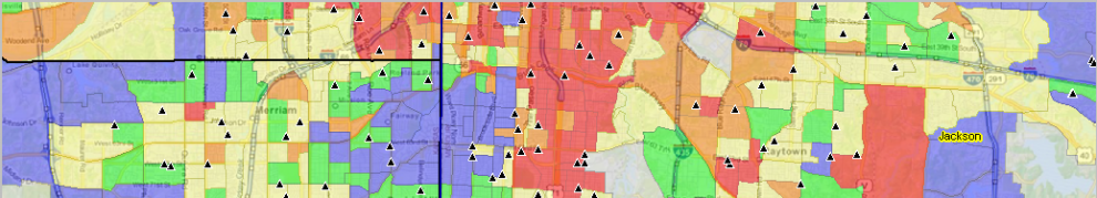
The following graphic shows how counties have gained population (blue and green) and lost population (orange and red) during the period 2010 to 2017. Click graphic for larger view; expand browser window for best quality view.

.. view developed with ProximityOne CV XE GIS and related GIS project.

The above graphic provides a visual summary of how and why demographics are changing from 2010 to 2017 in terms of components of change: births, deaths and migration. See the underlying data in this interactive table.

Change in the population from births and deaths is often combined and referred to as natural increase/change. The other way an area population changes is through migration (net international, net domestic, net migration). Examining an area’s unique combination of natural change and migration provides insights into why its population is changing and how quickly the change is occurring.

Examine States of Interest
Click a state link to view details about specific states …
Alabama .. Alaska .. Arizona .. Arkansas .. California .. Colorado .. Connecticut .. Delaware .. Florida .. Georgia .. Hawaii .. Idaho .. Illinois .. Indiana .. Iowa .. Kansas .. Kentucky .. Louisiana .. Maine .. Maryland .. Massachusetts .. Michigan .. Minnesota .. Mississippi .. Missouri .. Montana .. Nebraska .. Nevada .. New Hampshire .. New Jersey .. New Mexico .. New York .. North Carolina .. North Dakota .. Ohio .. Oklahoma .. Oregon .. Pennsylvania .. Rhode Island .. South Carolina .. South Dakota .. Tennessee .. Texas .. Utah .. Vermont .. Virginia .. Washington .. West Virginia .. Wisconsin .. Wyoming

Situation & Outlook Briefing Sessions
Join me in a Situation & Outlook Briefing Session, every Tuesday, where we review the where, what, how, and when of demographic-economic-business change – and how change might impact you.  We review current topical issues and data — and how you can access/use tools/data to meet your needs/interests.

About the Author
Warren Glimpse is former senior Census Bureau statistician responsible for innovative data access and use operations. He is also the former associate director of the U.S. Office of Federal Statistical Policy and Standards for data access and use. He has more than 20 years of experience in the private sector developing data resources and tools for integration and analysis of geographic, demographic, economic and business data. Contact Warren. Join Warren on LinkedIn.


Communities of U.S. Foreign Born Population

.. examining the U.S. foreign born population and how/where foreign born by country of origin communities exist .. the U.S. foreign born population includes anyone who is not a U.S. citizen at birth, including those who have become U.S. citizens through naturalization. The native born population includes anyone who is a U.S. citizen at birth, including those who were born in the U.S., Puerto Rico, a U.S. Island Area or abroad to U.S. citizen parent(s). Use the interactive table to examine foreign born population by country by census tract.

As of 2016, the U.S. foreign born population was estimated to be 43,739,345 compared to the total U.S. population of 323,127,515 (13.5%). See the related Web section for more detailed information about the U.S. foreign born population.

Chinese Foreign Born Population & $MHI Patterns; New York City Area
– red markers show census tracts with 500 or more Chinese foreign born
– neighborhood level views provide insights into patterns of economic prosperity
– census tract thematic patterns of median household income

– view developed with CV XE GIS software using related GIS project and datasets.

Importance of the Foreign Born Data … knowing about the geographic, demographic and economic attributes of the foreign born population tells us about the size, distribution and characteristics of the immigrant population. Projections of the foreign born population tell us how our country will grow. See more in this related section.

An Illustrative View. The Chinese foreign born population is used in the graphic below to illustrate the distribution of U.S.national scope foreign born population. Other population groups could have been used. Based on the ACS 2016 5-year estimates, there are 851 census tracts having 500 or more Chinese foreign born population (of a total 73,056 tracts). Twenty of the 25 tracts having the largest number of Chinese foreign born population are located in New York City. Determine which tracts using the related interactive table.

Chinese Foreign Born Population Patterns
– China is one of 162 country/country groups reviewed in this section
– red markers show census tracts with 500 or more Chinese foreign born
– the distribution is wide and difficult to gain insights

– view developed with CV XE GIS software using related GIS project and datasets.

Communities of Foreign Born Population
These additional views illustrate how selected foreign born country population clusters in many cases. Some develop communities without formal boundaries or any formally designated structure. Use the GIS project and tools to develop your own views for country combinations and areas of interest.

India Foreign Born Population & $MHI Patterns; New York City Area
– red markers show census tracts with 500 or more India foreign born
– neighborhood level views provide insights into patterns of economic prosperity
– census tract thematic patterns of median household income

– view developed with CV XE GIS software using related GIS project and datasets.

Asia Foreign Born Population & $MHI Patterns; Houston, TX Area
– red markers show census tracts with 500 or more Asia foreign born
.. all Asia countries (item 047 in country list above in this section
– neighborhood level views provide insights into patterns of economic prosperity
– census tract thematic patterns of median household income

– view developed with CV XE GIS software using related GIS project and datasets.

Cuba Foreign Born Population & $MHI Patterns; Miami, FL Area
– red markers show census tracts with 500 or more Cuba foreign born
– neighborhood level views provide insights into patterns of economic prosperity
– census tract thematic patterns of median household income

– view developed with CV XE GIS software using related GIS project and datasets.

Vietnam Foreign Born Population & $MHI Patterns; Los Angeles, CA Area
– red markers show census tracts with 500 or more Vietnam foreign born
– neighborhood level views provide insights into patterns of economic prosperity
– census tract thematic patterns of median household income

– view developed with CV XE GIS software using related GIS project and datasets.

Using the Interactive Table
— Foreign Born Population by Country by Census Tract

The following graphic illustrates use of the interactive table to examine census tracts in Queens County, NY (code 36081, New York City). South East Asia countries (columns) have been selected and sorted in descending order on China. The table shows the size of the China foreign born population by census tract; the census tract code is shown in the left column.

Use the interactive table and examine areas of interest to you.

Data Analytics Web Sessions
Join me in a Data Analytics Lab session to discuss more details about accessing and using wide-ranging demographic-economic data and data analytics. Learn more about using these data for areas and applications of interest.

About the Author
— Warren Glimpse is former senior Census Bureau statistician responsible for innovative data access and use operations. He is also the former associate director of the U.S. Office of Federal Statistical Policy and Standards for data access and use. He has more than 20 years of experience in the private sector developing data resources and tools for integration and analysis of geographic, demographic, economic and business data. Contact Warren. Join Warren on LinkedIn.


Housing Price Index Updates & Trends

.. this past week we have updated Housing Price Index data and tools to examine patterns and trends for the U.S., states, metros and counties .. the Housing Price Index (HPI) is one of many measures useful to gain insights into the housing market. The HPI provides information on how housing value appreciation is changing for areas of interest. Use the interactive table to view, compare, sort metros/CBSAs based on annual HPI 2010-2017 and housing value appreciation during the period. These annual data, with a 2000 base index value of 100, provide insights into longer term patterns.  The HPI is alos updated quarterly for U.S./state/metro areas quarterly for analyses requiring more recent data.  These data are new as of February 2018.

Visual Analysis of Housing Price Appreciation
The following graphic shows housing value appreciation as of 2017 based on the HPI with 2000 base of 100 by county in the Charlotte, NC-SC metro area. See more about by HPI by county for the Charlotte metro.

– view developed using CV XE GIS and related GIS project.
– Click graphic for larger view and details.

See similar HPI 2017 patterns view for the Houston, TX metro.

Housing Price Appreciation 2010-2017 — Largest 10 Metros
This table, derived from the  interactive table, shows the largest 10 metros based on total population. the HPI 2010, HPI 2017, housing price appreciation 2010-2017 and total population are presented in the table. Click the CBSA code link to view HPI by county component for the metro and an extended series.

 Metro CBSA HPI2010 HPI2017 HPA1017 Pop2016
 New York   35620 159.53 172.76 8.29 20,153,634
 Los Angeles   31080 169.83 242.78 42.95 13,310,447
 Chicago   16980 117.48 124.58 6.04 9,512,999
 Dallas   19100 120.89 175.35 45.05 7,233,323
 Houston   26420 134.02 183.52 36.93 6,772,470
 Washington   47900 166.82 198.74 19.13 6,131,977
 PhiladelphiaA   37980 157.26 162.91 3.59 6,070,500
 Miami   33100 140.43 213.91 52.33 6,066,387
 Atlanta   12060 103.95 129.24 24.33 5,789,700
 Boston   14460 134.33 165.27 23.03 4,794,447

– Metro names abbreviated; use table to view full name and code.

Using the HPI Annual 2010-2017 Interactive Table
The following graphic illustrates use of the HPI Annual 2010-2017 interactive table. Click graphic for larger view. This view shows metros in the 250,000-300,000 population peer group. Set your own criteria using tools below the table. There are 23 metros in this group. The table has been sorted on housing price appreciation (HPA) from 2010-2017 (second column from right). It shows that the Merced, CA metro had the highest HPA — 82.13% di=uring this period.

Use the interactive table and examine areas of interest.

Data Analytics Web Sessions
Join me in a Data Analytics Lab session to discuss more details about accessing and using wide-ranging demographic-economic data and data analytics. Learn more about using these data for areas and applications of interest.

About the Author
— Warren Glimpse is former senior Census Bureau statistician responsible for innovative data access and use operations. He is also the former associate director of the U.S. Office of Federal Statistical Policy and Standards for data access and use. He has more than 20 years of experience in the private sector developing data resources and tools for integration and analysis of geographic, demographic, economic and business data. Contact Warren. Join Warren on LinkedIn.