Category Archives: Situation & Outlook

Using VDA Desktop GIS with Remote Desktop

.. make reference and geostatistical maps using the VDA Desktop GIS online via our Remote Desktop Service. Perform simple, easy-to-use mapping tasks, or more advanced geospatial analyses. VDA .. Visual Data Analytics. GIS .. Geographic Information Systems. Here I review how to do this with only Internet and most any device. VDA Desktop GIS and associated “Base” project provides access to the Federal Statistical System and much more.

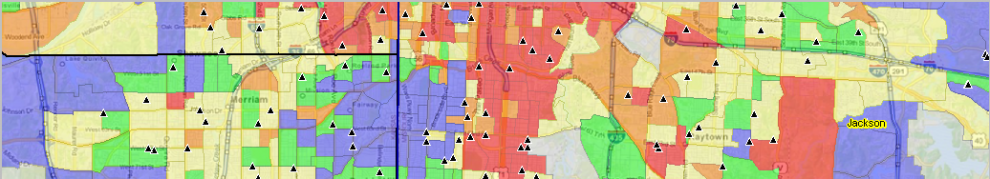
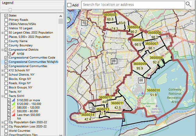
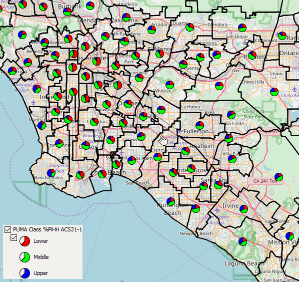
New York Congressional District 08 by Congressional Community .. an example
.. CD NY08 with CCs labeled with %Majority Minority .. click for larger view

How to use Remote Desktop Service Remote Desktop was envisioned as a protocol to connect a user’s desktop/device via Internet to a remote computer so that the user could access, run, use their files on the remote computer. Remote Desktop Service (RDS) provides far greater capabilities. In our case, we have installed VDA Desktop GIS (VDAD) on the Server enabling a user to run VDAD as if it were operating on the user’s computer. This enables a user to run VDAD 1) without installing anything and 2) using VDAD, a Windows-based program, on Macs, iOS and other devices.

Using VDAD with Remote Desktop Service
Start Remote Desktop Service. If this is the first time used, after starting RDS click the Add PC on the RDS interface, then key in the Server IP address .. 50.62.180.232. Next click the Server graphic. Next login using your userid and password. If needed, register here to get your userid and password. No fee. After logging in, click the VDAGIS icon to start VDAD.
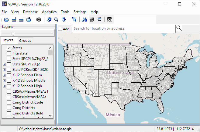
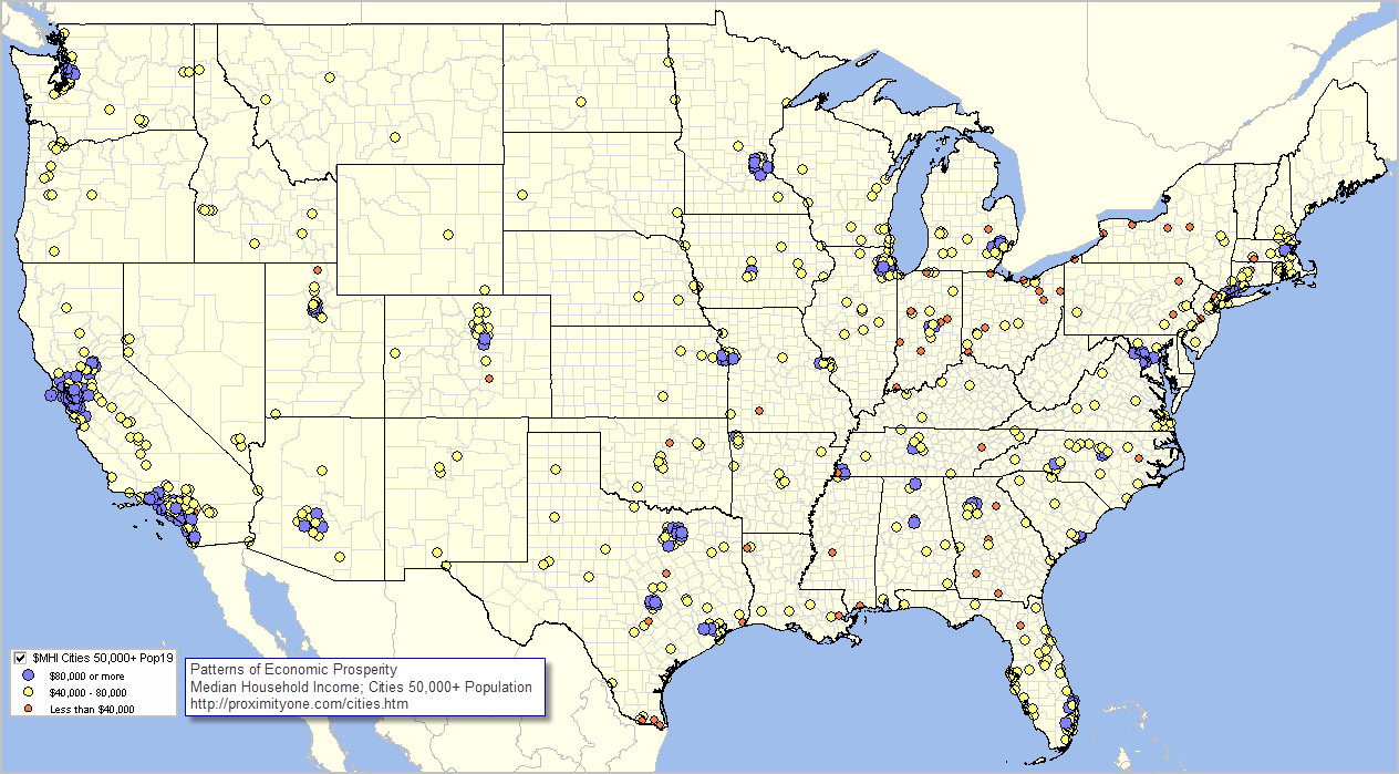
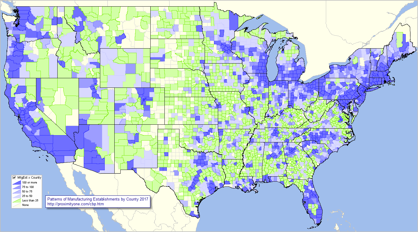
VDAD Start-up View
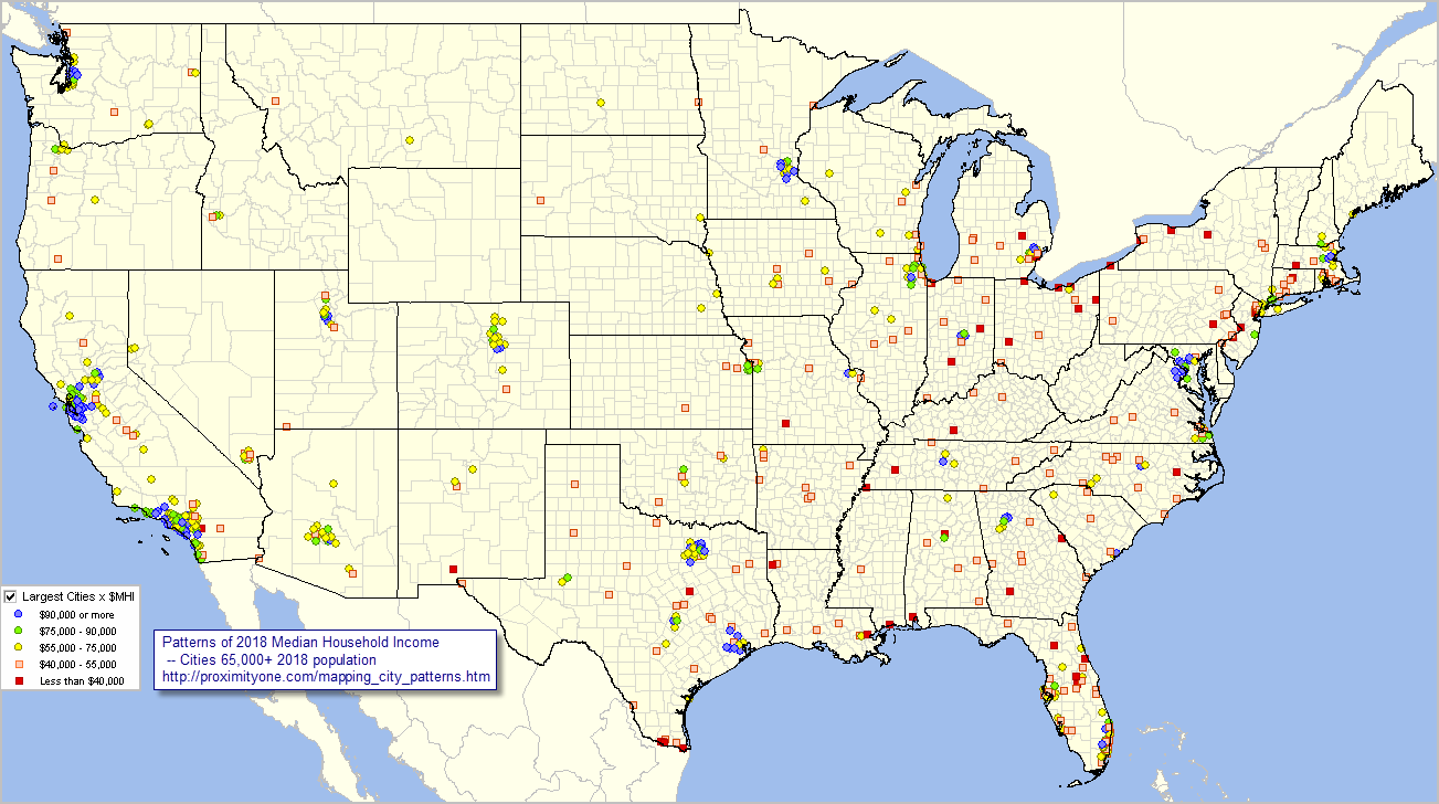
Start up view shows counties; 48 contiguous states .. click for larger view

See more about using VDAD via RDS

Updates on using VDA Desktop GIS will be included in forthcoming Blogs.
Don’t miss out! Click Follow in button at upper right.

About VDA GIS
Use VDA GIS tools to meet wide-ranging mapping needs and geospatial analysis. VDA Desktop GIS and VDA Web GIS have similar features that can be used separately or together. Each is a decision-making information resource designed to help stakeholders create and apply insight. VDA Web GIS is access/used with only a Web browser; nothing to install; GIS experience not required. VDA Desktop GIS is installed on a Windows computer and provides a broader range of capabilities compared to VDA Web GIS. VDA GIS resources have been developed and are maintained by Warren Glimpse, ProximityOne (Alexandria, VA) and Takashi Hamilton, Tsukasa Consulting (Osaka, Japan).

Data Analytics Web Sessions
Join us in the every Tuesday, Thursday Data Analytics Web Sessions. See how you can use VDA Web GIS and access different subject matter for related geography. Get your geographic, demographic, data access & use questions answered. Discuss applications with others.

About the Author
Warren Glimpse is former senior Census Bureau statistician responsible for national scope statistical programs and innovative data access and use operations. He is also the former associate director of the U.S. Office of Federal Statistical Policy and Standards for data access and use. He has more than 20 years of experience in the private sector developing data resources and tools for integration and analysis of geographic, demographic, economic and business data. Join Warren on LinkedIn.

State Economic Trends

.. examining state quarterly GDP trends, 2023 update .. the BEA state quarterly Gross Domestic Product (about GDP) estimates are among the more important regional economic time series. These estimates provide a comprehensive measure of the state level economy and have only a 3-month lag between reference data and data of availability.

California had the highest real GDP among all states over the year 2022Q1-2023Q1. Texas follows close behind and experienced the highest rate of growth in real GDP among all states over the same period. Two states experienced a decline in real GDP over the year. How will state and regional GDP components change over the next five years? What policy actions might affect this and how, when? Learn more in the next blog update on predicting outcomes using statistical models.

Examining Patterns of 2023Q1 per Capita Real GDP by State
Use the “no login” version of VDA Web GIS to examine patterns of 2023Q1 per capita real GDP by state as illustrated in the following graphic. Nothing to install. Start VDA Web Base here. See more about VDA Web Base. Click graphic for larger view.

How State GDP is Changing
Use this interactive table to learn more about how state GDP is changing. View, sort, examine GDP time series attributes: real GDP, real GDP indexes, current GDP. State GDP matters as it tells us about how the aggregate economy is changing by region. But stakeholders need more than just recent data. More needs to be known about the current situation, how things might change and how change might impact demographic-economic outcomes in the future.

About VDA GIS
Use VDA GIS tools to meet wide-ranging mapping needs and geospatial analysis. VDA Desktop GIS and VDA Web GIS have similar features that can be used separately or together. Each is a decision-making information resource designed to help stakeholders create and apply insight. VDA Web GIS is access/used with only a Web browser; nothing to install; GIS experience not required. VDA Desktop GIS is installed on a Windows computer and provides a broader range of capabilities compared to VDA Web GIS. VDA GIS resources have been developed and are maintained by Warren Glimpse, ProximityOne (Alexandria, VA) and Takashi Hamilton, Tsukasa Consulting (Osaka, Japan).

Data Analytics Web Sessions
Join us in the every Tuesday, Thursday Data Analytics Web Sessions. See how you can use VDA Web GIS and access different subject matter for related geography. Get your geographic, demographic, data access & use questions answered. Discuss applications with others.

About the Author
Warren Glimpse is former senior Census Bureau statistician responsible for national scope statistical programs and innovative data access and use operations. He is also the former associate director of the U.S. Office of Federal Statistical Policy and Standards for data access and use. He has more than 20 years of experience in the private sector developing data resources and tools for integration and analysis of geographic, demographic, economic and business data. Join Warren on LinkedIn.

Measuring & Analyzing Households by Social Class by PUMA

.. a social class is a population or household group typically referred to as a lower, middle and upper class. The size of the population or households in a social class is often determined in relationship to an interval related to the median household income of an area — from two-thirds of median household income to twice the median household income (MHI). Subsequent blog posts will address a broader definition for class determination. By better understanding composition and determinants of social class for an area, we might better understand and improve on income inequality and create new opportunities. This is a multi-part blog post on social class analytics. Click Follow at right to receive updates.

Percent Population in Households by Social Class by PUMA
.. Los Angeles area .. click for larger view.

Los Angeles metro area by social class .. PUMAs shown with black boundaries; pointer at Los Angeles-Orange County line

Percent of Households by Social Class by PUMA
.. Los Angeles area .. click for larger view.

Los Angeles metro area by social class .. PUMAs shown with black boundaries; pointer at Los Angeles-Orange County line

Using American Community Survey Microdata
We use of the American Community Survey microdata or “public use microdata samples” (PUMS) http://proximityone.com/pums.htm to develop estimates of population and households by middle class, lower class and upper class by “public use microdata area” (PUMA) http://proximityone.com/puma.htm. Microdata files are comprised of anonymized individual respondent data within PUMAs. The approximate 2,800 PUMAs cover the U.S. wall-to-wall and must have 100,000 population or more. 2010 and 2020 vintages PUMAs may be examined and compared with other geography using the VDA Web GIS http://proximityone.com/vda.htm with the MetroDynamics Project.

Social Class Participation by PUMA
Using custom software, the PUMA (ACS 2021 1 year data in this case), individual housing records are summarized for each PUMA. An estimate is developed for the lower, middle and upper class based on an algorithm.

Examine patterns of social class stratification using VDA Web GIS anywhere in U.S.
The estimates are then integrated into a PUMA shapefile. The PUMA shapefile is added to a Geographic Information System (GIS). Access this shapefile/layers using VDA Web GIS to examine patterns of social class, such as the graphics shown above, or in combination with other geography and subject matter.

About VDA GIS
VDA Web GIS is a decision-making information resource designed to help stakeholders create and apply insight. Use VDA Web GIS with only a Web browser; nothing to install; GIS experience not required. VDA Web GIS has been developed and is maintained by Warren Glimpse, ProximityOne (Alexandria, VA) and Takashi Hamilton, Tsukasa Consulting (Osaka, Japan).

Data Analytics Web Sessions
Join us in the every Tuesday, Thursday Data Analytics Web Sessions. See how you can use VDA Web GIS and access different subject matter for related geography. Get your geographic, demographic, data access & use questions answered. Discuss applications with others.

About the Author
Warren Glimpse is former senior Census Bureau statistician responsible for national scope statistical programs and innovative data access and use operations. He is also the former associate director of the U.S. Office of Federal Statistical Policy and Standards for data access and use. He has more than 20 years of experience in the private sector developing data resources and tools for integration and analysis of geographic, demographic, economic and business data. Join Warren on LinkedIn.

Examining Ukraine and Region using VDA

Ukraine is a country that is now on many people’s minds. It is easy to examine the geography of Ukraine in context of the region using VDA Web GIS.

The Visual Data Analytics (VDA) Web GIS supports worldwide applications. Explore characteristics of Ukraine and the surrounding area with only a browser. There is no cost. Follow the steps described below to get started.

• Start VDA Web GIS using a browser .. link to start VDA Web GIS.
– you will need to sign-up, then you can easily revisit.
• Open the Situation & Outlook Project.
– next you will see a form asking you to select a project.
– select the Situation & Outlook project.
– the opening view is the U.S. by county.
– note that for the VDA Level 1 free version, the session closes in 10 minutes.
– just start over … you are now more familiar with operations.
– if you are new to VDA, please review getting started.
• Check on “OpenStreetMaps” in Legend Panel; left of Map Window toward bottom:

• Navigate to Kyiv, Ukraine
– Key in the name Kyiv in Find Address edit box and click Find Address button
– the view refreshes; a marker (for Kyiv location) shows in the Map Window:

• In the legend panel, click on the “Country Projections to 2050” layer
• Zoom-out to Ukraine country view
– click zoom-out button below map window 6 times (or use zoom window).
– navigate in the map window to obtain this view of the region:

• To get the above view, with Ukraine the selected country, proceed as follows:
– select “Country Projections to 2050” in the “Select Layer” dropdown (upper left)
– click anywhere in map window on Ukraine
– the crosshatching appears; a profile of Ukraine appears in lower left Profile Panel.
– click the HTML button (lower left) to view this profile in HTML format.
– browser must be enabled to show popups.
– in the HTML profile, see that the 2022 Ukraine population is 43.5 million.
• Examining Ukraine provinces — Luhansk Oblast (eastern Ukraine):
– select “Country by State” in the “Select Layer” dropdown (upper left)
– navigate to eastern Ukraine
– click anywhere on Luhansk Oblast map and the following view appears:

– the crosshatching appears showing this Oblast.
– a profile of Luhansk Oblast appears in lower left Profile Panel.
– click the HTML button (lower left) to view this profile in HTML format.
– in the HTML profile, see the Oblast VDA computed area is 26,310,276,552 sqmt
… or 10,158 square miles (26310276552/2589988).

About VDA Web GIS
VDA Web GIS is a decision-making information resource designed to help stakeholders create and apply insight. VDA Web GIS has been developed and is maintained by Warren Glimpse, ProximityOne (Alexandria, VA) and Takashi Hamilton, Tsukasa Consulting (Osaka, Japan).

About the Author
Warren Glimpse is former senior Census Bureau statistician responsible for national scope statistical programs and innovative data access and use operations. He is also the former associate director of the U.S. Office of Federal Statistical Policy and Standards for data access and use. He has more than 20 years of experience in the private sector developing data resources and tools for integration and analysis of geographic, demographic, economic and business data. Join Warren on LinkedIn.

U.S. Demographic-Economic Insights

The results of the Census 2020 will not provide us with a good picture of the United States demographic-economic situation, mainly as a result of limited scope subject matter. While the Census 2020 data are important due to their more accurate and up-to-date small area demographics, and data tabulated by census block, only a small number of demographic subject matter items are available from Census 2020. The scope of subject matter is limited by items tabulated based on the questionnaire.

In comparison, the annual American Community Survey (ACS) data provide a much broader range of subject matter. Based largely on the 2019 ACS (the most up-to-date with data for small area geography .. released in December 2020), ProximityOne has developed tools/data to develop demographic-economic insights for the most widely used types of geography.

Demographic-Economic Insights Role & Scope
ACS and related data and ProximityOne tools have been used to develop the U.S. demographic-economic insights report, reviewed here, illustrating the scope and organization of the data and how it can be used. You can develop similar comparative analysis reports for your areas of interest. See more about the role and scope of the Demographic-Economic Insights.

U.S. National Scope Demographic-Economic Insights
View the U.S. National Scope Demographic-Economic Insights report develop using the ProximityOne Insights tool. This report is organized into two subject matter description columns, four statistical data columns and four subject matter groups. The first two statistical data columns present data based on the ACS 2019 1-year estimates. The second set of statistical data columns show data based on the 2019 ACS 5-year estimates (values centric to mid 2017). This report is a useful resource to compare/contrast data values based on the 1-year estimates side-by-side with the 5-year values. The four subject matter groups are reviewed below.

General Demographics
Graphic shows partial list of “D” items .. click graphic for larger view.
.. view this section in the U.S. Insights report.

Social Characteristics
Graphic shows partial list of “S” items .. click graphic for larger view.
.. view this section in the U.S. Insights report.

Economic Characteristics
Graphic shows partial list of “E” items .. click graphic for larger view.
.. view this section in the U.S. Insights report.

Housing Characteristics
Graphic shows partial list of “H” items .. click graphic for larger view.
.. view this section in the U.S. Insights report.

Creating Insights and Talking Points
The four subject matter groups provide a dense array of tabular statistical data that can be overwhelming to consume. Yet, not every topic can be distilled to just a few numbers. The scope of key data depends on the objective presentation, audience and desired talking points.

For example, a briefing or synopsis might include only 10-15 subject matter items such as … this report tells us that in 2019 (based on 2019 1-year estimates), the total resident population was estimated to be 328,239,523. The median age was 38.5 years. The percent high school graduates was 88.6%. The number of housing units was 139,686,209. The percent owner occupied housing units was 64.1%. These measures are roughly the same today, at the end of 2020, even with the pandemic impact. Some other measures in the report as not as reflective “as of today”.

While data shown here do not fully summarize the state of the Nation, there provide many insights. The same can said for any of the geographic areas covered. To obtain a better picture of the state of the Nation, we need supplementary subject matter, more up-to-date data and trending data that give clues into what’s happening.

Learn more — Join me in the Situation & Outlook Web Sessions
Join me in a Situation & Outlook Web Session where we discuss topics relating to measuring and interpreting the where, what, when, how and how much demographic-economic change is occurring and it’s impact.

About the Author
— Warren Glimpse is former senior Census Bureau statistician responsible for national scope statistical programs and innovative data access and use operations. He is also the former associate director of the U.S. Office of Federal Statistical Policy and Standards for data access and use. He has more than 20 years of experience in the private sector developing data resources and tools for integration and analysis of geographic, demographic, economic and business data. Contact Warren. Join Warren on LinkedIn.

Examine Neighborhood Demographics for any City

.. examine neighborhood demographics for any city (or county, school district ..) using the no fee, no registration new beta version of the Visual Data Analytics (VDA2) Web GIS. Nothing to install, access with any Web browser. Use this unique and powerful resource to make custom maps similar to the one shown below.

Patterns of Economic Prosperity by Neighborhood in Tampa, FL Area
Examine patterns of economic prosperity by neighborhood in context of a selected county, city or other geography. The following view shows patterns of median household income by census tract in Tampa, FL area. The bold black border shows the city boundary for Tampa; the thematic pattern shows colors associated with intervals of median household income ($MHI). The $MHI layer is set with a see through transparency enabling a view of the underlying topology. Create a view similar to this for any of the 19,500 cities in the U.S. See detailed steps to develop this view in the notes below the graphic.

Map Your Own Map View
Follow these stpe to create your own neighborhood by city map view.  Use other features of VDA2 to access demographic-economic data in a tabular or visual form.

More About VDA2 Web GIS
New in VDA2, not available in VDA1, are the table/query operations. View/analyze data for any layer in a spreadsheet/grid form.  Sort and perform queries on subject matter of interest. Click a button in the data grid to zoom to that geographic area in the map window.  The following graphic shows the VDA2 start-up view after clicking the Query/Table On/Off button. This button (shown below map window at right by pointer) toggles the table view on/off.

.. click graphic for larger view.

Learn more — Join me in the Situation & Outlook Web Sessions
Join me in a Situation & Outlook Web Session where we discuss topics relating to measuring and interpreting the where, what, when, how and how much demographic-economic change is occurring and it’s impact.

About the Author
— Warren Glimpse is former senior Census Bureau statistician responsible for national scope statistical programs and innovative data access and use operations. He is also the former associate director of the U.S. Office of Federal Statistical Policy and Standards for data access and use. He has more than 20 years of experience in the private sector developing data resources and tools for integration and analysis of geographic, demographic, economic and business data. Contact Warren. Join Warren on LinkedIn.

America’s Cities: Situation & Outlook

.. the path forward .. planning for the future .. in April 2019, the employment in Houston, TX was 1,111,283 with an unemployment rate of 3.2%. In April 2020, the employment in Houston, TX was 927,105 with an unemployment rate of 14.9%. What will the 2020 annual look like? 2021? There are many paths to get to 2021 and beyond. What policy and action measures might work best? What about your cities of interest? See the related Web section for more details.

Houston characteristics: Demographic .. Social .. Economic .. Housing
Get for any city/area .. e-mail your request

The pandemic impacts on America’s cities in different ways .. some experiencing little change, others with massive change. When, where and how will these disparate patterns change in cities and communities of interest? How might this change impact you and your community? A comprehensive plan needs to be developed and set in motion to achieve best outcomes. This section provides access to tools and data that stakeholders can use to examine America’s cities demographic-economic characteristics and trends. Examine cities of interest. Use ProximityOne data, tools, methods and advisory services to achieve improved results.

Of the nation’s 327.2 million people, an estimated 206.0 million (62.9%) live within an incorporated place. Of approximately 19,500 incorporated places, about 76 percent had fewer than 5,000 people and nearly 50 percent had fewer than 1,000 people. Examine characteristics of individual city population trends and compare cities in states, regions and peer groups using the interactive table below.

Patterns of Economic Prosperity; Cities 50,000 Population or More
The following view shows cities with 2019 population of 50,000 or more as markers .. mainly principal cities of metropolitan statistical areas (MSAs). Nationally, there are 69 cities with 2019 population of 5,000 or more (determine using interactive table below). The marker color shows the median household income; see inset legend. Click graphic for larger view; expand window to full screen.

– View developed using the ProximityOne CV XE GIS software.

Patterns of Economic Prosperity; Cities 5,000 Population or More
– zoom-in to Dallas Metro
The following view shows cities with 2019 population of 5,000 or more as polygons/city boundary-area in the Dallas metro area. There are 201 cities that intersect with the Dallas metro (code 19100); 96 of these cities have a population greater than 5,000 (determine using interactive table below). The color patterns show the median household income range; see inset legend. Click graphic for larger view; expand window to full screen.

Patterns of Economic Prosperity by Neighborhood & Adjacent Areas
The following view shows patterns of median household income by block group (sub-neighborhoods) within city (bold black boundary) in the Dallas County, TX area. In examining the situation & outlook for a city it is important to examine characteristics of drill-down geography and adjacent cities/areas. Inset legend shows median household income color intervals. Click graphic for larger view; expand window to full screen. In the larger view, a cross-hatch pattern is applied to Dallas city. It is easier to see how Dallas city is comprised of a core area as well as outlying areas and extends into adjacent counties.

Interactive Analysis of Cities: Demographic-Economic Patterns & Trends
Use the interactive table to view, rank, compare cities based on demographic-economic trends and characteristics. The following static graphics provide two examples.


Largest 15 U.S. Cities Ranked on 2019 Population

California Cities Ranked on Educational Attainment

Learn more — Join me in the Situation & Outlook Web Sessions
Join me in a Situation & Outlook Web Session where we discuss topics relating to measuring and interpreting the where, what, when, how and how much demographic-economic change is occurring and it’s impact.

About the Author
— Warren Glimpse is former senior Census Bureau statistician responsible for national scope statistical programs and innovative data access and use operations. He is also the former associate director of the U.S. Office of Federal Statistical Policy and Standards for data access and use. He has more than 20 years of experience in the private sector developing data resources and tools for integration and analysis of geographic, demographic, economic and business data. Contact Warren. Join Warren on LinkedIn.

Business Establishment Characteristics by County

.. what are the number and types of businesses underlying county economies of interest? What is the employment size by type of business establishment? What scope of wages, earnings do they contribute? Learn more here.

The pandemic impact on businesses remains in flux .. this post tools and data that can be used to examine pre-pandemic business establishments and employment pattern characteristics by county. By examining pre-pandemic conditions, we can better assess the impact of how and why business, demographic and economic change and impact as we move forward. The magnitude and duration of the impact on businesses will vary by community/area and become more measurable in the months ahead. The “How & Where of Business Establishment/Employment Change” will be updated later in 2020. See related, more detailed web section. See related section focused business establishments by ZIP code.

Where Things are Made by County
The following graphic shows patterns of the number of manufacturing establishments (NAICS 31) by county for the U.S. 48 contiguous states. Inset legend in map view shows number of establishments by interval/color. View/examine all U.S. states and areas using the related GIS project. Create custom maps similar to this view for your regions of interest depicting establishments, employment or payroll for your type of business selection(s). Click graphic for larger view with more detail; expand browser window for best quality view.

– view developed with ProximityOne CV XE GIS software and related GIS project.

The above view shows patterns for only one type of business. Data are tabulated more than 2,000 NAICS/type of business codes. These data may be examined by county using the interactive table. Use the GIS tools and related GIS project to develop variations of the views shown here.

Using the Interactive Table
The 10 largest counties based on the number of manufacturing establishments are shown in the static graphic below. Click for larger view.

Use the interactive table to dynamically create similar rankings on employment size or payroll. Set a query for a county, metro or state of interest.

Updates
These data update in June 2020. Follow the blog (click button at upper right) to receive updates.

Learn more — Join us in the Situation & Outlook Web Sessions
Join me in a Situation & Outlook Web Session where we discuss topics relating to measuring and interpreting the where, what, when, how and how much demographic-economic change is occurring and it’s impact.

About the Author
— Warren Glimpse is former senior Census Bureau statistician responsible for innovative data access and use operations. He is also the former associate director of the U.S. Office of Federal Statistical Policy and Standards for data access and use. He has more than 20 years of experience in the private sector developing data resources and tools for integration and analysis of geographic, demographic, economic and business data. Contact Warren. Join Warren on LinkedIn.

Patterns of Income in America’s Largest Cities

The retreat in personal and household income resulting from the pandemic will be historic and substantial. How long term? Which cities of what size and location will be affected the most? We start to study patterns and trends as new data become available in the next several weeks.

America’s largest 629 cities accounted for a group population of 121,228,560, or 37.1%, of the total U.S. population (327,167,434) in 2018. All of these cities are in Metropolitan Statistical Areas (MSAs). With contiguous cities and places, these urban areas account for more than 80% of the U.S. population. These cities, each with 65,000 population or more, are shown as markers in the thematic pattern view below. See more about cities/places and city/place 2010-2018 demographic trends.

Patterns of Economic Prosperity: America’s Largest Cities
– cities with 2018 population 65,000+ shown as markers
– markers show level of 2018 median household income
– data used to develop this veiw were extracted using GeoFinder.
– click map for larger view; expand browser to full screen for best quality view.

– view developed using ProximityOne CV XE GIS software and related GIS project.

Top 25 Largest Cities based on Median Household Income

About America’s Largest Cities & Economic Characteristics
The set of the 629 America’s largest cities is based on data from the 2018 American Community Survey 1-year estimates (ACS 2018). ACS 2018 1-year estimates, by design, provide data only for areas 65,000 population or more. The ACS 2018 data are the only source of income and related economic data for national scope each/all cities/places (29,853) on an annual and more recent basis. These data will update with 2019 estimates in September 2020. ACS-based data reflecting the impact of the pandemic will not be available until September 2021.

Situation & Outlook Web Sessions
Join me in a Situation & Outlook Web Session where we discuss topics relating to measuring and interpreting the where, what, when, how and how much demographic-economic change is occurring and it’s impact.

About the Author
— Warren Glimpse is former senior Census Bureau statistician responsible for innovative data access and use operations. He is also the former associate director of the U.S. Office of Federal Statistical Policy and Standards for data access and use. He has more than 20 years of experience in the private sector developing data resources and tools for integration and analysis of geographic, demographic, economic and business data. Contact Warren. Join Warren on LinkedIn.

Analyzing Patterns of COVID-19

.. as COVID-19 impacts our demographics, economy and way of life, we look for answers about where we are and what lies ahead.  Here we review data on COVID-19 incidence and tools to analyze those data. In the coming days, weeks, we plan to augment these tools and data. See more below.  See related Web section for more detail.

Use new resources to examine/analyze patterns of COVID-19 incidence in context of related demographic-economic characteristics. Resources include the narrative/interpretative portion, interactive table and GIS tools and project/files. Data and tools are updated daily. There is no fee to use any of these resources.

COVID-19 Incidence by County in the Atlanta Metro Area
The following graphic shows patterns of COVID-19 incidence (number of cases per 1,000 population) by county. See color patterns in the inset legend. This view shows counties labeled with name and number of confirmed COVID-19 cases. Use the GIS project described below to create variations of this view and develop similar views for any metro.

.. view developed with ProximityOne CV XE GIS and related GIS project.

The GIS resources and interactive table below makes use of the COVID-19 confirmed cases data updated daily by the New York Times. See more about the New York Times U.S. tracking page.

COVID-19 Incidence — U.S. by County
Similar to the above view, the following graphic shows patterns of COVID-19 incidence (number of cases per 1,000 population) by county for the U.S. See color patterns in the inset legend. This view shows counties labeled with name and number of confirmed COVID-19 cases. Use the GIS project described below to create variations of this view and develop similar views for any metro. Click graphic for larger, more detailed view. Expand browser window for best quality view.

.. view developed with ProximityOne CV XE GIS and related GIS project.

Using GIS Tools & Resources
Use the Geographic Information System (GIS) CV XE GIS software and GIS project to view maps and geospatially analyze patterns COVID-19 cases in context of related demographic-economic data. The GIS project automatically opens with the following view:

.. see details about using the mapping/GIS resources.
.. create map views for your areas of interest.

COVID-19 Confirmed Cases by County Interactive Table
Use the interactive table to view, rank, query compare patterns of COVID-19 cases. See related demographic-economic interactive tables.

The following static graphic illustrates use of the table to view daily patterns of COVID-19 cases in Cobb County, GA.

Use the interactive table to examine counties of interest.

Situation & Outlook Web Sessions
Join me in a Situation & Outlook Web Session where we discuss topics relating to measuring and interpreting the where, what, when, how and how much demographic-economic change is occurring and it’s impact.

About the Author
— Warren Glimpse is former senior Census Bureau statistician responsible for innovative data access and use operations. He is also the former associate director of the U.S. Office of Federal Statistical Policy and Standards for data access and use. He has more than 20 years of experience in the private sector developing data resources and tools for integration and analysis of geographic, demographic, economic and business data. Contact Warren. Join Warren on LinkedIn.