.. examining how is the Appalachia population changing and why .. Appalachia is a region that includes parts of 13 states and has long been challenged with poverty. The population of Appalachia increased from 25,184,339 in 2010 to 25,449,932 in 2015. The extended report below, developed using the ProximityOne Regional Data Analytics tool, in combination with GIS tools provide insights into why, how and where the population change has occurred since 2010.
Patterns of Appalachia County Population Trends 2010-2015
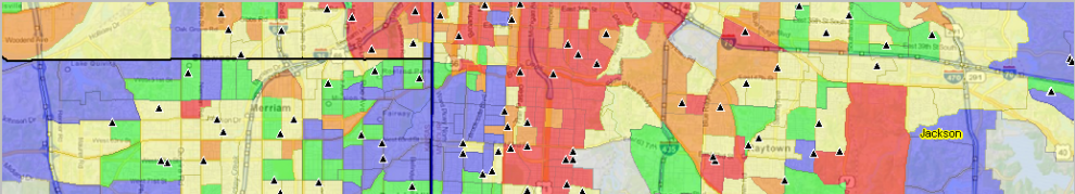
Appalachia counties are shown in the following graphic with the black bold boundary. The thematic pattern map shows how counties have gained population (blue and green) and lost population (orange and red) during the period 2010 to 2015. It is easy to see clusters of counties that are increasing or losing population and why. Counties increasing in population are shown by the dominant factor contributing to their growth — net migration or natural change (where births exceed deaths). Counties decreasing in population are shown by the dominant factor contributing to their population loss — net migration or natural change (where deaths exceed births). See more detail and access data via interactive table in the County Trends 2010-2015 section. Click graphic for larger view; expand browser window for best quality view.

.. view developed with ProximityOne CV XE GIS and related GIS project.
Summary of Population Change
Appalachia has increased in population since 2010 due to both net migration and natural increase. The analyses show that during the 2010 to 2015 period, the Appalachia population:
• increased by 1,688,832 births
• experienced 1,562,810 deaths
• had a natural increase (births less deaths) of 126,022 population
• increased by 166,990 net international migration
• increased by 53,209 net domestic migration
• had a net migration of 220,199 population
Region & County-by-County Population & Components of Change
The RDA report includes eight tables for each county and a summary for the Appalachia region. Tables displayed when using the “Population Estimates & Components” data include:
• Table 1 – total population
• Table 2 – births
• Table 3 – deaths
• Table 4 – natural change
• Table 5 – international migration
• Table 6 – domestic migration
• Table 7 – net migration
• Table 8 – group quarters population
Appalachia Counties & Region: Population Trends & Components of Change; 2010-2015
Click link below to view report. Data for all Appalachia counties, followed the regional summary, are provided table-by-table in the table sequence shown above.
• Appalachia region population & components of change 2010-15
Terms of Use
The above report may be used for any purpose provided that:
1 – it is not used for commercial or consulting purposes.
2 – it is not used in funded research.
3 – all use is referenced as to source with Web URL:
— developed by ProximityOne based in part on Census Bureau data; http://proximityone.com/rda.htm.
Using the RDA Resources
Use the RDA tool to develop reports like the one shown here for counties and regions of interest. Possibly more importantly, these resources can help us examine related topics such as healthcare and education. What are the characteristics and requirements now and how are needs, services and capabilities distributed across a region? How will the population change over the next several years and possibly result in improving – or deteriorating – conditions? Use the RDA demographic insights features and predictive analytics to better assess future change and needs.
Contact ProximityOne (mention RDA in text section or call 888.364.7656) for more information about using the RDA resources or custom reports.
Support Using these Resources
Learn more about accessing and using demographic-economic data and related analytical tools. Join us in a Data Analytics Lab session. There is no fee for these one-hour Web sessions. Each informal session is focused on a specific topic. The open structure also provides for Q&A and discussion of application issues of interest to participants.
Join me in a Data Analytics Lab session to discuss more details about accessing and using wide-ranging demographic-economic data and data analytics. Learn more about using these data for areas and applications of interest.
About the Author
— Warren Glimpse is former senior Census Bureau statistician responsible for innovative data access and use operations. He is also the former associate director of the U.S. Office of Federal Statistical Policy and Standards for data access and use. He has more than 20 years of experience in the private sector developing data resources and tools for integration and analysis of geographic, demographic, economic and business data. Contact Warren. Join Warren on LinkedIn.


