.. tools & data to examine the local area employment situation .. this update on the monthly and over-the-year (Jan 2016-Jan 2017) change in the local area employment situation shows general improvement. Yet many areas continue to face challenges due to both oil prices, the energy situation and other factors. This section provides access to interactive data and GIS/mapping tools that enable viewing and analysis of the monthly labor market characteristics and trends by county and metro for the U.S. See the related Web section for more detail. The civilian labor force, employment, unemployment and unemployment rate are estimated monthly with only a two month lag between the reference date and the data access date (e.g., March 2017 data are available in May 2017).
Use our new tools to develop your own LAES U.S. by county time series datasets. Link your data with LAES data. Run the application monthly extending/updating your datasets. Optionally use our 6-month ahead employment situation projection feature. See details
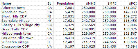
Unemployment Rate by County – January 2017
The following graphic shows the unemployment rate for each county.

— view created using CV XE GIS and associated LAES GIS Project
— click graphic for larger showing legend details.
New with this post are the monthly 2016 monthly data on the labor force, employment, unemployment and unemployment rate. Use the interactive table to view/analyze these data; compare annual over the year change, January 2016 to January 2017.
View Labor Market Characteristics section in the Metropolitan Area Situation & Outlook Reports, providing the same scope of data as in the table below integrated with other data. See example for the Dallas, TX MSA.
The LAES data and this section are updated monthly. The LAES data, and their their extension, are part of the ProximityOne Situation & Outlook database and information system. ProximityOne extends the LAES data in several ways including monthly update projections of the employment situation.
Interactive Analysis
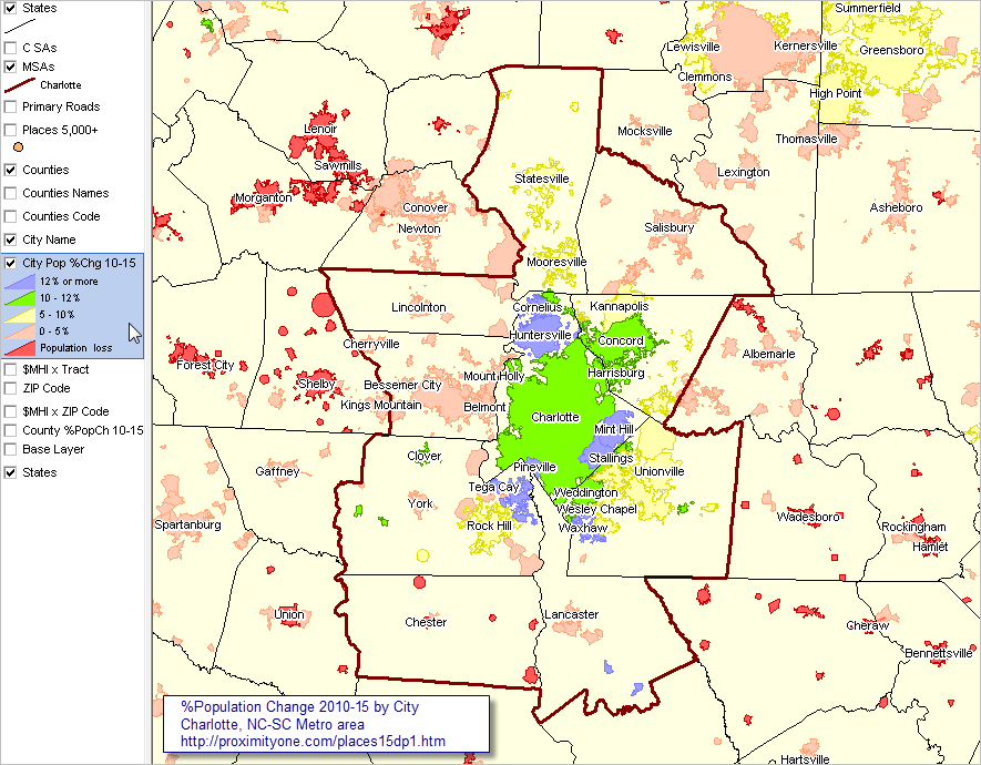
The following graphic shows an illustrative view of the interactive LAES table. In January 2017, 149 counties experienced an unemployment rate of 10% or more. The graphic shows counties experienced highest unemployment rates. Use the table to examine characteristics of counties and metros in regions of interest. Click graphic for larger view.

Metro by County; Integrating Total Population
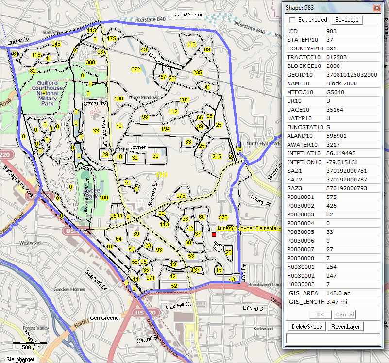
The following graphic shows an illustrative view of the interactive LAES table focused on the Chicago MSA. By using the query tools, view characteristics of metro component counties for any metro. This view shows Chicago metro counties ranked on January 2017 unemployment rate (only 10 of the 14 metro counties shown in this view). Click graphic for larger view.

The above view shows the total population (latest official estimates) as well as employment characteristics.
More About Population Patterns & Trends
U.S. by county population interactive tables & datasets:
• Population & Components of Change 2010-2016 – new March 2017.
• Population Projections to 2060 2010-2060 – updated March 2017.
Join me in a Data Analytics Lab session to discuss more details about accessing and using wide-ranging demographic-economic data and data analytics. Learn more about using these data for areas and applications of interest.
About the Author
— Warren Glimpse is former senior Census Bureau statistician responsible for innovative data access and use operations. He is also the former associate director of the U.S. Office of Federal Statistical Policy and Standards for data access and use. He has more than 20 years of experience in the private sector developing data resources and tools for integration and analysis of geographic, demographic, economic and business data. Contact Warren. Join Warren on LinkedIn.