Monthly Archives: November 2015

2015 Housing Price Appreciation by ZIP Code

.. housing value appreciated by 6.77% in the Houston 3-digit ZIP code 770 from the third quarter 2014 through the third quarter 2015 .. how has housing value appreciated in areas of interest during 2015?  Use the  Housing Price Index (HPI) to examine quarterly or annual housing value appreciation by 3-digit ZIP code, metro or state.  The HPI is calculated in part using home sales price information from Fannie Mae- and Freddie Mac-acquired mortgages. The U.S. HPI all transactions, non-seasonally adjusted, value increased by 5.5 percent from 2014Q3 to 2015Q3. Use the interactive table in this section to compare and contrast HPI quarterly data for/among all metropolitan statistical areas, states and the U.S. Use the GIS tools and data resources reviewed in the related Web section to visually examine and map these data. Install the GIS project on your computer; add your own data.

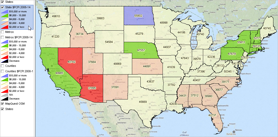
Housing Value Appreciation 2014Q3-2015Q3 by 3-Digit ZIP Code
The following graphic shows housing value appreciation 2014Q3-2015Q3 by 3-digit ZIP code based on the HPI. Click graphic for larger view and details.

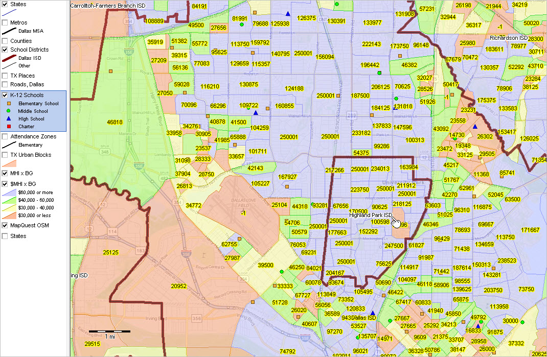
• View developed using CV XE GIS and related GIS project.
• Interactive table coming in December.
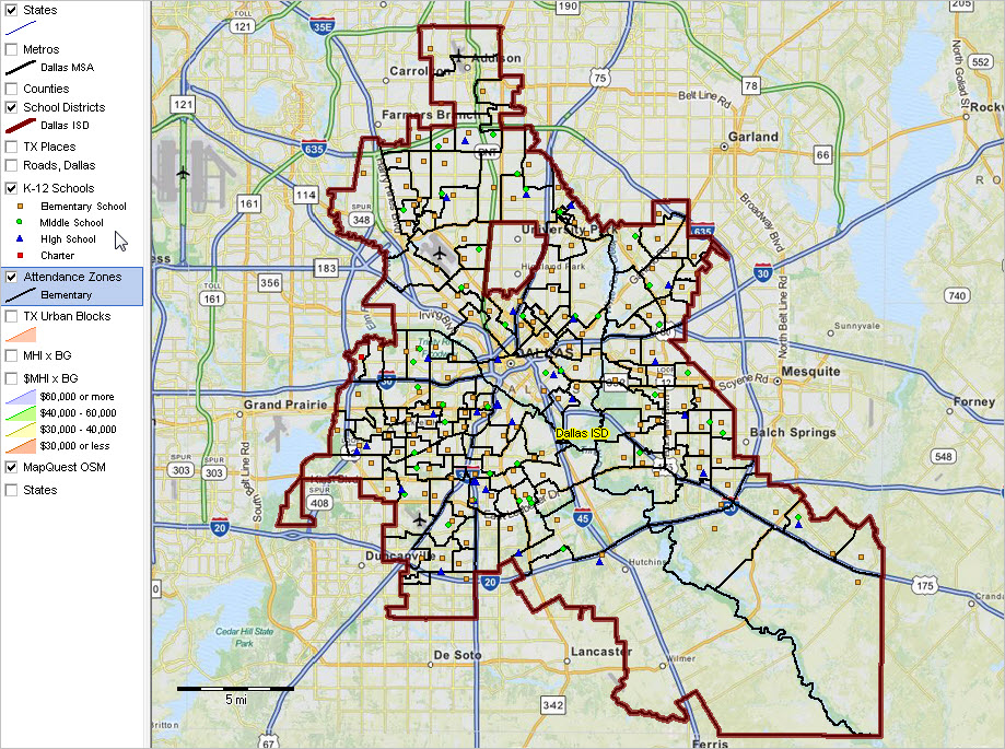
• Click to view Houston metro area .. with counties
.. Houston area view with counties shows mini-profile
for 3-digit ZIP code 770; housing appreciation 6.77% 2014Q3-2015Q3.

Related Housing Market Data & Analytical Resources
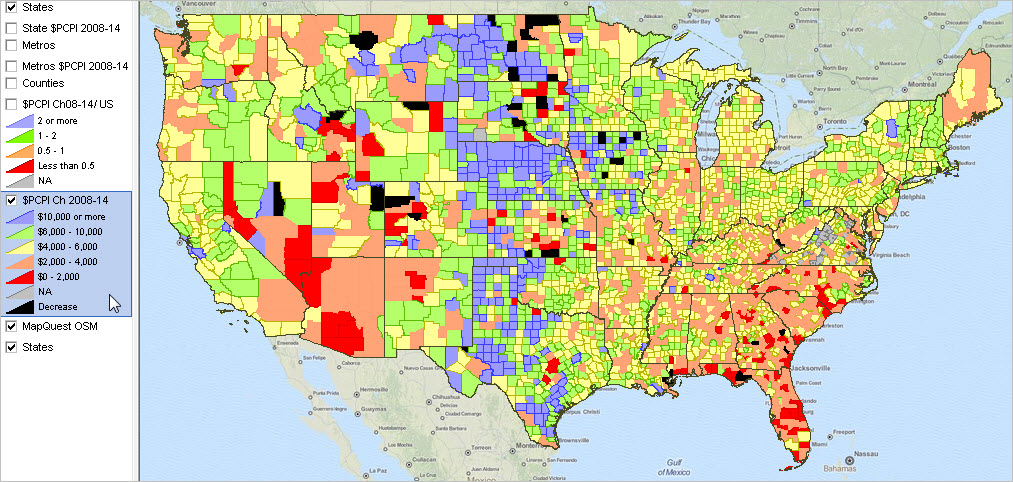
The HPI alone provides only partial insights. Evaluation of housing markets, and the regional economy, trends and patterns need to use the HPI in combination with many other measures.
2010-2014 annual population estimates: county, metro, state, U.S.
ACS 2014 1-year demographic-economic tables: county, metro, state, U.S.
Housing Unit Time Series, Trends & Patterns
Housing market conditions
ProximityOne Data Services: access/integrate these with other data
• Each data resource section has associated GIS project & datasets.
CV XE GIS software: data analytics, maps, geospatial analysis
• See related Interactive Ranking Tables

Using Tools & Data Resources in this Section
Use tools in this section to examine the quarterly HPI from 2014Q3 to 2015Q3. View/rank/compare HPI trends using the interactive table (see below). Use the GIS tools to visually and geospatially analyze patterns and characteristics of interest. Members of the ProximityOne User Group may download the HPI GIS project and use this project and datasets with the CV XE GIS software. Develop variations on maps shown in this section; add your own data.

Metro Housing Market Reports
Register for information on Metro Housing Market Reports. Updated quarterly, these reports provide a comprehensive housing market assessment and outlook for the U.S. by metro with geographic drill-down (tract and ZIP code) within individual metros.

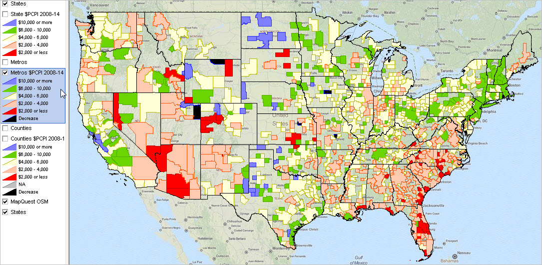
Visual Analysis of 2014Q3-2015Q3 HPI Patterns by Metro
The following graphic shows housing value appreciation 2014Q3-2015Q3 by metro (MSA) based on the HPI. Click graphic for larger view and details.

– view developed using CV XE GIS and related GIS project.
User Group (join now) members: use HPI GIS project with CV XE GIS.

Interactive Table
The graphic shown below illustrates use of the interactive table to rank metros on the 2014Q3 to 2015Q3 quarter-to-quarter housing appreciation. Two Florida metros, Port St. Lucie and Palm Bay-Melbourne-Titusville, FL, led the nation.

– click graphic for larger view.

Use the interactive table to examine areas of interest. Join me in a Data Analytics Lab session to discuss use of these data using analytical tools and methods applied to your situation.

HPI Updates
The HPI updates quarterly for 3-digit ZIP codes, metropolitan statistical areas and other geography. The next update is scheduled for revisions and the new 2015Q4 on February 25, 2016. See in calendar and set a reminder.

Upcoming Topics
Follow my blog (click button in upper right column) where I will review related market topics, using other data resources and analytical tools available to you at no fee. Upcoming topics include an update on Low & Moderate Income by Census Tract and the Rental Vacancy Rate access, interpretation and role as a leading economic indicator.

About the Author
— Warren Glimpse is former senior Census Bureau statistician responsible for innovative data access and use operations. He is also the former associate director of the U.S. Office of Federal Statistical Policy and Standards for data access and use. He has more than 20 years of experience in the private sector developing data resources and tools for integration and analysis of geographic, demographic, economic and business data. Contact Warren. Join Warren on LinkedIn.

Why Data on Total Housing Units Are So Important

.. data on total housing units are important to the housing industry and many others .. to understand the characteristics, patterns and trends of the housing market, we need good data on the number of housing units. Understanding the how, where, when, how much housing market change might affect you … starts with the number of total housing units by geographic area. As of Census 2010, there were 131,704,730 housing units in the U.S. As of mid-2014, the total number of housing units had increased to 133,957,180 (2.25 million units, a 1.71% increase). See more detail in the related Web section.

Housing Unit Percent Change by County: 2010-2014
Patterns of housing unit percent change by county, 2010-2014, are shown in the map below. More than 1,000 counties (1,214 counties of 3,142) experienced a loss of housing units between 7/2010 and 7/2014 (orange and red fill patterns). Six counties lost more than 1,000 housing units during this period. Click graphic for larger view with details.

– view developed using CV XE GIS software and associated GIS project.
– data based partly on Census 2010 &s Census Bureau housing unit estimates.

Being Informed; Benefits of Using Total Housing Unit Data
Realtors, brokers and selling agents need to know how total housing units are trending — what has been changing where that might affect sales now and in the months ahead. The construction industry and builders need data on the number of housing units and data on the rental vacancy rate to assess likely demand by type of housing in the future. Businesses employing people who might tend to occupy rental properties need to know about the availability and affordability of nearby residential properties. Every school district needs to know how many students there will be enrolled; examining housing unit trends is imperative. By understanding that growth in the housing market may mean new jobs, and more, economic developers, planners and city/neighborhood stakeholders need to monitor what housing unit change in their area means to them. Lenders and financial institutions need these data to assess viability of loans to businesses planning to develop new housing units and assess value in making loans to potential housing buyers.

Understanding the housing stock size, trends and composition in an area, and how that differs from adjacent areas, can help determine the targeted planning for stabilizing and improving local housing markets, developing and preserving affordable rental housing and facilitating neighborhood investment.

Housing Units Defined
A housing unit is a house, apartment, mobile home, group of rooms or single room, which are occupied or intended as separate living quarters. The separate living quarters that define a housing unit are those where the occupants live and eat separately from other residents in the structure or building, and have direct access from the building’s exterior or through a common hallway.

Using the Interactive Table to Examine Housing Unit Patterns
Use the interactive table to examine housing units trends and change by county, metro and state. The following graphic illustrates use of the table to rank counties on the housing unit change from 2010 to 2014. The graphic shows that Wayne County, MI experienced the largest decrease among all counties. Click graphic for larger view with details.

Use the interactive table to examine areas of interest. Join me in a Data Analytics Lab session to discuss use of these data using analytical tools and methods applied to your situation.

Follow my blog (click button in upper right column) where I will review related market topics, using other data resources and analytical tools available to you at no fee. Upcoming topics include an update on the Housing Price Index and the Rental Vacancy Rate access, interpretation and role as a leading economic indicator.

About the Author
— Warren Glimpse is former senior Census Bureau statistician responsible for innovative data access and use operations. He is also the former associate director of the U.S. Office of Federal Statistical Policy and Standards for data access and use. He has more than 20 years of experience in the private sector developing data resources and tools for integration and analysis of geographic, demographic, economic and business data. Contact Warren. Join Warren on LinkedIn.

Regional Economic Information System; 2015 Annual Update

.. examining patterns of economic well-being among counties and regions … per capita personal income (PCPI) is the most comprehensive measure of individual economic well-being. PCPI estimates are developed/updated annually for counties, metros, states and the U.S. PCPI estimates, available as an annual time series 1969 through 2014, are developed as a part of the Regional Economic Information System (REIS). This section provides information on accessing and using the REIS data. See related Web section for more detail and data access tools.

Visual Analysis of Per Capita Personal Income Patterns
The following map shows the Houston metro (view profile) with bold brown boundary. Counties are labeled with county name and 2014 per capita personal income.

Click graphic for larger view. View developed with CV XE GIS software.

• See similar view of the San Francisco Metro/Area by County
• See this section to learn about making custom metro maps.

Important Features of the REIS Data
A distinguishing characteristic of the REIS data is that they are a set of multi-sourced data organized and used to estimate personal income. Personal income, unlike money income, is income received by all persons from all sources. A second characteristic is, unlike the American Community Survey (ACS), the REIS data are not based on a sample survey but rather employer-based data and other administrative data. Third, the lengthy annual time series lends itself to use in modeling and trend analysis based on a set of consistently defined subject matter.

Accessing & Using REIS Data
Resources to analyze regional economic patterns and characteristics:
1. Use the interactive table to examine characteristics of counties, metros and states. View/rank/compare per capita personal income over time.
2. Use the metro demographic-economic profiles. Examine REIS-based personal income components in context with other subject matter. Select/view any metro via interactive table.
3. Use the REIS datasets made available as a part of the ProximityOne Data Services Program (PDS).
4. Create thematic pattern maps & perform geospatial analysis of REIS data in ready-to-use GIS projects.
5. Use ProximityOne modeling tools to forecast personal income components; assess impact of change on your interests.

More About Using GIS Resources & Pattern Analysis
The following graphics illustrate use of the REIS GIS Project (details in Web section). These views show the change in per capita personal income during the period 2008 to 2014. The underlying datasets provide annual data in most cases from 1969 through 2014. Analyze patterns for only one/any selected/ year, change or percent change over time (an average of years or selected point in time). Zoom into regions of interest, set alternative pattern views, flexibly use labels, add data from other sources.

Per Capita Personal Income Change 2008-2014 by State

Click graphic for larger view. View developed with CV XE GIS software.

Per Capita Personal Income Change 2008-2014 by Metro

Click graphic for larger view. View developed with CV XE GIS software.
See this section to learn about making custom metro maps.

Per Capita Personal Income Change 2008-2014 by County

Click graphic for larger view. View developed with CV XE GIS software.

Per Capita Personal Income: County, Metro, State Interactive Table
  — top-ranked counties based on 2014 PCPI
Use of the interactive table is illustrated in the graphic below. The GeoType feature is used to select only counties. The table is then sorted in descending order on 2014 $PCPI.

Use the main Web section interactive table to examine areas of interest. Join me in a Data Analytics Lab session to discuss use of these data using analytical tools and methods applied to your situation.

About the Author
— Warren Glimpse is former senior Census Bureau statistician responsible for innovative data access and use operations. He is also the former associate director of the U.S. Office of Federal Statistical Policy and Standards for data access and use. He has more than 20 years of experience in the private sector developing data resources and tools for integration and analysis of geographic, demographic, economic and business data. Contact Warren. Join Warren on LinkedIn.

Relating Block Groups to ZIP Code Areas

.. the popularity of block group demographic data is mainly due to this being the smallest geographic area for which annually updated demographic data, with U.S. wall-to-wall coverage, are available from the American Community Survey (ACS) — or any other source. While block groups nest within census tracts from both a geometric and geocode hierarchy perspective, the relationship between block groups and ZIP code areas is far less clear. Analysts are often interested in relating block group geography and demographics with ZIP code areas. The Census 2010 217,740 block groups intersect with 32,824 ZIP code areas forming 308,805 BG-ZIP area combinations. This section reviews tools to examine the relationship between block group geography/demographics and ZIP code areas. See related Web section for full details.

Block Group 06-075-015700-1 in Context of ZIP Code Area 94115
Block groups (BGs) are often wholly contained within a ZIP code area. But around the ZIP code area boundary, intersecting block groups are often split by the ZIP code boundary. This relationship is illustrated in the graphic shown below. This graphic shows block group 06-075-015700-1 (yellow BG code label, cross-hatched, black boundary) in context of ZIP Code area 94115 (white labels, bold blue boundary) located in San Francisco. This GIS application is closely related to the Mapping Block Group Data, also uses the San Francisco area in applications.

– view developed with ProximityOne CV XE GIS and related GIS project.
– view all San Francisco ZIP code areas; see ZIP 94115 in context.

The cross-hatched BG 060750157001 (or 06-075-015700-1) is split by ZIP code 94115. What part of the BG is in ZIP code area 94115 and adjacent ZIP code area 94118? The situation is similar for BG 060750157002, directly below 060750157001, which is split into 3 ZIP code areas. Use the interactive table to make these determinations.

Using the Interactive Table
The interactive table illustrated in the graphic below contains a row for block group area part which intersects with a unique ZIP code area. The simple case of a BG being split into two ZIP code areas can be visually observed as shown in the graphic presented above. A tabular relational table offers processing advantages compared to visual geospatial depictions. Here is an example. ZIP code area 94115 contains whole or parts of 32 BGs. To view/verify this using the table below, 1) click the ShowAll button below the table, then 2) click the Find ZIP button (edit box at right preloaded with this ZIP). The table refreshes with 32 rows — the BGs intersecting with this ZIP code area. Verify there are 32 BGs; the BG codes can be viewed in column 1.

In the above map at the top of this section, block group 06-075-015700-1 is shown visually to be contained in two ZIP code areas. To view how block group 06-075-015700-1 is split among multiple ZIP code areas using the table below, 1) click the ShowAll button below the table, then 2) click the Find GEOID button (enter G0607501057001 in the edit box to right of Find GEOID then click Find button). The table refreshes with two BGs. In this example, it can be seen that the total BG population (Census 2010) is 1,375. The part of the BG population is shown and the percent of the population from that BG allocated to the corresponding ZIP code are shown. This BG has a total area 0.09 square miles. The part of the BG area Census 2010, square miles) is shown and the percent of the area from that BG allocated to the corresponding ZIP code are shown.

Use the main Web section interactive table to examine areas of interest. Join me in a Data Analytics Lab session to discuss use of these data using analytical tools and methods applied to your situation.

About the Author
— Warren Glimpse is former senior Census Bureau statistician responsible for innovative data access and use operations. He is also the former associate director of the U.S. Office of Federal Statistical Policy and Standards for data access and use. He has more than 20 years of experience in the private sector developing data resources and tools for integration and analysis of geographic, demographic, economic and business data. Contact Warren. Join Warren on LinkedIn.

Establishments, Employment & Earnings Trends: 2015Q1

.. county & metro Establishment, Employment & Earnings (EEE) monthly-quarterly-annual time series by detailed type of business .. financial sector employment in Manhattan (New York County, NY) led the nation in average weekly wages at $8,932 during the first quarter 2015.  Use the interactive table to examine characteristics of establishments (number, employment, earnings) for counties and metros by type of business of interest. See the related Web section for more detail.  Follow that section for quarterly and interim data establishments by sector updates and use of tools to analyze patterns and trends.

The most current and comprehensive measures of business activity by county, metro and higher level geography are provided by the Establishments, Employment & Earnings (EEE) database. Use the interactive table to view, rank, query, compare data on establishments, employment and wages by county, metro and state for high level industries. Subscribers to the ProximityOne Data Service (PDS) database can use the more detailed (6-digit NAICS coverage) with data structured for time-series analysis supported with modeling and data analytics tools.

Where Does America Make Things?
The graphic below shows percent employment in the manufacturing sector (employment in the private manufacturing sector as a percent of total private sector employment January 2015 by county). Click graphic for larger view providing more detail. Use the GIS tools to analyze similar patterns for any industry. Interpreting this map graphic and alternative data resources … join us in a Data Analytics Lab session where we discuss making and interpreting this map view and alternatives.

– view developed with ProximityOne CV XE GIS and related GIS project.

The EEE quarterly data are based on employer reported data and provide EEE characteristics by detailed type of business collected and tabulated by the Bureau of Labor Statistics (BLS). Derived from reports submitted by every employer subject to unemployment insurance (UI) laws, the data cover 9.5 million employers and 136.2 million full- and part-time workers.

Important features of these data …
• Tabulated for all counties, metros, states and the U.S.
• Tabulated for detailed types of business (6-digit NAICS).
• Tabulated quarterly and annually, the data enable time-series modeling.
• Employer-based administratively collected data; not estimates.
• Short lag (5 months) between reporting date and date of data accessibility
– data for second quarter 2015 (2015Q2) are available mid-December 2015.
Limitations of these data.

Use these data to examine how a detailed type of business is changing in a county or metro … or how that type of business in one county/metro compares to another county or metro. Answer questions like how much of the healthcare sector in a particular metro is comprised by offices of physicians. Or, are the number of establishments in a business sector growing or declining? How are the characteristics of establishments in one metro changing relative to another metro?

Establishments, Employment, Earnings — Interactive Table
The following graphic illustrate use of the interactive table to examine characteristics of construction industry for California by county. The rows/counties are ranked on the rightnost column AWW15Q1 (average weekly wages, 1st quarter 2015) in descending order. It is easy to see that California was led by San Francisco county with $1,661 AWW reflecting activity of 1,564 establishments and January employment of 16,850. Click graphic for larger view.

Updates
These data update quarterly. The next update includes data for 2015Q2 and becomes available December 17, 2015 (set reminder).

About the Author
— Warren Glimpse is former senior Census Bureau statistician responsible for innovative data access and use operations. He is also the former associate director of the U.S. Office of Federal Statistical Policy and Standards for data access and use. He has more than 20 years of experience in the private sector developing data resources and tools for integration and analysis of geographic, demographic, economic and business data. Contact Warren. Join Warren on LinkedIn.

Enhancing the Role of Luck in Your Outcomes

.. or maybe it should be “enhancing the propensity for luck.” Luck often occurs when the environment is favorable to being lucky. Luck is a major factor underlying great things happening. Of course there is also bad luck. Luck comes in small and big bundles. One small piece of luck can change one’s fortunes, broadly defined, in permanent, enormous ways.

This blog generally addresses topics on the role and use of tools and data to know about a situation or trends … or influence favorable outcomes. Luck can play a role to influence favorable outcomes.

Today is a “Friday the 13th.” One of the few days that some are leery about, for no good reason. For me, I don’t think bad things will happen, but it’s on my mind. I might think about it once/twice in the week lead-up, or on that day. Does that create an environment for possibly less luck propensity? Maybe.

While luck is a matter of being at the right place at the right time, it can also be a matter of how one creates expanded opportunities for being in the right place at the right time … and being able to read the situation. Maybe a luck-oriented opportunity requires 2-3 extra steps for it to present itself. Plus other things worthy of dwelling on.

Enjoy your Friday the 13th. Go expand your opportunities for luck to occur; enjoy possible good fortunes. Consider how you can enhance luck propensities to achieve improved outcomes. It is not all strictly chance.

About the Author
— Warren Glimpse is former senior Census Bureau statistician responsible for innovative data access and use operations. He is also the former associate director of the U.S. Office of Federal Statistical Policy and Standards for data access and use. He has more than 20 years of experience in the private sector developing data resources and tools for integration and analysis of geographic, demographic, economic and business data. Contact Warren. Join Warren on LinkedIn.

Navigating the Federal Statistical System: Important County Level Data Updates

.. several important U.S. by county demographic-economic data resources become available in the November-December time period .. review how these data mesh with your needs and mark your calendar.

There are many reasons that national scope county-level data are important. The county geographic level is the most widely used statistical data summary level. While many analyze ZIP code data, there is a narrow range of ZIP code summary data available compared to county level data. Counties offer a good geographic drill-down; data can be analyzed for sub-metro and sub-state areas. County geography changes very little over time; counties offer more geographic stability for long-term analysis than metros (above them) or census tracts (below them).

Regional Economic Information System
Personal Income by Major Source
… most comprehensive measure of per capita economic well-being
Annual update; annual time-series
Bureau of Economic Analysis; November 19, 2015
More information .. set data release date reminder.

American Community Survey 2014 5-year Data
Demographic-Economic Estimates
… broadest range of demographic-economic data
    for county and subcounty geography
Annual update
Census Bureau; December 3, 2015
More information .. set data release date reminder.

Establishments, Employment & Wages by detailed type of industry
… establishments summary data by most detailed type of business
… quarterly
… six month lag from data reference to data access
Quarterly update; 2015Q2; extends time series
Bureau of Labor Statistics; December 17, 2015
More information … updated today with 2015Q1 interactive table.
Set data release date reminder.

There are other important metro and small area Federal statistical resources becoming available in this period. See related section Navigating the Federal Statistical System for a more in-depth resource.

Data Analytics Lab Session
Join me in a Data Analytics Lab session. There is no fee. Discuss how tools and methods reviewed in this section can be applied to your situation.

About the Author
— Warren Glimpse is former senior Census Bureau statistician responsible for innovative data access and use operations. He is also the former associate director of the U.S. Office of Federal Statistical Policy and Standards for data access and use. He has more than 20 years of experience in the private sector developing data resources and tools for integration and analysis of geographic, demographic, economic and business data. Contact Warren. Join Warren on LinkedIn.

K-12 Data Analytics: Dallas ISD, Texas

.. using tools and data analytics methods for analysis of K-12 schools located in Dallas ISD school district, Texas .. use the interactive table in related section to examine demographic-economic characteristics of Dallas County by block group. Apply these tools and methods to your schools, school districts and related areas of interest. Contact me for details. Tools and methods described here can help leadership, staff and stakeholders answer key questions and facilitate strategic planning. See the related main Web section for more details and tools access.

Examining the Current Situation
While most schools and school districts know a lot about the students, often less is known about children’s living environment and the broader school district community. See the demographic-economic profile for Dallas ISD total population (compare to Dallas city). These profiles tell a story. It helps stakeholders know “where we are now.”

Use the annually updated School District Special Tabulation that provides similar data but for the grade relevant school age population by type of enrollment universe. See Dallas ISD Children’s Demographic-Economic Profile by Universe of Enrollment.

Dallas ISD School District in Context
Dallas ISD (bold brown boundary) shown in regional context.

  — view created using CV XE GIS and associated GIS Project

School Locations in Context
Zoom-in to Dallas ISD. Pointer at county boundary; Dallas ISD is located in Dallas County. Schools are shown by different types of markers. See markers/style in legend at left. Using the query feature, it is possible to identify charter schools as one type of marker, irrespective of grade range.

Use the national scope interactive tables to examine characteristics of individual public schools and individual private schools. Rank, query, compare and contrast schools within a state or on a national basis.


  — view created using CV XE GIS and associated GIS Project

Zoom-in View of Schools; School Characteristics
Further zoom-in shows schools labeled with name.  The identify tool is used to show a mini-profile of a school by clicking on the Edna Rowe school marker.
The partial view of the profile shows free and reduced lunch participation and enrollment by grade.

  — view created using CV XE GIS and associated GIS Project

School Attendance Zones
Elementary school attendance (black boundaries) are shown in the next graphic. Dallas ISD has three types of attendance zones (elementary, middle, high school). The query feature is used to show only elementary zones. Click graphic for larger view showing more detail.

  — view created using CV XE GIS and associated GIS Project

Cities/Places & School District
Cities/places are shown in the next graphic (cross-hatch pattern) in context with the school district. Places are non-incorporated areas of population concentration. Click graphic for larger view showing more detail; adjacent city/places shown with yellow diagonal cross-hatch pattern.


  — view created using CV XE GIS and associated GIS Project

Road Infrastructure
Roads/streets are added to the view as shown in the next graphic. Vital to student transportation planning and management, the street density view also helps view the scope of build-out. Click graphic for larger view showing more detail; mini-profile shows attributes of street segment by school/pointer.

  — view created using CV XE GIS and associated GIS Project

Schools in Context of Urban/Rural Geography
Census blocks are categorized as urban or rural based on Census 2010. The graphic below shows urban census blocks with an orange fill pattern. It is easy see that most of Dallas ISD is urban; but a large area in the southeast part of the district is rural. See related K-12 Schools by Urban/Rural Status
.

  — view created using CV XE GIS and associated GIS Project

Percent Population in Poverty by Census Tract
Census tracts are statistically defined geographic areas covering the U.S. wall-to-wall (73,057 areas). The view below shows patterns of percent population in poverty by census tract. Click on graphic to view larger view. Choose from hundreds of demographic-economic measures to assess patterns of well-being, age distribution, housing structure and age, educational attainment, housing value, race/origin, employment, language spoken at home among many others.

  — view created using CV XE GIS and associated GIS Project

See zoom-in view of Edna Rowe school vicinity with tract and %poverty labels

Patterns of Economic Prosperity by Block Group
Block groups are statistically defined geographic areas covering the U.S. wall-to-wall (217,740 areas) and nest within census tracts (see above). Block groups (BGs) provide a finer geographic granularity compared to census tracts. The view below shows patterns of economic prosperity as measured by the median household income (MHI). MHI interval/color patterns are shown in the highlighted layer at left of the map. Click on graphic to view larger version that uses the MHI as a label for each BG. Choose from hundreds of demographic-economic measures to assess patterns of well-being. This view illustrates use of transparency setting to “see through” the pattern layer to view the topology/road infrastructure.


  — view created using CV XE GIS and associated GIS Project

Dallas County Block Group Demographic-Economic Characteristics
Use the interactive table to view, rank compare Dallas County block group demographic-economic characteristics. See about Dallas County demographic trends. All block groups for the county are included in the table. Optionally key in an address using the location-based demographics tool to determine the block group code of interest. You can then use the Find button below the table to locate that block group. See about using block group codes — a 12 character code uniquely identifying that area.

Block Groups in Vicinity of School — Interactive Table
The graphic below illustrates use is the Dallas County block group interactive table. Block groups in census tract “48113012206” are shown in the table. This tract was selected as it contains the Edna Rowe school (location used above in maps). The school’s address was used in the location-based lookup tool. Do this for any school or address in Dallas County. It is easy to see that the Gini Index is low indicating high degree of income equality. It is easy to see and compare the number and type of housing units, median income, housing values, and rent. Try this process yourself:
1 – enter an address using this tool to obtain a census tract code see this example.
2 – below the interactive table click ShowAll button, enter your 11 character tract code, click Find.
All block groups in this tract will show as rows in the table.

Data Analytics Lab Session
Join me in a Data Analytics Lab session. There is no fee. Discuss how tools and methods reviewed in this section can be applied to your situation.

About the Author
— Warren Glimpse is former senior Census Bureau statistician responsible for innovative data access and use operations. He is also the former associate director of the U.S. Office of Federal Statistical Policy and Standards for data access and use. He has more than 20 years of experience in the private sector developing data resources and tools for integration and analysis of geographic, demographic, economic and business data.