Monthly Archives: May 2020

Business Establishment Characteristics by County

.. what are the number and types of businesses underlying county economies of interest? What is the employment size by type of business establishment? What scope of wages, earnings do they contribute? Learn more here.

The pandemic impact on businesses remains in flux .. this post tools and data that can be used to examine pre-pandemic business establishments and employment pattern characteristics by county. By examining pre-pandemic conditions, we can better assess the impact of how and why business, demographic and economic change and impact as we move forward. The magnitude and duration of the impact on businesses will vary by community/area and become more measurable in the months ahead. The “How & Where of Business Establishment/Employment Change” will be updated later in 2020. See related, more detailed web section. See related section focused business establishments by ZIP code.

Where Things are Made by County
The following graphic shows patterns of the number of manufacturing establishments (NAICS 31) by county for the U.S. 48 contiguous states. Inset legend in map view shows number of establishments by interval/color. View/examine all U.S. states and areas using the related GIS project. Create custom maps similar to this view for your regions of interest depicting establishments, employment or payroll for your type of business selection(s). Click graphic for larger view with more detail; expand browser window for best quality view.

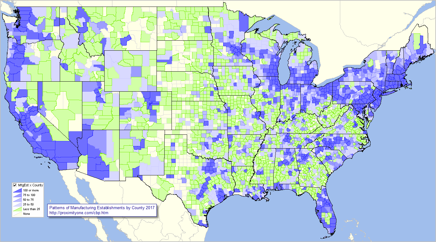
– view developed with ProximityOne CV XE GIS software and related GIS project.

The above view shows patterns for only one type of business. Data are tabulated more than 2,000 NAICS/type of business codes. These data may be examined by county using the interactive table. Use the GIS tools and related GIS project to develop variations of the views shown here.

Using the Interactive Table
The 10 largest counties based on the number of manufacturing establishments are shown in the static graphic below. Click for larger view.

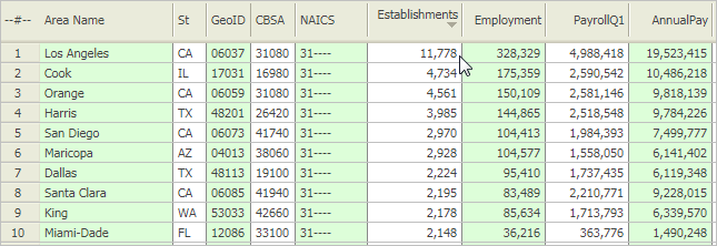
Use the interactive table to dynamically create similar rankings on employment size or payroll. Set a query for a county, metro or state of interest.

Updates
These data update in June 2020. Follow the blog (click button at upper right) to receive updates.

Learn more — Join us in the Situation & Outlook Web Sessions
Join me in a Situation & Outlook Web Session where we discuss topics relating to measuring and interpreting the where, what, when, how and how much demographic-economic change is occurring and it’s impact.

About the Author
— Warren Glimpse is former senior Census Bureau statistician responsible for innovative data access and use operations. He is also the former associate director of the U.S. Office of Federal Statistical Policy and Standards for data access and use. He has more than 20 years of experience in the private sector developing data resources and tools for integration and analysis of geographic, demographic, economic and business data. Contact Warren. Join Warren on LinkedIn.

How & Why County Demographics are Changing

.. the pandemic impact on population change remains in flux. For many counties it will impact each component of population change: births, deaths and migration. The magnitude and duration of the impact on each component will vary by county and become more measurable in the months ahead. The “How & Why County Demographics are Changing” will be updated later in 2020.

Here we look at population and components of change by county for the period 2010 to 2019 .. tools and data to examine how the U.S. by county population is changing. These latest 2019 estimates were released this spring. See more in the related web section.

Top 25 Counties with Largest Population Change 2010-2019
Create a table similar to the one shown below using the interactive table. Sort on selected criteria and within a selected state or metro.

Patterns of Population Change by County, 2010-2019
The following graphic shows how counties have gained population (blue and green) and lost population (orange and red) during the period 2010 to 2019. Click graphic for larger view; expand browser window for best quality view.

.. view developed with ProximityOne CV XE GIS and related GIS project.

Examining Population Components of Change
Population change can be examined in terms of components of change. There are three components of change: births, deaths, and migration. The change in the population from births and deaths is often combined and referred to as natural increase or natural change. Populations grow or shrink depending on if they gain people faster than they lose them. Examining a county’s unique combination of natural change and migration provides insights into why its population is changing and how quickly the change is occurring. The above graphic shows these relationships.

County Population & Components of Change 2010-2019 – Interactive Table
View/analyze county population and components of change characteristics and trends in a tabular manner using the interactive table. The following static graphic shows net migration 2010-2019 by year for Houston, TX metro component counties. Rows have been ranked in descending order based on 2010 population. It is easy to see how the net migration in Harris County has been decreasing annually since 2015.

Try it yourself. Use the interactive table to examine counties/areas of interest.

Situation & Outlook Web Sessions
Join me in a Situation & Outlook Web Session where we discuss topics relating to measuring and interpreting the where, what, when, how and how much demographic-economic change is occurring and it’s impact.

About the Author
— Warren Glimpse is former senior Census Bureau statistician responsible for innovative data access and use operations. He is also the former associate director of the U.S. Office of Federal Statistical Policy and Standards for data access and use. He has more than 20 years of experience in the private sector developing data resources and tools for integration and analysis of geographic, demographic, economic and business data. Contact Warren. Join Warren on LinkedIn.

Patterns of Income in America’s Largest Cities

The retreat in personal and household income resulting from the pandemic will be historic and substantial. How long term? Which cities of what size and location will be affected the most? We start to study patterns and trends as new data become available in the next several weeks.

America’s largest 629 cities accounted for a group population of 121,228,560, or 37.1%, of the total U.S. population (327,167,434) in 2018. All of these cities are in Metropolitan Statistical Areas (MSAs). With contiguous cities and places, these urban areas account for more than 80% of the U.S. population. These cities, each with 65,000 population or more, are shown as markers in the thematic pattern view below. See more about cities/places and city/place 2010-2018 demographic trends.

Patterns of Economic Prosperity: America’s Largest Cities
– cities with 2018 population 65,000+ shown as markers
– markers show level of 2018 median household income
– data used to develop this veiw were extracted using GeoFinder.
– click map for larger view; expand browser to full screen for best quality view.

– view developed using ProximityOne CV XE GIS software and related GIS project.

Top 25 Largest Cities based on Median Household Income

About America’s Largest Cities & Economic Characteristics
The set of the 629 America’s largest cities is based on data from the 2018 American Community Survey 1-year estimates (ACS 2018). ACS 2018 1-year estimates, by design, provide data only for areas 65,000 population or more. The ACS 2018 data are the only source of income and related economic data for national scope each/all cities/places (29,853) on an annual and more recent basis. These data will update with 2019 estimates in September 2020. ACS-based data reflecting the impact of the pandemic will not be available until September 2021.

Situation & Outlook Web Sessions
Join me in a Situation & Outlook Web Session where we discuss topics relating to measuring and interpreting the where, what, when, how and how much demographic-economic change is occurring and it’s impact.

About the Author
— Warren Glimpse is former senior Census Bureau statistician responsible for innovative data access and use operations. He is also the former associate director of the U.S. Office of Federal Statistical Policy and Standards for data access and use. He has more than 20 years of experience in the private sector developing data resources and tools for integration and analysis of geographic, demographic, economic and business data. Contact Warren. Join Warren on LinkedIn.