Monthly Archives: April 2017

Creating & Using Location Shapefiles

.. GIS tools and methods to develop and update location shapefiles .. location shapefiles are essential to most GIS applications. Location shapefiles, or point shapefiles, enable viewing/analyzing locations on a map and attributes of these locations such store or customer ID, street address, city, date updated, value, ZIP code and wide-ranging attributes about the location. This section reviews tools and methods to develop and use location shapefiles. See more detail about topics covered in this section in the related Web page.

Viewing/Analyzing Store Locations in the Dallas, TX Area
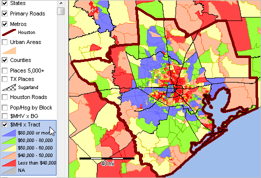
The following graphic illustrates how store locations can be shown in context of other geography and associated demographic-economic attributes. This view shows store locations (red markers) in context of Dallas city (blue cross-hatch pattern) and broader metro area. Markers shown in this view are based on a location shapefile created using steps described below. The identify tool is used to click on a location and show attributes in a mini-profile.

.. view developed with ProximityOne CV XE GIS and related GIS project.

View the locations contextually with thematic patterns by tract or other geography. Combine views of store, customer, agent, competitor and other location shapefiles.
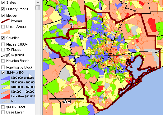
The following view shows patterns of median household income by census tract.

.. view developed with ProximityOne CV XE GIS and related GIS project.

Development of location shapefiles often starts with a list of addresses. Locations are not always address-oriented; they might be geographically dispersed measurement or transaction locations — having no address assigned. In applications reviewed here, locations are organized as rows in a CSV file. Each CSV file contains like-structured attributes for each location. The example used in this section uses store locations located in the Dallas, TX area.

There are two basic methods used to create location shapefiles: 1) geocoding address-data contained in the source data file or 2) using the latitude-longitude of the location included in the source data file record. The focus here is on option 2 — using the latitude-longitude of the location already present in the source data file.

Creating a Location Shapefile
The process of creating a location shapefile uses the CV XE GIS Manage Location Shapefile feature. With CV running, the process is started with File>Tools>ManageLocationShapefile. The following form appears.

.. ManageLocationShapefile feature/operation in ProximityOne CV XE GIS.

CV XE GIS provides other ways to create location shapefiles:
• Tools>AddShapes>Points — click points on the map window canvas.
• Tools>FindAddress — creates a single point shapefile based on specified address.
• Tools>FindAddress (Batch) — creates a point shapefile based on specified file of address records.
See details in User Guide.

Steps to Create a Location Shapefile
The process of creating the shapefile “C:\cvxe\1\locations1pts.shp” can be viewed by clicking the Run button on the form (with CV running). Two input CSV structured files are required:
• data definition file
• source data file

There are two sets of illustration location input files included with the CV installer:
• locations1_dd.csv and locations1.csv (7 locations in Johnson County, KS)
• locations2_dd.csv and locations2.csv (252 locations in Dallas and Houston)
These files are located in the \1 (typically c:\cvxe\1) folder. The marker/location shapefile used in the map shown above was created using the lcoations2 input files.

Data Definition File
The Data Definition (DD) file is an ASCII/text file structured as a CSV file. It may created with any text editor. The DD file is specific to the source data file. But in the case of recurring source data files for different periods the same DD file might apply to many source data files. There are several rules and guidelines for development of the DD file:
• there is one line/record for each field in the source data file.
• each line/record must be structured in an exact form:
.. each line/record is comprised of exactly 4 elements separated by a comma:
.. 1 field name for subject matter item
– must consist of 1 to 10 characters and include no blanks or special characters
.. 2 field type: C for character, N for numeric
.. 3 field length: an integer specifying the maximum with of the field
.. 4 maximum number of decimals for field (value is 0 for character fields)
The DD File must include three final fields:
LATITUDE,n,12,6
LONGITUDE,n,12,6
GEOID,c,15,0
The structure of these three DD file records must be as shown above. The source data file, described below, must have the LATITUDE and LONGITUDE fields populated with accurate values. The GEOID field may populated with either an accurate value of placeholder value like 0.

Example. Data for each store for the default DD file name “C:\cvxe\1\locations1_dd.csv” include the following fields/attributes:
  NAME,C,45,0
STORE,c,15,0
ADDRESS,c,60,0
CITY,c,40,0
LATITUDE,n,12,6
LONGITUDE,n,12,6
GEOID,c,15,0

Optionally create a DD File using the Create DD File button on the form. Clicking this button will create a DD File containing attributes of the dBase file specified in the associated edit box. The DD File name is created from the dBase file name. If the dBase file name is “c:\cvxe\1\locations1pts.dbf”, the DD File will be named “c:\cvxe\1\locations1pts_dd.csv”.

About the GEOID
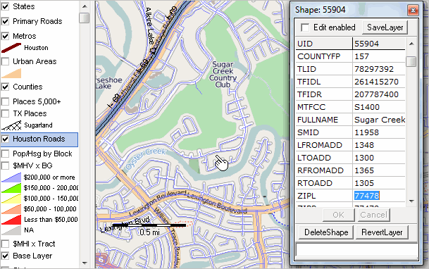
The GEOID is a 15 character code which defines the Census 2010 census block containing each location. The GEOID is generally assigned by the ManageLocationShapefile operation and is one of the important and distinctive features of this tool. The GEOID is used to uniquely determine, with the GIS application, any of the following: state, county, census tract, block group, or census block.

The GEOID, as used in this section, is the 15 character Census 2010 geocode for the census block. The GEOID value 481130002011012 (see in location profile in map at top of section) is structured as:
state FIPS code: 48 (2 chars)
county FIPS code: 113 (3 chars)
census tract code 000201 (6 chars)
census block code: 1012 (4 chars) (block group code: 1 — first of 4 characters)

About the Source Data File
The Source Data File is an ASCII/text file structured as a CSV file. It is typically developed by exporting/saving an Excel or dBase file in CSV structure. There are several rules and guidelines for development of the source data file:
• fields must be structured and arranged as defined in the DD File.
• character fields must not contain embedded commas.
• final items in record sequence must be:
.. LATITUDE – must have accurate decimal degree value; 6 digit precision suggested.
.. LONGITUDE- must have accurate decimal degree value; 6 digit precision suggested.
.. GEOID – this may be 0, not assigned or the accurately assigned GEOID value.
– optionally create/rewrite the GEOID used in the new shapefile.

Updates; Combining Vintages of Location Attributes
Location based data might update frequently, even daily. The recommended method to add, update and extend the scope of location-based data is to create new address shapefiles corresponding to different vintages or dates covered. The structure of the files must be the same so that they files can be used together or separately. Suppose there is one set of data covering year to date and a second set of data covering the following month. The ManagePointShapefile operation would be run once for each time period. Two shapefiles would be created. These shapefiles may be added to a GIS project and used separately or in combination to view/analyze patterns.

Join me in a Data Analytics Lab session to discuss more details about accessing and using wide-ranging demographic-economic data and data analytics. Learn more about using these data for areas and applications of interest.

About the Author
— Warren Glimpse is former senior Census Bureau statistician responsible for innovative data access and use operations. He is also the former associate director of the U.S. Office of Federal Statistical Policy and Standards for data access and use. He has more than 20 years of experience in the private sector developing data resources and tools for integration and analysis of geographic, demographic, economic and business data. Contact Warren. Join Warren on LinkedIn.

Examining Houston Metro Demographic-Economic Characteristics

.. tools & data to examine metro demographic-economic characteristics .. this Houston, TX metro focused section is one of several similar metro sections that will be covered in weeks ahead.  Each metro-focused section provides a summary of tools and data that can be used to view, rank, compare, analyze conditions and trends within the metro and this metro relative to other metros, regions and the Nation.  The ready-to-use GIS project/datasets provide the basis for extended data/geographic views and analysis immediately.  See more detail about topics covered in this related Web section.

Relating your data to demographic-economic characteristics and trends in a region involves more than information provided by a report or set of statistical tables. It is important to use your data to be able to identify areas of missed opportunity and competitive position. It is important to have a “10,000 foot” view as well as understanding individual neighborhoods and market/service areas. Geographic Information System (GIS) tools, with the right set of geographic, demographic and economic data can facilitate decision-making through the use of visual and tabular data analytics.

This section provides information on installing and using the Houston Metro Demographic-Economic GIS software and project/datasets. This same scope of data, tools and operation is available for any metro, state or combination.

10,000 Foot View
The following graphic shows patterns of median household income by census tract for the Houston metro area. This is the start-up view when using the GIS tools and data described below. The color patterns/intervals are shown in the highlighted layer in legend at left of map window. Use the GIS tools described below to develop thematic pattern maps for a range of data and criteria.

.. view developed using the CVGIS software.

See more about census tracts; see tracts main page.

Several additional views follow, developed using this same GIS project. These views illustrate different levels of geographic granularity and patterns of different subject matter.

Median Household Value by Block Group
See more about block groups; see block groups main page.

.. view developed using the CVGIS software.

Population/Housing Unit by Block
See more about census blocks; see census block main page.

.. view developed using the CVGIS software.

Zoom-in to Sugarland/Fort Bend County
See more about cities/places; see cities/places main page.
Access data for any city using interactive table.

.. view developed using the CVGIS software.

Further Zoom-in Showing Street/Road Detail
See more about streets.

.. view developed using the CVGIS software.

Additional Information
See the related Houston metro Situation & Outlook Report.

Using the GIS Software and Project/Datasets
(requires Windows computer with Internet connection)
1. Install the ProximityOne CV XE GIS
… run the CV XE GIS installer
… requires UserID; take all defaults during installation
2. Download the Houston Metro GIS project fileset
… requires UserID; unzip Houston Metro GIS project files to local new folder c:\p1data
3. Open the c:\p1data\us1_metros_houston.gis project
… after completing the above steps, click File>Open>Dialog
… open the file named c:\p1data\us1_metros_houston.gis
4. Done. The start-up view is shown above.

Join me in a Data Analytics Lab session to discuss more details about accessing and using wide-ranging demographic-economic data and data analytics. Learn more about using these data for areas and applications of interest.

About the Author
— Warren Glimpse is former senior Census Bureau statistician responsible for innovative data access and use operations. He is also the former associate director of the U.S. Office of Federal Statistical Policy and Standards for data access and use. He has more than 20 years of experience in the private sector developing data resources and tools for integration and analysis of geographic, demographic, economic and business data. Contact Warren. Join Warren on LinkedIn.

115th Congressional Districts: Analysis and Insights

.. interpretative data analytics; tools, data & methods ..  this section is focused on 115th Congressional District geographic, demographic and economic patterns and characteristics. Use tools and data reviewed here to examine/analyze characteristics of one congressional district (CD) or a group of CDs based on state, party or other attribute. Use the GIS resources described here for general CD reference/pattern/analytical views, to examine current demographics and demographic change and for redistricting applications. See this related Web section for more details.

Examining the 115th Congressional Districts
• the 115th Congress runs from January 2017 through December 2018.
• FL, MN, NC, VA have redistricted since the 114th CD vintage;
  .. some 115th CDs have new boundaries compared the 114th CDs.
• view, rank, compare CDs using the interactive table.
  .. table uses ACS 2015 data for 115th CDs & include incumbent attributes.
  .. examine districts by party affiliation.
• use these more detailed 114th CD interactive tables
  .. data based on 2015 American Community Survey – ACS 2015.
  .. corresponding data for the 115th CDs from ACS 2016 available Sept 2017.
• use the new GIS project including 114th & 115th CDs described below.
  .. create CD thematic and reference maps;
  .. examine CDs in context of other geography & subject matter.
• join us in the April 25 Data Analytics Lab session

Visual Analysis of Congressional Districts
The following views 1) provide insights into patterns among the 115th CDs and 2) illustrate how 114th to 115th geographic change can be examined. Use CV XE GIS software with the GIS project to create and examine alternative views.

Patterns of Household Income by 115th Congressional District
The following graphic shows the patterns of the median household income by 115th Congressional District based on the American Community Survey 2015 1-year estimates (ACS2015). The legend in the lower left shows data intervals and color/pattern assignment

.. view developed with ProximityOne CV XE GIS and related GIS project.

Charlotte NC-SC Metro Area
  – with 114th/115th Congressional District 12

The following graphic shows North Carolina CD 12 with 114th boundary (blue) and 115th boundary (pale yellow) and Charlotte metro bold brown boundary. Click graphic for larger view with more detail. Expand browser window for best view.

.. view developed using the CVGIS software.

• View zoom-in to Charlotte city & Mecklenburg County.

115th Congressional District Interactive Table
Use the interactive table to examine characteristics of one congressional district (CD) or a group of CDs. The following graphic illustrates use of the interactive table. First, the party type was selected, Democratic incumbents in this example. Next, the income and educational attainment columns were selected. Third, the set of districts were sorted on median household income. It is quick and easy to determine that CA18 has the highest median household income and that the MHI is $1,139,900. Try using the table to examine districts of interest.

Join me in a Data Analytics Lab session to discuss more details about accessing and using wide-ranging demographic-economic data and data analytics. Learn more about using these data for areas and applications of interest.

About the Author
— Warren Glimpse is former senior Census Bureau statistician responsible for innovative data access and use operations. He is also the former associate director of the U.S. Office of Federal Statistical Policy and Standards for data access and use. He has more than 20 years of experience in the private sector developing data resources and tools for integration and analysis of geographic, demographic, economic and business data. Contact Warren. Join Warren on LinkedIn.

County 5-Year Trends: Income & Income Inequality

.. tools and data to examine how the U.S. by county household income and income inequality are changing … how is household income changing in counties of interest? What are the trends; what is causing the change? What are the characteristics of income inequality and how is it changing? How might this change impact your living environment and business?

This section provides access to tools and data to examine U.S. by county measures of household income and income inequality between two 5-year periods (2006-10 and 2011-2015). These data can provide insights into how household income and income inequality are changing for one county, a group of counties and the U.S. overall. Use the interactive table to view median household income and measures income inequality for all counties. See more detail about these topics here. Measures of income inequality can be estimates/examined using the Gini Index.

The Gini Index & Measuring Income Inequality
The Gini Index is a dimensionless statistic that can be used as a measure of income inequality. The Gini index varies from 0 to 1, with a 0 indicating perfect equality, where there is a proportional distribution of income. A Gini index of 1 indicates perfect inequality, where one household has all the income and all others have no income.

At the national level, the 2015 Gini index for U.S. was 0.482 (based on 2015 ACS 1-year estimates) was significantly higher than in the 2014 ACS Index of 0.480 (based on 2014 ACS 1-year estimates). This increase suggests that income inequality increased across the country.

Examining Household Income & Income Inequality Patterns & Change
The following two graphics show patterns of the GIni Index by county. The first view is based on the American Community Survey (ACS) 2010 5-year estimates and the second is based on the ACS 2015 5-year estimates. The ACS 2010 estimates are based on survey respondents during the period 2006 through 2010. The ACS 2015 estimates are based on survey respondents during the period 2011 through 2015. One view compared with the other show how patterns of income inequality has changed at the county/regional level between these two 5-year periods.

Following these Income Inequality views are two corresponding views of median household income; using data from ACS 2010 and ACS 2015. Use CV XE GIS software with the GIS project to create and examine alternative views.

Patterns of Income Inequality by County; ACS 2010
The following graphic shows the patterns of the Gini Index by county based on the American Community Survey 2010 5-year estimates (ACS1115). The legend in the lower left shows data intervals and color/pattern assignment

.. view developed with ProximityOne CV XE GIS and related GIS project.

Patterns of Income Inequality by County; ACS 2015
The following graphic shows the patterns of the Gini Index by county based on the American Community Survey 2015 5-year estimates (ACS1115). The legend in the lower left shows data intervals and color/pattern assignment

.. view developed with ProximityOne CV XE GIS and related GIS project.

Patterns of Economic Prosperity by County; ACS 2010
The following graphic shows the patterns of median household income ($MHI) by county based on the American Community Survey 2010 5-year estimates (ACS1115). The legend in the lower left shows data intervals and color/pattern assignment

.. view developed with ProximityOne CV XE GIS and related GIS project.

Patterns of Economic Prosperity by County; ACS 2015
The following graphic shows the patterns of median household income ($MHI) by county based on the American Community Survey 2015 5-year estimates (ACS1115). The legend in the lower left shows data intervals and color/pattern assignment

.. view developed with ProximityOne CV XE GIS and related GIS project.

Join me in a Data Analytics Lab session to discuss more details about accessing and using wide-ranging demographic-economic data and data analytics. Learn more about using these data for areas and applications of interest.

About the Author
— Warren Glimpse is former senior Census Bureau statistician responsible for innovative data access and use operations. He is also the former associate director of the U.S. Office of Federal Statistical Policy and Standards for data access and use. He has more than 20 years of experience in the private sector developing data resources and tools for integration and analysis of geographic, demographic, economic and business data. Contact Warren. Join Warren on LinkedIn.

Creating Custom School District Maps

…tools & data to map & geospatially analyze school districts. Ready-to-use state-by-state GIS projects may be downloaded enabling you to view and create custom maps almost instantly. Benefit from the power of using GIS software to perform tasks not available on Web-based mapping options. Use the latest school district and related shapefiles. See more information about using these resources in this related Web section.

Federal Revenue per Student by School District
Create views similar to the one shown below. Optionally combine layers as illstrated here by showing four Texas metros.

.. view developed with CV XE GIS and related GIS project.

Extending Reference and Analytical Possibilities

Texas by School District
Examine reference maps at the state, regional or local level. Optionally combine with roads/streets and other layers.

Patterns of Economic Prosperity by School District
Select from many ready-to-use demographic-economic subject matter items to create custom pattern views.

Drill-down — Houston Metro Area by School District
Zoom-in to a school district of interest. Set attributes of district as shown here.

County/School District
Visually examine the boundaries or school districts and counties. This view shows Harris County, TX area; select a county of interest.

Drill-down to Street Level
Add road/street and other layers. Drill-down within Fort Bend ISD, Houston metro, showing general earth surface features with streets layers. Mouse used to click on street (see pointer) and display mini-profile of street segment attributes.

Use for Analysis, Reference or in the Classroom
Schools and teachers: consider using these resources for classroom use. Familiarize students about how GIS resources can be used with a minimum of learning time and no cost. Enable students to use their own geography and adapt that learning to more general geography. See related Mapping Statistical Data ready-to-use GIS projects.

Join me in a Data Analytics Lab session to discuss more details about accessing and using wide-ranging demographic-economic data and data analytics. Learn more about using these data for areas and applications of interest.

About the Author
— Warren Glimpse is former senior Census Bureau statistician responsible for innovative data access and use operations. He is also the former associate director of the U.S. Office of Federal Statistical Policy and Standards for data access and use. He has more than 20 years of experience in the private sector developing data resources and tools for integration and analysis of geographic, demographic, economic and business data. Contact Warren. Join Warren on LinkedIn.

Examining County Migration: 2010-2016

.. tools and data to examine U.S. by county migration 2010 to 2016 … is the population moving away or into your counties of interest? What are the trends; what is causing the change? What are the characteristics of the population moving in and out? How might this impact your living environment and business?

The total net international migration among all counties 7/1/2010 – 7/1/2016 was 5,641,260, an annual average of 940,432. The sum of net domestic migration among counties is zero by definition, but domestic migration among counties varies radically by size and direction. This section is focused on U.S. by county migration from 2010 to 2016. Migration is one component of change used to develop population estimates. See more about county population estimates and components of change in this related Web section.

Largest 10 Counties Based on 2016 Population
This table shows how domestic migration varies widely among the most populated counties. Use this interactive table to develop your own custom views for counties of interest.

Patterns of Population Change by County, 2010-2016
– the role and impact of migration
The following graphic shows how counties have gained population (blue and green) and lost population (orange and red) during the period 2010 to 2016. Click graphic for larger view; expand browser window for best quality view.

.. view developed with ProximityOne CV XE GIS and related GIS project.

Examining Population Components of Change
– net migration and natural change
Population change can be examined in terms of components of change. There are three components of change: births, deaths, and migration. The change in the population from births and deaths is often combined and referred to as natural increase or natural change. Populations grow or shrink depending on if they gain people faster than they lose them. Examining a county’s unique combination of natural change and migration provides insights into why its population is changing and how quickly the change is occurring.

Using the Interactive Table
– examining migration by county
Use the interactive table to examine characters of counties by states, metro or peer group. The following graphic illustrates use of the interactive table to view net migration for the Houston metro by county. The net migration button was used to select only the net migration columns, FindCBSA button used to show only counties in this metro and the final step was to sort the resulting table on 2016 population. Click graphic for larger view.

Join me in a Data Analytics Lab session to discuss more details about accessing and using wide-ranging demographic-economic data and data analytics. Learn more about using these data for areas and applications of interest.

About the Author
— Warren Glimpse is former senior Census Bureau statistician responsible for innovative data access and use operations. He is also the former associate director of the U.S. Office of Federal Statistical Policy and Standards for data access and use. He has more than 20 years of experience in the private sector developing data resources and tools for integration and analysis of geographic, demographic, economic and business data. Contact Warren. Join Warren on LinkedIn.

Tools to Analyze County Demographic-Economic Characteristics

.. demographic-economic characteristics of counties are essential for business development, market analysis, planning, economic development, program management and general awareness of patterns and trends. This section provides access to data and tools to examine these data for all counties in the U.S. This annual update includes geographic area characteristics based on ACS 2015 data.  The tools/data are organized into four related sections summarized below.

1. General Demographics
View interactive table at http://proximityone.com/us155dp1.htm
Patterns of School Age Population by County
Use GIS tools to visually examine county general demographics as illustrated below. The following view shows patterns of percent population ages 5 to 17 years of age by county — item D001-D004-D018 in the interactive table. Create your own views.

… view developed using the CV XE GIS software.

2. Social Characteristics
View interactive table at http://proximityone.com/us155dp2.htm 
Patterns of Educational Attainment by County
– percent college graduate
Use GIS tools to visually examine county social characteristics as illustrated below. The following view shows patterns of percent college graduate by county — item S067 in the interactive table. Create your own views.

… view developed using the CV XE GIS software.

3. Economic Characteristics
View interactive table at http://proximityone.com/us155dp3.htm 
Patterns of Median Household Income by County
Use GIS tools to visually examine county economic characteristics as illustrated below. The following view shows patterns median household income by county — item E062 in the interactive table. Create your own views.

… view developed using the CV XE GIS software.

4. Housing Characteristics
View interactive table at http://proximityone.com/us155dp4.htm 
Patterns of Median Housing Value by County
Use GIS tools to visually examine county housing characteristics as illustrated below. The following view shows patterns median housing value by county — item E062 in the interactive table. Create your own views.

… view developed using the CV XE GIS software.

Join me in a Data Analytics Lab session to discuss more details about accessing and using wide-ranging demographic-economic data and data analytics. Learn more about using these data for areas and applications of interest.

About the Author
— Warren Glimpse is former senior Census Bureau statistician responsible for innovative data access and use operations. He is also the former associate director of the U.S. Office of Federal Statistical Policy and Standards for data access and use. He has more than 20 years of experience in the private sector developing data resources and tools for integration and analysis of geographic, demographic, economic and business data. Contact Warren. Join Warren on LinkedIn.