Monthly Archives: January 2016

American Community Survey 2014 Interactive Tables

.. examining demographic-economic patterns .. use the interactive tables described in this section to examine, view, compare, rank and assess demographic-economic patterns and characteristics of interest for wide-ranging geography based on ACS 2014 data.

It is very important to understand the demographic-economic make-up and patterns for wide-ranging geographies. Community and neighborhood challenges and opportunities are shaped by demographic-economic dynamics. Knowing more about “where we are now” is essential to understanding needs for policy and program management. The quality and precision of business marketing and operational plans and decisions can be improved using these data. School districts can better understand their school district community using these data. Elected officials and policymakers can better understand the needs and characteristics of constituents who they represent. Students can benefit by using these data in studies and research by attaching real world data to support, document and analyze topics of interest.

Data from the American Community Survey 2014 (ACS 2014) are key to these uses, users and processes. See more about the importance of these data. The ACS 2014 interactive tables are part of a larger set of tables comprised of multi-sourced data that are updated frequently. Additional ACS 2014 tables will be added. Join the User Group to receive updates as tables are added.

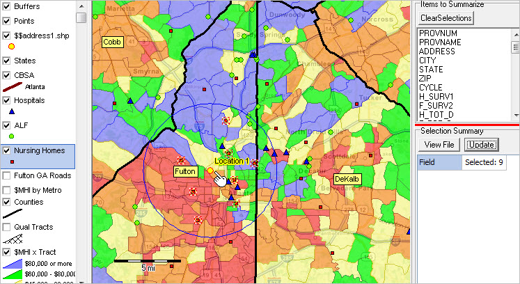
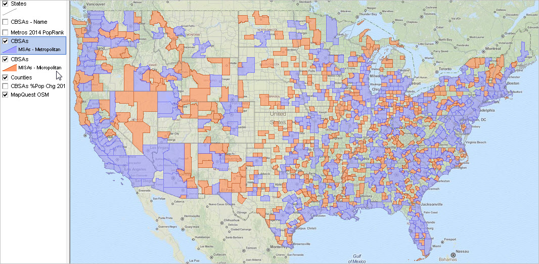
Median Household Income by ZIP Code Area; Los Angeles Area
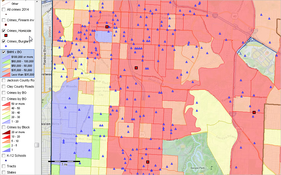
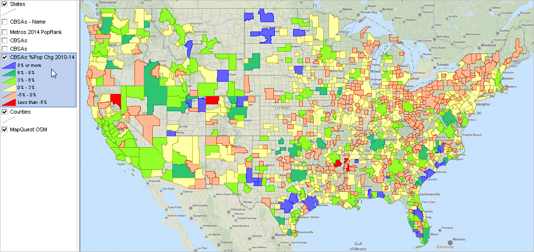
Illustrating integration of data in tables using GIS tools & geospatial analysis. Larger view illustrates ZIP code area labeling and use of mini-profile feature.

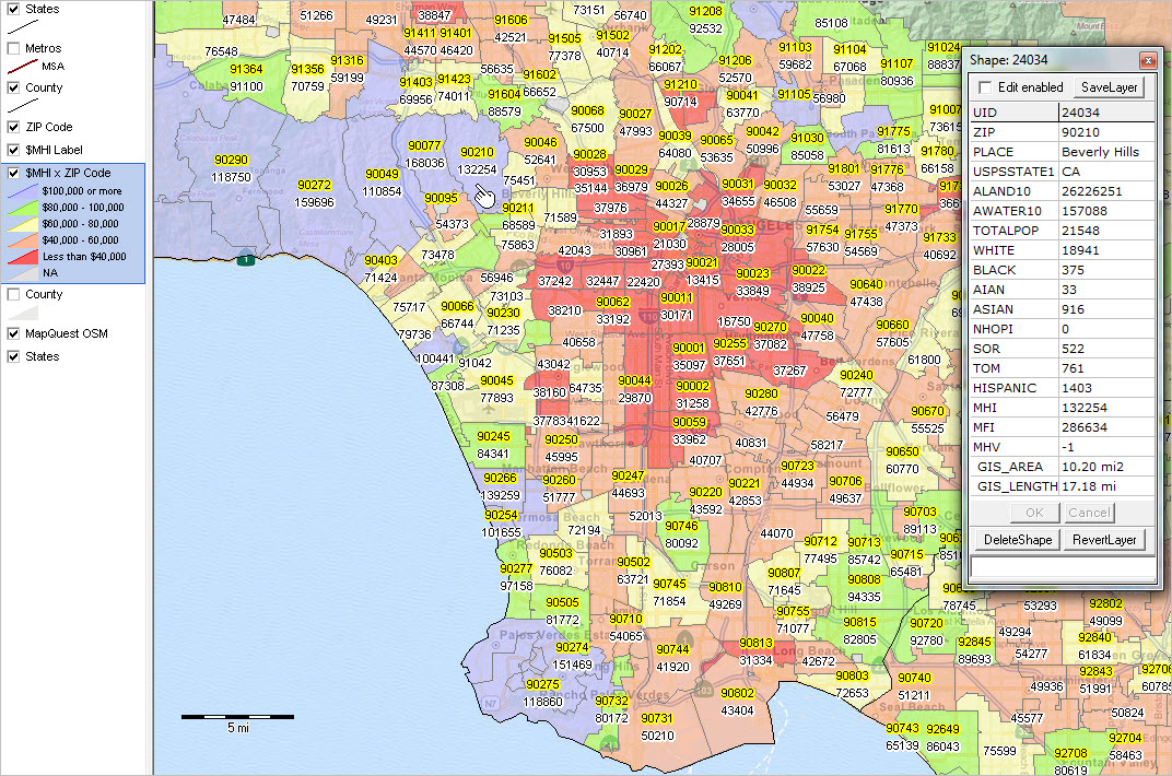
View developed with CV XE GIS software. Click graphic for larger view; expand browser window for best quality view.

Using the Tables
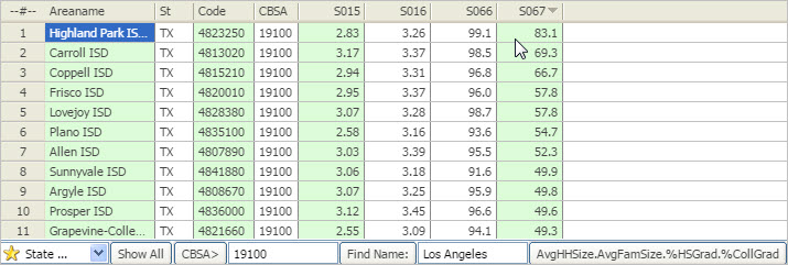
The interactive tables are organized by type of geography (e.g., ZIP codes) using a standardized structure. There are four types of subject matter for each type of geography (general demographic, social, economic and housing). There is a table/web page for each combination of geography by type of subject matter.

Within each table there is a row that corresponds to a geographic area. Also within each table, columns provide geographic names and codes and a set of subject matter data standardized across all geographies. Similarly designed table controls are provided at the below the table. Usage notes are located below the table.

Terms of Use
These data may be used for any purpose, except that the data may not be bulk downloaded nor used to create similar interactive tables. There is no warranty of any type with regard to any aspect of the data, table or Web pages. The user is solely responsible for any use. It is requested that any use of any table reference the source of the data (ACS 2014), ProximityOne and a link to the Web page.

Data Analytics
ProximityOne has developed these interactive tables as part of a broader set of data analytics tools and data resources. Data shown in the tables are available in dataset structure (CSV, DBF, Excel) on a fee basis. These data are also available as data integrated into shapefiles for GIS applications and geospatial analysis. Most geographic table sections also provide access to ready-to-use GIS projects/datasets. These data are integrated with yet other data to develop/update the Situation & Outlook database and information system, ProximityOne Data Service,Situation & Outlook Metro Reports and other products. These data are also used in the ProximityOne Certificate in Data Analytics and custom service/study applications.

Where’s Waldo?
Use this interactive tool to key in an address and determine geographic codes (geocodes) that might be useful. After keying in an address, click Find button. If the address is located, the page refreshes with a set of geocodes presented below the demographic-economic statistical summary.

ACS 2014 Tables & Datasets
ACS summary data are are tabulated and released annually as 1-year and 5-year estimates. These data are all estimates, subject to errors of estimation and other errors, based on household surveys.
ACS 1-year estimates (for areas 65,000 population or more) become available in September; e.g. the ACS 2014 1-year estimates became available in September 2015.
ACS 5-year estimates (all geographies) become available in December; e.g. the ACS 2014 5-year estimates became available in December 2015.
• See this section for more information about 1-year versus 5-year estimates and comparing ACS data over time.
Table listing provided below are separated into two groups as to data source: ACS 1-year and ACS 5-year. All tables are U.S. national scope.

ACS 2014 1-Year Tables


Data in these tables are centric to mid-2014.
U.S., State, CBSA/Metro
General Demographics .. Social .. Economic .. Housing

114th Congressional Districts
General Demographics .. Social .. Economic .. Housing

ACS 2014 5-Year Tables


Data in these tables are centric to mid-2012 (mid-point of survey period 2010-2014).
Census Tracts
General Demographics .. Social .. Economic .. Housing

ZIP Code Areas
General Demographics .. Social .. Economic .. Housing

School Districts
General Demographics .. Social .. Economic .. Housing

State Legislative Districts
General Demographics .. Social .. Economic .. Housing

Weekly Data Analytics Lab Sessions
Join me in a Data Analytics Lab session to discuss more details about using these data in context of data analytics with other geography and other subject matter.  Learn more about integrating these data with other geography, your data and use of data analytics that apply to your situation.

About the Author
— Warren Glimpse is former senior Census Bureau statistician responsible for innovative data access and use operations. He is also the former associate director of the U.S. Office of Federal Statistical Policy and Standards for data access and use. He has more than 20 years of experience in the private sector developing data resources and tools for integration and analysis of geographic, demographic, economic and business data. Contact Warren. Join Warren on LinkedIn.


Healthcare Data Analytics: Market Analysis

What factors best determine where a clinic, hospital or professional practice is located? For those that exist, how to best determine the scope and needs of the market served? Understanding healthcare market dynamics is one way these entities can improve their business and operation by using Health Data Analytics. Professionals skilled with Health Data Analytics can help their organization, or clients, better achieve their vision and improve performance.

This section is focused on analyzing healthcare markets and infrastructure using Geographic Information System (GIS) tools and related data resources. Participants in the Certificate in Data Analytics may optionally use the tools and resources described here. See overview of steps to install and use the GIS project and datasets illustrated in more detail in the related Web section.

Using GIS to Analyze Healthcare Market Characteristics
Illustrating GIS start-up view discussed in this section.

– View developed using CV XE GIS; click graphic for larger view.

Analyzing healthcare markets involves examining characteristics of healthcare facilities in context of competitive position and market potential. Geographic Information System (GIS) tools can be used to knit together geographic, demographic, economic and business data to perform these analyses. This document makes use of the Atlanta area to illustrate applications. In an actual study, the geographic focus could be a city, county, metro, state or some combination, anywhere in the U.S., or the U.S. overall.

Understanding Needs and Visions
A first step involves an assessment of your situation — your needs, visions and data that you have to work with. The results of this assessment and data that you provide help develop/frame a market study in context of GIS project(s).

Market Infrastructure Analytical Framework
The following graphic shows the start-up view of the Atlanta area Healthcare Data Analytics (HCDA) GIS project. This GIS project involves use of many layers and types of data as shown in the legend at left of map window. Selection of the type of geography, scope of geography and scope of subject matter are key elements in setting up the market infrastructure analytical framework. This is a proxy/example for the GIS project that would be developed to meet your needs/application focus.

The above view shows a thematic pattern of median household income by census tract (averaging 4,000 population). Pattern analysis helps you visualize demographic-economic characteristics by census tract — in this example you can easily see patterns of economic prosperity. This example uses median household income; we can draw upon hundreds of subject matter items and depict other types of patterns.

Examining the Healthcare Infrastructure
The graphic below shows selected types of healthcare facilities.
See legend to the left of map:
• Hospitals – blue triangle markers
• Assisted Living Facilities (ALF) – green circle markers
• Nursing Homes – red square markers

Site Analysis — Examining Characteristics of Healthcare Facilities
The yellow circle marker shows the hypothetical location of a prospective new facility. A 5-mile radius site study area — from the yellow marker — is used to select existing nursing homes; characteristics of the competition. Nursing homes show as cross-hatched; circular area is study zone.

Display of the 9 facilities selected above.

See the related Web section to view further details.

Weekly Data Analytics Lab Sessions
Join me in a Data Analytics Lab session to discuss more details about using these data in context of data analytics with other geography and other subject matter.  Learn more about integrating these data with other geography, your data and use of data analytics that apply to your situation.

About the Author
— Warren Glimpse is former senior Census Bureau statistician responsible for innovative data access and use operations. He is also the former associate director of the U.S. Office of Federal Statistical Policy and Standards for data access and use. He has more than 20 years of experience in the private sector developing data resources and tools for integration and analysis of geographic, demographic, economic and business data. Contact Warren. Join Warren on LinkedIn

Business Establishment Characteristics by ZIP Code

.. among all approximate 38,800 ZIP codes in the U.S. with business establishments, ZIP Code 10001 has more than 7,200 establishments. 9 of the top 10 ZIP codes, ranked on total number of business establishments, are located in Manhattan (New York County, NY); the 10th largest in Miami. Use the interactive table to examine ZIP code business establishment characteristics of interest.

Business establishments are the places of employment that drive and characterize the economy. ZIP codes are the smallest geography for which business establishment data are available. ZIP code business patterns data can help stakeholders identify areas of employment, business opportunities and more. While we can obtain employment data (by place of residence) for ZIP code areas from the American Community Survey 5-year estimates (ACS), the number of establishments and employment by place of work are only available from the ZIP business patterns data. See related Web section.

Use tools described in this section to analyze patterns and characteristics of ZIP code business patterns. The interactive table provides data on the characteristics of business establishments for 2012 and 2013 by ZIP code. Use the GIS tools and related GIS project to develop variations of the views shown below.

Establishments by ZIP Code in Los Angeles Area
– number of establishments; click graphic for larger view

– View developed using CV XE GIS and related GIS project.

Employment by ZIP Code in Los Angeles Area
– employment by place of work for all ZBP establishments

– View developed using CV XE GIS and related GIS project.

Using the Interactive Table
Use the interactive table in this related section to view, query, rank, compare business establishment characteristics among a set of ZIP codes or for a specific ZIP code.

The following graphic illustrates use of the interactive table; click graphic for larger view. This view shows ZIP codes in the 3-digit ZIP code group 950 in the Silicon Valley area ranked in descending order on number of 2013 establishments. Note that Cupertino 95014 (Apple Computer HQ location) has the 4th largest number of 2013 establishments among all 950 3-digit ZIP codes.

Try it yourself:
Click the ShowAll button below Table
– Key in a 3-digit ZIP to right of Find ZIP3> button.
– Click Find ZIP3> button.
– Click Estab 2013 button to sort the ZIP code.

Weekly Data Analytics Lab Sessions
Join me in a Data Analytics Lab session to discuss more details about using these data in context of data analytics with other geography and other subject matter.  Learn more about integrating these data with other geography, your data and use of data analytics that apply to your situation.

About the Author
— Warren Glimpse is former senior Census Bureau statistician responsible for innovative data access and use operations. He is also the former associate director of the U.S. Office of Federal Statistical Policy and Standards for data access and use. He has more than 20 years of experience in the private sector developing data resources and tools for integration and analysis of geographic, demographic, economic and business data. Contact Warren. Join Warren on LinkedIn.

Mapping Statistical Data with R

The world of visual and geospatial analysis continues to morph and evolve. So it is with R’s geospatial analysis evolvement. This section is focused on mapping statistical data with R and provides steps you can use to develop Web-based interactive maps in complete HTML structure ready to publish. No coding.

R (more about R) is an open source language and environment for statistical computing and graphics. R has many similarities with the Statistical Analysis System (SAS), but is free … and widely used by an ever increasing user base. R is used throughout the ProximityOne Certificate in Data Analytics course.

For now, in the areas of mapping and geospatial analysis, R is best used in a companion role with Geographic Information System (GIS) software like CV XE GIS. Maybe it will always be that way. R’s features to 1) perform wide-ranging statistical analysis operations and 2) to process and manage shapefiles and relate those and other data to many, many types of data structures are among R’s key strengths.

Mapping with R
The graphic shown below illustrates a Web-based interactive map that has been developed totally using R. The map shows patterns of Census 2010 population for Texas by county. Aside from satellite imagery, which can be added, this application provides the look and feel of a Google maps application. Yet the steps to develop the application are far different and much closer to more traditional GIS software and data structures .. and there are no proprietary constraints. Join us in weekly Data Analytics Lab sessions to learn about developing this type of mapping application and geospatial analysis. See more about this application in narrative below the map.

Create & Publish this Interactive Map or Variation
  … no coding .. see details in Web version of this post.

Click graphic for larger view and details — opens new window with interactive map.. View developed using R.

R generates the final product HTML as shown above. This application illustrates use of a Census countyTIGER/Line shapefile integrated with Census 2010 demographics. Participants in the ProximityOne Data Analytics course learn how to develop the types of maps using a range of TIGER/Line shapefiles from census block to metro to congressional district to state and integrating subject matter from the American Community Survey and many other Federal statistical programs. R and the ProximityOne CV XE GIS tools work together to expand the range of analytics to an unlimited set of possibilities.

Weekly Data Analytics Lab Sessions
Join me in a Data Analytics Lab session to discuss more details about using R for mapping, data management and statistical analysis in context of data analytics.  Learn more about integrating these data with other geography, your data and use of data analytics that apply to your situation.

About the Author
— Warren Glimpse is former senior Census Bureau statistician responsible for innovative data access and use operations. He is also the former associate director of the U.S. Office of Federal Statistical Policy and Standards for data access and use. He has more than 20 years of experience in the private sector developing data resources and tools for integration and analysis of geographic, demographic, economic and business data. Contact Warren. Join Warren on LinkedIn.

Crime Data Analytics

Goto ProximityOne .. examining crime incidence and socioeconomic patterns and analyzing small-area and location-based data.

.. what are the crime patterns in neighborhoods or areas of interest? It is challenging to get useful answers to this type of question. Crime incidence data by location/address are often difficult or not possible to obtain. Even where the location-based crime data are available, the data must be geocoded, e.g., assigned a census block code to each address. Separately demographic-economic must be organized to examine contextually with the crime data.

Integrating Crimes by Location & Patterns of Economic Prosperity
– View developed using CV XE GIS and related GIS project.

Crime Data Analytics. Use the Crime Incidence and Socioeconomic Patterns GIS project and associated datasets to explore relationships between crime and small area demographic-economic characteristics. Follow the steps described below to study patterns and relationships in Kansas City and/or use this framework to develop similar data analytics for other areas.

Framework for a case study. 409 of Missouri’s 4,506 block groups are within the jurisdiction of the Kansas City police department (KCPD) and had one or more crimes in 2014 (latest fully reported year). There were approximately 10,400 crimes recorded by the KCPD in 2014, in the city area spanning four counties. In this section tools and data are used to examine crime patterns in Kansas City, MO. Crime data are included as markers/locations in a GIS project. Crime data are also aggregated to the census block level and examined as summary data (aggregate crimes by census block). Crime data are related to American Community Survey (ACS) 2014 5-year demographic-economic data at the block group geographic level.

To perform these types of analyses, it is important to start with location-based crime data that have been attributed with type of offense (offense code). Ideally, each crime incidence data record includes minimally the offense code and address of the crime. Such location-based crime incidence data have been acquired from the KCPD. These data are used to develop a shapefile that can be included in a GIS project.

Patterns of Crime Incidence in Kansas City, MO
The following graphic shows patterns of crime incidence by census block for the “Plaza Area” within Kansas city. This view shows all types of crimes aggregated to the census block level. Crimes committed where a handgun was involved are shown as black/red circular markers. Click the graphic for a larger view that shows legend and more detail.
– View developed using CV XE GIS and related GIS project.

Related views (click link to view graphic in new window):
Use the GIS project to develop variations of these views. Optionally add your own data.
Lay of the land: Kansas City city (cross hatched) in context of metro
All crimes as markers in Kansas City in 2014

Patterns of Economic Prosperity & Crime Incidence
The following graphic shows patterns of economic prosperity (median household income $MHI) by block group for the same general area as above. This view illustrates how two types of crimes (burglary blue triangle markers and homicide (red/black square markers) can be examined in context. Click the graphic for a larger view that shows legend and more detail.

– View developed using CV XE GIS and related GIS project.

Related views (click link to view graphic in new window):
Use the GIS project to develop variations of these views.
View similar to above, without $MHI layer

Data used to analyze patterns of economic prosperity/$MHI are based on the American Community Survey (ACS) 2014 5-year estimates at the block group geographic level. The same scope of subject matter is available for higher level geography. The GIS project/datasets includes many types of demographic-economic subject matter that can be used to display/analyze different socioeconomic patterns.

Using Block Group Geography/Data
Census Block Groups sit in a “mid-range” geography between census blocks and census tracts. All cover the U.S. wall-to-wall and nest together, census blocks being the lowest common denominator for each. Block Groups (BGs) are the smallest geographic area for which annually updated ACS 5-year estimates data are tabulated.

Advantages of using BG geodemographics include the maximum degree of geographic drill-down (using ACS data) … enabling the most micro-perspective of demographics for a neighborhood or part of study area. A disadvantages of using BG estimates is that typically the smaller area estimates have a relatively higher error of estimate.

Crime Incidence and Socioeconomic Patterns GIS Project/Datasets
1. Install the ProximityOne CV XE GIS
… omit this step if CV XE GIS software already installed.
… run the CV XE GIS installer
… take all defaults during installation
2. Download the CISP GIS Project fileset
… requires ProximityOne User Group ID (join now)
… unzip CISP GIS project files to local folder c:\crime
3. Open the kcmo_crimes_2014.gis project
… after completing the above steps, click File>Open>Dialog
… open the file named C:\crime\kcmo_crimes_2014.gis
4. Done .. the start-up view shows the crime patterns.

Weekly Data Analytics Lab Sessions
Join me in a Data Analytics Lab session to discuss more details about accessing location-based data and block group demographics and integrating those data into analytical applications.  Learn more about integrating these data with other geography, your data and use of data analytics that apply to your situation.

About the Author
— Warren Glimpse is former senior Census Bureau statistician responsible for innovative data access and use operations. He is also the former associate director of the U.S. Office of Federal Statistical Policy and Standards for data access and use. He has more than 20 years of experience in the private sector developing data resources and tools for integration and analysis of geographic, demographic, economic and business data. Contact Warren. Join Warren on LinkedIn.

Linguistic Isolation Patterns by Block Group

Goto ProximityOne Linguistic isolation inhibits the ability of people and households to integrate into neighborhoods, cities and living areas. Opportunities for advancement and participation in society are improved where linguistic isolation is minimal. This section describes tools and data resources to examine patterns of linguistic isolation for block group level geography.

Size and distribution data on speakers of languages other than English and on their English speaking ability are important for many reasons. These data help us understand where populations with special needs exist and how they are changing. The data are used in a wide-ranging legislative, policy, and research applications. Many legal, financial and marketing decisions involving language-based issues make use of data on language use and English-speaking ability.

Data used to analyze patterns of “household linguistic isolation” are based on the American Community Survey (ACS) 2014 5-year estimates at the block groupgeographic level. The same scope of subject matter is available for higher level geography. The following graphic shows patterns of linguistic isolation in Los Angeles County. Block groups colored in red have more than 40-percent of households where no household member age 14 years and over speaks English “very well”. Click graphic for larger view showing more detail and legend.

Patterns of Linguistic Isolation; Los Angeles County, CA

– View developed using CV XE GIS and related GIS project.

The next view shows a zoom-in to the vicinity of the pointer shown in the above map. This view shows block groups labeled with total population. Click graphic for larger view showing more detail and legend.

– View developed using CV XE GIS and related GIS project.

Language Spoken by Households – Tabular View
The table presented below shows data from ACS Table B16002 Households by Linguistic Isolation for block group 1 in census tract 212304 (also referred to as 2123.04) in Los Angeles County (037) California (06); geoid=060372123041. This block group is shown toward the center of the above view with population 1,894. Data for this block group are shown in the rightmost column of the table below. 47.2 percent of households (803) are linguistically isolated (317+0+62).


— “Language Spoken” categories are based on four major language groups.

More About Linguistic Isolation
One definition of a “linguistically isolated household” is a household in which all adults have substantial limitation in communicating English. In the ACS data, a household is classified as “linguistically isolated” if 1) no household member age 14 years and over spoke only English, and 2) no household member age 14 years and over who spoke another language spoke English “very well”.

Like many demographic measures, linguistic isolation tends to be “masked” when analyzing data for larger geographic areas, even census tracts, are used. Block group geography provides an ability to locate linguistic isolation in sub-neighborhood areas.

Using Block Group Geography/Data
Census Block Groups sit in a “mid-range” geography between census blocks and census tracts. All cover the U.S. wall-to-wall and nest together, census blocks being the lowest common denominator for each. Block Groups (BGs) are the smallest geographic area for which annually updated ACS 5-year estimates data are tabulated.

Advantages of using BG geodemographics include the maximum degree of geographic drill-down (using ACS data) … enabling the most micro-perspective of demographics for a neighborhood or part of study area. A disadvantages of using BG estimates is that typically the smaller area estimates have a relatively higher error of estimate.

Summary of Steps to Access and Use these Data
The ACS 2014 5-year Table B16002 data can be accessed for Los Angeles County using the following API call (paste the following text into a browser and press Enter). See more about using Census API operations.

At the end of this string is the text “state:06+county:037”. Change the state and county to “state:36+county:061” to access the data for New York County, NY (Manhattan); and similarly for any any county.

The results of the API call are shown in this text file. These data are easily imported into an Excel file. The DBF version of the data were integrated into the Los Angeles County 2014 block group shapefile using the CV XE GIS software dBMerge feature. The Layer Editor was then used to develop the map legend/color intervals. Join me in aData Analytics Lab session to learn more about these steps/operations.

Weekly Data Analytics Lab Sessions
Join me in a Data Analytics Lab session to discuss more details about accessing block group demographics using API tools and integrating those data into analytical applications.  Learn more about integrating these data with other geography, your data and use of data analytics that apply to your situation.

About the Author
— Warren Glimpse is former senior Census Bureau statistician responsible for innovative data access and use operations. He is also the former associate director of the U.S. Office of Federal Statistical Policy and Standards for data access and use. He has more than 20 years of experience in the private sector developing data resources and tools for integration and analysis of geographic, demographic, economic and business data. Contact Warren. Join Warren on LinkedIn.

Characteristics of Largest 50 U.S. Metropolitan Areas

.. the total population of the largest 50 U.S. metropolitan areas as of 2014 (latest official estimates) was 174,886,265. These 50 metros account for 58.3% of the population in all 917 metropolitan areas and 54.8% of the total U.S. population. By either measure, more than half of the U.S. population resides in these 50 metros. Use tools and data resources described in this section to view and analyze these metros.

View the list of these metros by population rank in the scroll section provided below. Click on a metro link to view the Metro Situation & Outlook Report for that metro. The report provides extensive details on the geographic-demographic-economic attributes of the metro.

Use the largest_50_metros GIS project described in this section to map and explore characteristics of these metros. Create zoom-in views of metros/regions of interest. Label geography. Add other geography and data. The largest_50_metros GIS project/datasets includes all U.S. metros and has been used to develop the views in this section:
View 1 .. 50 Largest Metros Ranked on 2014 Total Population
View 2 .. All Metropolitan & Micropolitan Statistical Areas
View 3 .. Patterns of Percent Population Change 2010-2014
See details about using the largest_50_metros GIS project below in this section.

50 Largest Metros Ranked on 2014 Total Population
The following graphic shows the 50 largest metros by 2014 population rank (blue metros are the largest 10). Click graphic for larger view, more detail and legend color/data intervals (expand browser window for best view).

– View developed using CV XE GIS and related GIS project.

All Metropolitan & Micropolitan Statistical Areas
The following graphic shows all metropolitan statistical areas (blue) and micropolitan statistical areas (orange). Click graphic for larger view, more detail and legend color/data intervals (expand browser window for best view).

– View developed using CV XE GIS and related GIS project.

Patterns of Percent Population Change 2010-2014
The following graphic shows the percent change in total population from 2010 to 2014 for all metros. Click graphic for larger view, more detail and legend color/data intervals (expand browser window for best view). This map illustrates the relative ease to gain insights into patterns of population change using geospatial data analytics tools.

– View developed using CV XE GIS and related GIS project.

50 Largest Metros Ranked on 2014 Total Population — scroll section
Click link to view Metro Situation & Outlook Report

Largest 50 Metros GIS Project/Datasets
1. Install the ProximityOne CV XE GIS
… omit this step if CV XE GIS software already installed.
… run the CV XE GIS installer
… take all defaults during installation
2. Download the Largest 50 Metros GIS project fileset
… requires ProximityOne User Group ID (join now)
… unzip Largest 50 Metros GIS project files to local folder c:\largest_metros
3. Open the large_50_metros1.gis project
… after completing the above steps, click File>Open>Dialog
… open the file named c:\largest_metros\largest_50_metros1.gis
4. Done .. the start-up view is similar to the graphic shown at the top of this section.

Weekly Data Analytics Lab Sessions
Join me in a Data Analytics Lab session to discuss more details about using metropolitan area geography and using demographic-economic data.  Learn more about integrating these data with other geography, your data and use of data analytics that apply to your situation.

About the Author
— Warren Glimpse is former senior Census Bureau statistician responsible for innovative data access and use operations. He is also the former associate director of the U.S. Office of Federal Statistical Policy and Standards for data access and use. He has more than 20 years of experience in the private sector developing data resources and tools for integration and analysis of geographic, demographic, economic and business data. Contact Warren. Join Warren on LinkedIn.

Examining School District Demographic-Economic Patterns

.. the importance of understanding the demographic-economic make-up and trends for school districts can hardly be overstated. Community and educational challenges and opportunities are shaped by demographic-economic dynamics. Only by knowing “where we are” can we develop the most effective plans for improvement.

This section reviews tools, resources and methods that you can use to access, integrate and analyze demographic-economic data. The U.S. national scope ACS 2014 (released December 2015) School District Demographic-Economic Dataset contains approximately 600 subject matter items tabulated for each school district organized into four subject matter groups:
  • General Demographics
  • Social Characteristics
  • Economic Characteristics
  • Housing Characteristics
See similar interactive tables for: Census Tracts | ZIP Codes | State, Metro & County.

These data provide information and insights not available by examining data of students and schools alone — or any other data. See more about the importance of these data. Data are based on the American Community Survey (ACS)2014 5-year estimates for school districts defined as of the 2013-14 school year.

Patterns of Educational Attainment by School District
This view shows percent population 25 years and over with bachelor’s degree by school district; Texas and south central U.S. The thematic pattern shows item S067 shown in the interactive table. Click graphic for larger view, more detail and legend color/data intervals. This map illustrates the relative ease to gain insights into school district patterns using geospatial data analytics tools.

– View developed using CV XE GIS and related GIS project.

Using GIS software and project datasets, you can create zoom-in views, label geographic objects, add your own data, select different subject matter, change intervals/colors and perform a wide range of geospatial analyses.

Get a Custom Map for Your Area of Interest
Use this form to request a no fee map graphic similar to the one shown above for a state of interest. Enter the request with state name in the text section; e.g., “Requesting school district pattern map for Illinois.”

Using the Interactive Table
Use the interactive table in this related section to view, query, rank, compare social characteristics of the population among a set of school district — or view characteristics of a selected district.

The following graphic illustrates use of the interactive table; click graphic for larger view. This view shows school districts in the Dallas, TX metro ranked in descending order on item S067 (Percent bachelor’s degree or higher). Highland Park ISD has the highest value of 83.1%.

Try it for a metro of interest — get metro 5-character code here. Go to the Social Characteristics table, then:
  • Click ShowAll button below table.
  • Click AvgHHSize… button below table.
  • Paste the 5-character metro code in the edit box to right of CBSA> button.
    … overwriting the value 19100.
  • Click the CBSA> button.
  • Click the S067 column header; click again to sort in other direction.
    … Done!

Weekly Data Analytics Lab Sessions
Join me in a Data Analytics Lab session to discuss more details about using school & school district geography and using demographic-economic data.  Learn more about integrating these data with other geography, your data and use of data analytics that apply to your situation.

About the Author
— Warren Glimpse is former senior Census Bureau statistician responsible for innovative data access and use operations. He is also the former associate director of the U.S. Office of Federal Statistical Policy and Standards for data access and use. He has more than 20 years of experience in the private sector developing data resources and tools for integration and analysis of geographic, demographic, economic and business data. Contact Warren. Join Warren on LinkedIn.