.. examining the how and why of U.S. population change by county from 2010 to 2015. This section provides an overview of this topic and provides a summary of tools, interactive table and GIS project, to analyze population change by county using latest Census Bureau estimates data through 2015. These data are used by ProximityOne to develop/update annual county demographic-economic projections. See related Web section for more detail.
Patterns of Population Change by County, 2010-2015
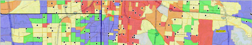
The following graphic shows how counties have gained population (blue and green) and lost population (orange and red) during the period 2010 to 2015. Click graphic for larger view; expand browser window for best quality view.

.. view developed with ProximityOne CV XE GIS and related GIS project.
.. see related drill-down views of Texas by county
Examining Population Components of Change
Population change can be examined in terms of components of change. There are three components of change: births, deaths, and migration. The change in the population from births and deaths is often combined and referred to as natural increase or natural change. Populations grow or shrink depending on if they gain people faster than they lose them. Examining a county’s unique combination of natural change and migration provides insights into why its population is changing and how quickly the change is occurring.
See more about these topics below:
• Natural Increase/Change; birth & deaths
• Migration; net international, net domestic, net migration
Interactive Analysis
Use the interactive table to view population trends and components of change for selected counties. The following graphic illustrates how the table can be used.
• Click the ShowAll button (below table)
• Click the Pop Min & Max button .. refreshes table
to show only counties with 2015 population 250,000-300,000
• Click ChgCols button to show all 2010-15 change columns
• Click PopChg 2010-15 header column to sort.
Resulting view:
Among these counties, Horry County, SC has the largest 2010-15 population change. The peer group counties are shown in rank order.

– Click graphic for larger view.
– experiment with settings of interest.
Join me in a Data Analytics Lab session to discuss more details about accessing and using wide-ranging demographic-economic data and data analytics. Learn more about using these data for areas and applications of interest.
About the Author
— Warren Glimpse is former senior Census Bureau statistician responsible for innovative data access and use operations. He is also the former associate director of the U.S. Office of Federal Statistical Policy and Standards for data access and use. He has more than 20 years of experience in the private sector developing data resources and tools for integration and analysis of geographic, demographic, economic and business data. Contact Warren. Join Warren on LinkedIn.
