Tag Archives: Chicago

Tools to Analyze County Demographic-Economic Characteristics

.. demographic-economic characteristics of counties are essential for business development, market analysis, planning, economic development, program management and general awareness of patterns and trends. This section provides access to data and tools to examine these data for all counties in the U.S. This annual update includes geographic area characteristics based on ACS 2015 data.  The tools/data are organized into four related sections summarized below.

1. General Demographics
View interactive table at http://proximityone.com/us155dp1.htm
Patterns of School Age Population by County
Use GIS tools to visually examine county general demographics as illustrated below. The following view shows patterns of percent population ages 5 to 17 years of age by county — item D001-D004-D018 in the interactive table. Create your own views.

… view developed using the CV XE GIS software.

2. Social Characteristics
View interactive table at http://proximityone.com/us155dp2.htm 
Patterns of Educational Attainment by County
– percent college graduate
Use GIS tools to visually examine county social characteristics as illustrated below. The following view shows patterns of percent college graduate by county — item S067 in the interactive table. Create your own views.

… view developed using the CV XE GIS software.

3. Economic Characteristics
View interactive table at http://proximityone.com/us155dp3.htm 
Patterns of Median Household Income by County
Use GIS tools to visually examine county economic characteristics as illustrated below. The following view shows patterns median household income by county — item E062 in the interactive table. Create your own views.

… view developed using the CV XE GIS software.

4. Housing Characteristics
View interactive table at http://proximityone.com/us155dp4.htm 
Patterns of Median Housing Value by County
Use GIS tools to visually examine county housing characteristics as illustrated below. The following view shows patterns median housing value by county — item E062 in the interactive table. Create your own views.

… view developed using the CV XE GIS software.

Join me in a Data Analytics Lab session to discuss more details about accessing and using wide-ranging demographic-economic data and data analytics. Learn more about using these data for areas and applications of interest.

About the Author
— Warren Glimpse is former senior Census Bureau statistician responsible for innovative data access and use operations. He is also the former associate director of the U.S. Office of Federal Statistical Policy and Standards for data access and use. He has more than 20 years of experience in the private sector developing data resources and tools for integration and analysis of geographic, demographic, economic and business data. Contact Warren. Join Warren on LinkedIn.

Regional Economic Information System: Annual Updates

.. which counties are experiencing the fastest economic growth? by what economic component? what does this look like on a per capita level?

.. access & analyze economic characteristics and patterns by county and state .. annual time series 1969 through 2015 with projections.  Personal income is the income available to persons for consumption expenditures, taxes, interest payments, transfer payments to governments and the rest of the world, or for saving. Use the interactive table to examine characteristics of counties and regions of interest. The table provides access to 31 personal income related summary measures. These data are a selection of a broader set of annual time series data from the Regional Economic Information System (REIS). REIS is a part of the ProximityOne State & Regional Income & Product Accounts (SRIPA) and Situation & Outlook (S&O) featuring current (2016) estimates and demographic-economic projections. Go to table.

Visual Analysis of Per Capita Personal Income Patterns
The following map shows the Houston metro (view profile) with bold brown boundary. Counties are labeled with county name and 2014 per capita personal income.

Click graphic for larger view. View developed with CV XE GIS software.

Per Capita Personal Income Change 2008-2014 by County
.. relative to U.S 2008-2014 change

Click graphic for larger view. View developed with CV XE GIS software.

Interactive Analysis – County or State Profiles
The following graphic illustrate use of the interactive table to view an economic profile for Harris County, TX. Use the table to examine characteristics of any county or state. Click graphic for larger view.

Interactive Analysis
– comparing per capita personal income across counties
The next graphics illustrates use of the interactive table to rank/compare per capita personal income across counties. Rank/compare states. Choose any of the economic profile items. Click graphic for larger view.

Join me in a Data Analytics Lab session to discuss more details about accessing and using wide-ranging demographic-economic data and data analytics. Learn more about using these data for areas and applications of interest.

About the Author
— Warren Glimpse is former senior Census Bureau statistician responsible for innovative data access and use operations. He is also the former associate director of the U.S. Office of Federal Statistical Policy and Standards for data access and use. He has more than 20 years of experience in the private sector developing data resources and tools for integration and analysis of geographic, demographic, economic and business data. Contact Warren. Join Warren on LinkedIn.

Congressional District 2015 Demographic-Economic Characteristics

.. congressional districts vary widely in demographic-economic characteristics.  We have new data for 2015 providing insights to characteristics of the 114th Congressional Districts.  This section summarize a few of these characteristics and provides access to a wide range of data that you can use to view, sort, rank, and compare congressional districts using interactive tables.

Patterns of 2015 Educational Attainment
The following graphic shows patterns of educational attainment (percent college graduate) by congressional district in the Los Angeles area. White label shows the congressional district code; yellow label shows percent college graduate. Legend shows color patterns associated with percent college graduate intervals.

– View developed using CV XE GIS software and associated GIS project.

How Congressional Districts Compare
Reference items refer to items/columns shown in tables described below.

.. general demographics: congressional district UT03 has the smallest median age (27.5 years — item D017) and FL11 has the highest median age (53.5 years).

.. social characteristics: congressional district KY05 has the fewest number of people who speak English less than “very well” (2,676 — item S113) and FL27 has the largest number (281,053).

.. economic characteristics: congressional district ND00 has the lowest unemployment rate (2.6% — item E009) and MI13 has the highest unemployment rate (14.6%).

.. housing characteristics: congressional district MI13 has the lowest median housing value ($63,100 — item H089) and CA18 has the highest median housing value ($1,139,900).

Access the Detailed Interactive Tables
Click a link to view more thematic pattern maps and use the interactive tables.
.. General Demographics
.. Social Characteristics
.. Economic Characteristics
.. Housing Characteristics

Join me in a Data Analytics Lab session to discuss more details about accessing and using wide-ranging demographic-economic data and data analytics. Learn more about using these data for areas and applications of interest.

About the Author
— Warren Glimpse is former senior Census Bureau statistician responsible for innovative data access and use operations. He is also the former associate director of the U.S. Office of Federal Statistical Policy and Standards for data access and use. He has more than 20 years of experience in the private sector developing data resources and tools for integration and analysis of geographic, demographic, economic and business data. Contact Warren. Join Warren on LinkedIn.

Citizen Voting Age Population by Block Group

.. tools and resources to access and analyze citizen voting age population by block group … ideally analysts and stakeholders will examine patterns and characteristics of the citizen voting age population (CVAP) by block group. This is partly because of the extreme variability of CVAP within higher level geography — even at the census tract level. This becomes even more important in more densely populated areas. See about ACS 2014 CVAP block group demographics in this related Web section.

Patterns of ACS 2014 CVAP Population by Block Group
— Houston Area
See legend in lower right of graphic for interval/color correspondence. Click graphic for larger view; expand browser window for best quality view.

.. view developed with ProximityOne CV XE GIS and related GIS project.

The size, characteristics and distribution of the citizen voting age population by block group is very important.
• Block groups are the most granular geography at which we can study these demographics.
• The size of the citizen voting age population ultimately determines election outcomes.

This section provides thematic pattern map views and analyses of selected metros. These applications can be replicated for any area. They serve as an “analytical basis” that can be augmented with other methods and data (e.g., voter registration, voter propensity, voter turnout, and other election factors) to gain insights into election outcomes under alternative scenarios. Equally important, this information can be used to better equip voters with the potential impact of improved voting activity for their own neighborhood and larger areas (e.g., even congressional districts).

Using these GIS Resources; Obtaining Custom Maps & Analyses
Contact us (or call 888.364.7656) for maps and analyses for areas of interest or to use the integrated, ready-to-use, national scope GIS software, GIS project and datasets. Add your own data; create custom views.

CVAP Block Group Thematic Pattern Map shown below for Selected Areas
• Atlanta
• Chicago
• Los Angeles
• Kansas City
• Washington, DC

Patterns of ACS 2014 CVAP Population by Block Group
— Atlanta Area
See legend in lower right of graphic for interval/color correspondence. Click graphic for larger view; expand browser window for best quality view.

.. view developed with ProximityOne CV XE GIS and related GIS project.

Patterns of ACS 2014 CVAP Population by Block Group
— Chicago Area
See legend in upper right of graphic for interval/color correspondence. Click graphic for larger view; expand browser window for best quality view.

.. view developed with ProximityOne CV XE GIS and related GIS project.

Patterns of ACS 2014 CVAP Population by Block Group
— Los Angeles Area
See legend in upper right of graphic for interval/color correspondence. Click graphic for larger view; expand browser window for best quality view.

.. view developed with ProximityOne CV XE GIS and related GIS project.

Patterns of ACS 2014 CVAP Population by Block Group
— Kansas City Area
See legend in lower right of graphic for interval/color correspondence. Click graphic for larger view; expand browser window for best quality view.

.. view developed with ProximityOne CV XE GIS and related GIS project.

Patterns of ACS 2014 CVAP Population by Block Group
— Washington, DC Area
See legend in lower right of graphic for interval/color correspondence. Click graphic for larger view; expand browser window for best quality view.

.. view developed with ProximityOne CV XE GIS and related GIS project.

ACS 2014 CVAP Block Group Demographics
For the 217,479 block groups covering the U.S. wall-to-wall, the median citizen population value is 1,165 (291.8 million population) and the median citizen voting age population is 885 (220 million population). The median total population is 1,252 (314 million population). These data are based on the 2014 American Community Survey ACS 2014 CVAP special tabulation completed in early 2016. WHile the focus here is on the total population, the same scope of data is integrated into the shapefiles used here for 13 race/origin population groups. The 13 race/origin groups include:
  • American Indian or Alaska Native Alone
• Asian Alone
• Black Alone
• Native Hawaiian or Other Pacific Islander Alone
• White Alone
• American Indian or Alaska Native and White
• Asian and White
• Black and White
• American Indian or Alaska Native and Black
• Remainder of Two or More Races
• not Hispanic
• Hispanic (of any race)

Related CVAP Sections
Census Tracts; ACS 2009-13 special tabulation
Census Tracts; ACS 2009-13 special tabulation – Hispanic focus
Tracts & Congressional Districts; ACS 2009-13 special tabulation

See this blog post in this full, more detailed Web section.

Join me in a Data Analytics Lab session to discuss more details about accessing and using wide-ranging demographic-economic data and data analytics. Learn more about using these data for areas and applications of interest.

About the Author
— Warren Glimpse is former senior Census Bureau statistician responsible for innovative data access and use operations. He is also the former associate director of the U.S. Office of Federal Statistical Policy and Standards for data access and use. He has more than 20 years of experience in the private sector developing data resources and tools for integration and analysis of geographic, demographic, economic and business data. Contact Warren. Join Warren on LinkedIn.

Census Tract Demographics by ZIP Code

.. analyzing census tract demographics by ZIP code … a wide range of demographic-economic data for census tracts and ZIP code areas are now developed annually as a part of the American Community Survey (ACS). Census tract and ZIP code area demographics are popular for examining characteristics of sub-county areas. This section reviews use of resources to analyze census tract demographics in context of ZIP code areas. For many analytical and decision-making applications these methods might be preferred to analyzing ZIP code area demographics alone. See related Web section for more detail on topics covered here.

Census tracts provide a more granular geography than ZIP code areas, have well known boundaries, have little change over the decade and provide a more uniform population size, averaging 4,000 population. Census tracts are more suitable for demographic analysis as compared to ZIP code areas. Yet, users of these data seek to understand patterns by ZIP code areas. This section reviews how that can be done. The applications make use of census tract demographics based on the ACS 2013 5-year estimates.

Geographic Information System (GIS) resources are used here. The census tract to ZIP code area relationship can also be be shown in an equivalence table. See the census tract to ZIP Code area interactive equivalence table. While the equivalence table is very useful, use of GIS tools offer a much more powerful method of understanding demographic-economic relationships. These applications are focused on the Chicago area, but the same set of resources can be used anywhere in the U.S.

Patterns of Economic Prosperity by Census Tract
The graphic presented below shows patterns of the economic prosperity (median household income/MHI) by census tract in the Chicago area. MHI intervals and corresponding colors are shown in the legend at the left of the map. It is easy to see where concentrations of high and low MHI exist by census tract.

Click graphic for larger view; view developed with CV XE GIS.
Map view developed using TractZIP GIS Project.

Relating ZIP Codes to Census Tracts
The graphic presented below shows a view similar to the map shown above. In this view ZIP code areas have been added. ZIP code areas are shown by black boundaries and labeled with the ZIP Code. As above, it is easy to see where concentrations of high and low MHI exist by census tract are located and now — how the distribution relates to ZIP code areas. Click graphic for larger view that shows ZIP codes as labels.

Click graphic for larger view; view developed with CV XE GIS.
Map view developed using TractZIP GIS Project.

Neighborhood Drill-Down
The graphic presented below shows a zoom-in view in the vicinity of the pointer in the map shown above. ZIP code areas have a bolder black boundary and ZIP codes are shown as labels. K-12 school locations have been added, illustrating how yet other area characteristics can be integrated. The tracts thematic pattern layer is shown with see-through transparency enabling a background view of highways and related earth surface geography.

Relating Tract Codes/Areas to ZIP Codes/ZIP Code Areas
The graphic presented below shows a zoom-in view of ZIP code view similar to the map shown above. In this view the focus is placed on ZIP code area 60622 — it could be any ZIP code. This view shows the ZIP code with white label and census tracts with yellow labels. It is easy to see which census tracts intersect with ZIP code 60622, which tracts are wholly versus partly included in the ZIP code area and the MHI for each tract intersecting ZIP code 60622.

Analyzing Areas of Interest — Using the GIS Resources
Install the GIS software and project used to develop map views presented above for areas of interest. Add other types of geography such as geocoded address data. Select alternative demographic-economic measures. Create custom map graphics. See the main Web section for details.

About the Author
— Warren Glimpse is former senior Census Bureau statistician responsible for innovative data access and use operations. He is also the former associate director of the U.S. Office of Federal Statistical Policy and Standards for data access and use. He has more than 20 years of experience in the private sector developing data resources and tools for integration and analysis of geographic, demographic, economic and business data.

Metros 2014: Chicago-Naperville-Elgin, IL-IN-WI

… examining Chicago-Naperville-Elgin, IL-IN-WI metropolitan area dynamics:
• How will the market for single family homes change over the next 5 years? 20 years?
• How does economic prosperity in the Chicago metro compare to others?
• What are the patterns in metro rental income and homeownership/vacancy rates?
• How do patterns manifest themselves in different ways by county/neighborhood?
• How are demographic-economic characteristics trending?

We examine these types of topics in this section. Stakeholders can replicate applications reviewed here for this and other metros using ProximityOne resources.

.. this section now continuously updated … see Chicago Metro Situation & Outlook; see related Illinois Demographic-Economic Characteristics.

Metropolitan areas include approximately 94 percent of the U.S. population — 85 percent in metropolitan statistical areas (MSAs) and 9 percent in micropolitan statistical areas (MISAs). Of 3,143 counties in the United States, 1,167 are in the 381 MSAs in the U.S. and 641 counties are in the 536 MISAs (1,335 counties are in non-metro areas).

See this section as the corresponding more detailed ProximityOne Web page.

Focus on Chicago-Naperville-Elgin, IL-IN-WI MSA
This section is focused on the Chicago-Naperville-Elgin, IL-IN-WI MSA; Core-Based Statistical Areas (CBSA) 16980. It is not intended to be a study of the metro but rather illustrate how relevant decision-making information (DMI) resources can be brought together to examine patterns and change and develop insights. The data, tools and methods can be applied to any metro.

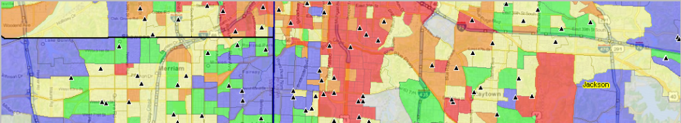
The Chicago-Naperville-Elgin, IL-IN-WI MSA is shown in the graphic below. The 14-county metropolitan statistical area is shown with bold brown boundary; counties appear with black boundaries and county name labels. The thematic pattern shows a measure of economic prosperity (median household income: MHI) by census tract.


Click graphic for larger view. Map developed using CV XE GIS. Develop variations of this map view using the Mapping Illinois Neighborhood Patterns GIS resources.

Metro-County Geographic-Demographic Structure
The Census 2010 population of the metro was 9,461,105 (3rd largest in the U.S.) compared 9,537,289 (3rd largest in the U.S.) based on the 2013 estimate. See interactive table to examine other metros in a similar manner.

Click here to view a metro by county profile for the Chicago metro. Click the county component links below to view annual county population estimates and components of change.
• Cook, IL (17031)
• DeKalb, IL (17037)
• DuPage, IL (17043)
• Grundy, IL (17063)
• Kane, IL (17089)
• Kendall, IL (17093)
• Lake, IL (17097)
• McHenry, IL (17111)
• Will, IL (17197)
• Jasper, IN (18073)
• Lake, IN (18089)
• Newton, IN (18111)
• Porter, IN (18127)
• Kenosha, WI (55059)

Use this interactive table to view demographic attributes of these counties and rank/compare with other counties.

Population Pyramids & Age-Cohort Patterns
The graphic below shows the Census 2010 Cook County, IL population pyramid. Click graphic to view as HTML section with related Census 2010 age-gender population distribution.

Cook County, IL; Census 2010; Total population

Use ChartGraphics examine population by age-gender-race/origin for any county.

County Population Projections to 2020 and Beyond
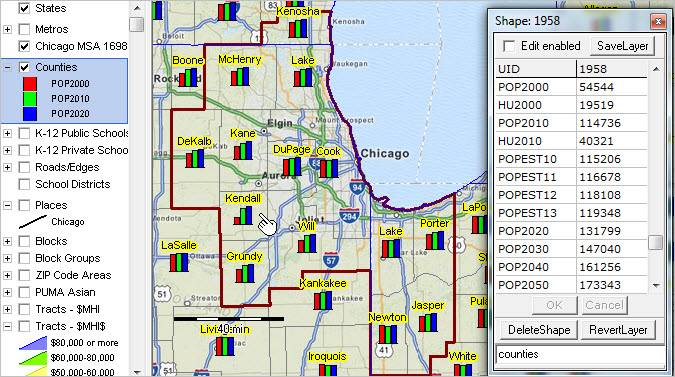
The following view shows counties in the metro area. Counties are labeled with name; bar charts show Census 2000, Census 2010 and the ProximityOne projection to 2020. The CV XE GIS identify tool (see pointer) is used to show a mini-profile for one county. Kendall County, IL is projected to change from 115,206 as of Census 2000 to 173,343 in 2050. See more about how USA TODAY used ProximityOne projections to analyze diversity, 1960 to 2060. More about diversity below.

Click graphic for larger view. Map developed using CV XE GIS.

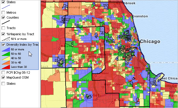
Diversity by Neighborhood in the Chicago Region
Diversity Patterns Neighborhood/Census Tract
Census tracts are colored based on value of the diversity index. See color patterns assigned based on diversity index values as shown in legend at left of the map. Blue tracts are most diverse; red tracts are least diverse. Tracts shown with black cross-hatched pattern are tracts with 50-percent or more Hispanic population. See more aboutneighhborhood diversity in the Chicago area.

Click graphic for larger view. Map developed using CV XE GIS.

Metro Demographic-Economic Characteristics
In 2012, the metro median household income was $59,261, percent high school graduates 86.8%, percent college graduates 34.8% and 14.5% in poverty. Use the following U.S.-state-metro interactive table to view/compare/rank compare this metro with other areas:
• General Demographics — http://proximityone.com/usstcbsa12dp1.htm
• Social Characteristics — http://proximityone.com/usstcbsa12dp2.htm
• Economic Characteristics — http://proximityone.com/usstcbsa12dp3.htm
• Housing Characteristics — http://proximityone.com/usstcbsa12dp4.htm

Metro Cities & Places
Click link to view profile for the metro principal cities:
Arlington Heights
Chicago
Des Plaines
Elgin
Evanston
Hoffman Estates
Naperville
Schaumburg
Skokie
Gary

View similar profile for any Illinois city — Illinois Community Profiles

Drill-down Analysis
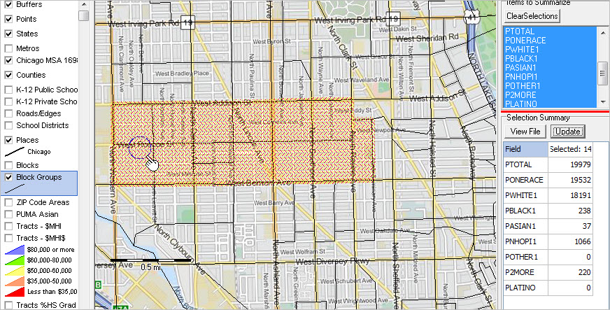
The following view illustrates how a set of block groups in Chicago can be visually selected and analyzed using site analysis tools. The cross-hatched areas are 14 block groups in a study area that were visually selected using the mouse. A mini-profile in the lower right grid shows the 14 area aggregate for selected race origin items. The total population for these 14 block groups is 19,979. Perform this type of operation for any set of block groups for wide-ranging demographic-economic measures.

Click graphic for larger view. Developed using CV XE GIS.

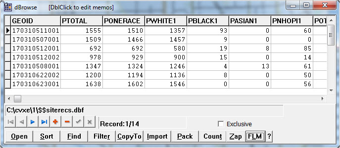
Click the View File button, the selected 14 block group records are shown in the grid below. Optionally save and output these block group records for further analysis.

Click graphic for larger view. Developed using CV XE GIS.

About Metropolitan Areas
By definition, metropolitan areas are comprised of one or more contiguous counties. Metropolitan areas are not singlecities and typically include many cities. Metropolitan areas are comprised of urban and rural areas and often have large expanses of rural territory. A business and demographic-economic synergy exists within each metro; metros often interact with adjacent metros. The demographic-economic make-up of metros vary widely and change often. See more about metros.

Support Using these Resources
Learn more about demographic economic data and related analytical tools. Join us in a Decision-Making Information Web session. There is no fee for these one-hour Web sessions. Each informal session is focused on a specific topic. The open structure also provides for Q&A and discussion of application issues of interest to participants.