Tag Archives: population change

State and Regional Decision-Making Information

Organized on a state-by-state basis, use tools and geographic, demographic and economic data resources in these sections to facilitate planning and analysis. Updated frequently, these sections provide a unique means to access to multi-sourced data to develop insights into patterns, characteristics and trends on wide-ranging issues. Bookmark the related main Web page; keep up-to-date.

Using these Resources
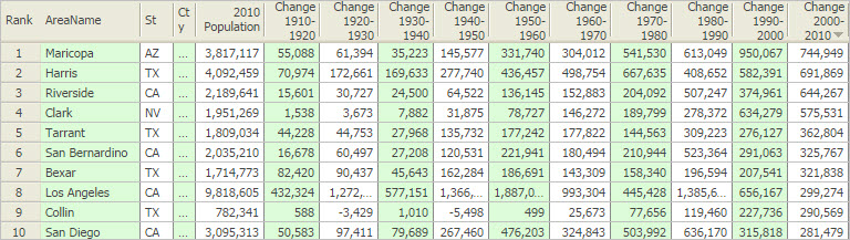
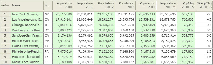
Knowing “where we are” and “how things have changed” are key factors in knowing about the where, when and how of future change — and how that change might impact you. There are many sources of this knowledge. Often the required data do not knit together in an ideal manner. Key data are available for different types of geography, become available at different points in time and are often not the perfect subject matter. These sections provide access to relevant data and a means to consume the data more effectively than might otherwise be possible. Use these data, tools and resources in combination with other data to perform wide-ranging data analytics. See examples.

Select a State/Area

Alabama
Alaska
Arizona
Arkansas
California
Colorado
Connecticut
Delaware
D.C.
Florida
Georgia
Hawaii
Idaho
Illinois
Indiana
Iowa
Kansas
Kentucky
Louisiana
Maine
Maryland
Massachusetts
Michigan
Minnesota
Mississippi
Missouri
Montana
Nebraska
Nevada
New Hampshire
New Jersey
New Mexico
New York
North Carolina
North Dakota
Ohio
Oklahoma
Oregon
Pennsylvania
Rhode Island
South Carolina
South Dakota
Tennessee
Texas
Utah
Vermont
Virginia
Washington
West Virginia
Wisconsin
Wyoming

Topics for each State — with drill-down to census block
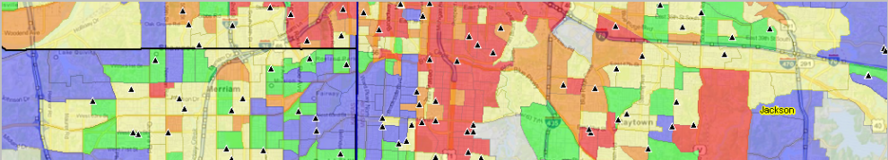
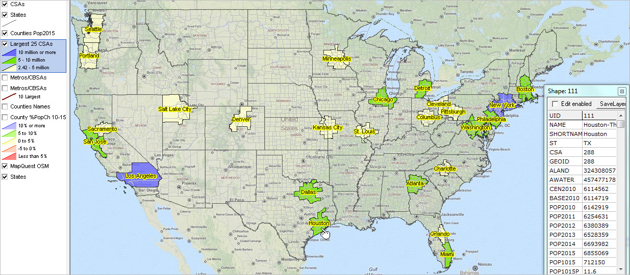
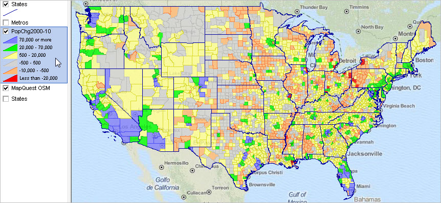
Visual pattern analysis tools … using GIS resources
Digital Map Database
Situation & Outlook
Metropolitan Areas
Congressional Districts
Counties
Cities/Places
Census Tracts
ZIP Code Areas
K-12 Education, Schools & School Districts
Block Groups
Census Blocks

Join me in a Data Analytics Lab session to discuss more details about accessing and using wide-ranging demographic-economic data and data analytics. Learn more about using these data for areas and applications of interest.

About the Author
— Warren Glimpse is former senior Census Bureau statistician responsible for innovative data access and use operations. He is also the former associate director of the U.S. Office of Federal Statistical Policy and Standards for data access and use. He has more than 20 years of experience in the private sector developing data resources and tools for integration and analysis of geographic, demographic, economic and business data. Contact Warren. Join Warren on LinkedIn.

Combined Statistical Areas Demographic Trends

.. Combined Statistical Areas are aggregates of adjacent metropolitan areas; they are groups of contiguous counties that have demographic-economic affinity. These 166 areas are important in market research and development for several reasons. Based on the 2015 population estimate, these areas include 244.1 million population of the total U.S. population of 321.4 million (76 percent). CSAs are at least two adjacent metropolitan areas — reflecting a larger and broader market area. Due to their size (of many), it is often possible to develop more detailed custom demographic-economic estimates and projections than at the county or metropolitan area level. See more below about CSA definitions and relation to other geography.

25 Largest CSAs based on 2015 Total Population
The following graphic shows the largest 25 CSAs based on the latest 2015 official population estimates. The intervals/colors are depicted in legend panel at left of map window. Create custom maps similar to this view for your regions of interest. Use the GIS project/datasets to examine alternative patterns such as percent change for different time periods. Set queries to include CSAs by peer group. Click graphic for larger view with more detail; expand browser window for best quality view.

View developed with CV XE GIS software using the us1.gis GIS project.

View all Combined Statistical Areas

This section provides an overview of recent demographic trends among CSAs and provides access to tools to further examine these areas, markets, and demographic-economic-business related characteristics. Use the interactive table below to examine patterns and relationships among CSAs of interest. Use the GIS project and datasets described below to examine CSAs in a mapping and geospatial analysis context.

As an example, the Houston CSA is comprised of the Houston MSA and four adjacent MISAs — Bay City, Brenham, El Campo and Huntsville — four relatively small metros. Compare this to the Los Angeles CSA — the “old 5-county LA metro” — comprised of three adjacent MSAs — Los Angeles-Long Beach-Anaheim, Oxnard-Thousand Oaks-Ventura and Riverside-San Bernardino-Ontario. The Los Angeles CSA is the second largest CSA (based on population) and more than twice the size of the 3rd largest CSA — Chicago. Use the interactive table below to examine relationships among CSAs. Click the ShowAll button then the CSA Only button to rank/compare CSAs. Click the ShowAll button then select the CSA by code button to examine the metro and county components of a specific CSA of interest.

Analyze CSA Demographic Patterns using GIS Tools
View maps for your areas of interest. Add other geography/subject matter. Modify content, color settings, labeling and other attributes. See details about installing and getting started in this section.

Population by Combined Statistical Area: 2010-2015
— Using the Interactive Table
The following graphic illustrates using the interactive table to view a list of the largest 10 CSAs ranked on 2015 total population.
Click graphic for larger view. Use the interactive table to examine CSAs of interest.

Join me in a Data Analytics Lab session to discuss more details about accessing and using wide-ranging demographic-economic data and data analytics. Learn more about using these data for areas and applications of interest.

About the Author
— Warren Glimpse is former senior Census Bureau statistician responsible for innovative data access and use operations. He is also the former associate director of the U.S. Office of Federal Statistical Policy and Standards for data access and use. He has more than 20 years of experience in the private sector developing data resources and tools for integration and analysis of geographic, demographic, economic and business data. Contact Warren. Join Warren on LinkedIn.

State of the States: 2010-2015

.. examining the how, why and where of population change by state from 2010 to 2015. This section provides an overview of this topic and provides a summary of tools, interactive table and GIS project, to analyze population change by state by county, using latest Census Bureau estimates data through 2015. These data are used by ProximityOne to develop/update annual national state and county demographic-economic projections. See schedule of related 2016 updates. See more about development of these data/reports below.

Updates … see related State and Regional Decision-Making Information section … frequently updated state-by-state pages.

Patterns of Net Migration by State, 2010-2015
The following graphic shows patterns of state net migration during 2010 to 2015. 14 states experienced negative net migration. See in table below. States are labeled with net migration 2010-15 as a percent of 2015 population. Click graphic for larger view; expand browser window for best quality view.

.. view developed with ProximityOne CV XE GIS and related GIS project.

Examining Population Components of Change
Population change can be examined in terms of components of change. There are three components of change: births, deaths, and migration. The change in the population from births and deaths is often combined and referred to as natural increase or natural change. Populations grow or shrink depending on if they gain people faster than they lose them. Examining a region’s unique combination of natural change and migration provides insights into why its population is changing and how quickly the change is occurring.

State by County Profiles
Click a state link to view a state by county profile. For each state, eight tables of population change are presented. Each of the eight tables shows characteristics of each/all counties in the state in addition to state overall.

Alabama
Alaska
Arizona
Arkansas
California
Colorado
Connecticut
Delaware
District of Columbia
Florida
Georgia
Hawaii
Idaho
Illinois
Indiana
Iowa
Kansas
Kentucky
Louisiana
Maine
Maryland
Massachusetts
Michigan
Minnesota
Mississippi
Missouri
Montana
Nebraska
Nevada
New Hampshire
New Jersey
New Mexico
New York
North Carolina
North Dakota
Ohio
Oklahoma
Oregon
Pennsylvania
Rhode Island
South Carolina
South Dakota
Tennessee
Texas
Utah
Vermont
Virginia
Washington
West Virginia
Wisconsin
Wyoming

Use the Interactive Table
.. to examine patterns in states of interest. The following interactive table graphic shows the 14 states that experienced negative domestic migration during the period 2010-2015. See full full interactive table. Click link for larger view.

Join me in a Data Analytics Lab session to discuss more details about accessing and using wide-ranging demographic-economic data and data analytics. Learn more about using these data for areas and applications of interest.

About the Author
— Warren Glimpse is former senior Census Bureau statistician responsible for innovative data access and use operations. He is also the former associate director of the U.S. Office of Federal Statistical Policy and Standards for data access and use. He has more than 20 years of experience in the private sector developing data resources and tools for integration and analysis of geographic, demographic, economic and business data. Contact Warren. Join Warren on LinkedIn.

Metro Situation & Outlook Reports Updated

.. how are metros of interest changing? The Metro Situation & Outlook Reports provide the premier integrated, multi-sourced demographic-economic overview for individual metropolitan areas.

Largest 25 Metros Based on 2015 Population
Click graphic for larger view with names. Expand browser window for best view. Label shows metro rank among all 917 metros based on 2015 population.

– View developed using CV XE GIS and related GIS project.

The no fee report for each metro was updated today with the annually updated population and population components of change. Use this interactive table to view, query, rank metros. Examine total population annually 2010 to 2015 and rankings.

Click on a link in the interactive table to view the integrated, multi-sourced demographic-economic Situation & Outlook report for that metro. See this example for the Charlotte-Concord-Gastonia, NC-SC MSA. The metro report provides drill-down demographic-economic attributes of metro component areas including counties, cities and school districts.

Join me in a Data Analytics Lab session to discuss more details about accessing and using wide-ranging demographic-economic data and data analytics. Learn more about using these data for areas and applications of interest.

About the Author
— Warren Glimpse is former senior Census Bureau statistician responsible for innovative data access and use operations. He is also the former associate director of the U.S. Office of Federal Statistical Policy and Standards for data access and use. He has more than 20 years of experience in the private sector developing data resources and tools for integration and analysis of geographic, demographic, economic and business data. Contact Warren. Join Warren on LinkedIn.

Examining a Century of County Population Change: 1910-2010

Harris County, Texas (Houston area) increased in population from 115,693 in 1910 to 4,092,459 in 2010. See how the county population changed, decade by decade, using the interactive table in the related Web section.

How have your counties of interest changed in population since 2000? during the past century? Find out … key in a county name of interest using the interactive table shown in this section.

Decade-to-decade population change by county has varied greatly in the last century in many parts of the United States. This section presents U.S. by county map views depicting change by decade based on the decennial census. Use the related interactive table in this section to view, query, rank and compare counties of interest. The interactive table shows the Census 2010 population and the population change by decade for each county.

County Population Change, Houston TX Area

View created using CV XE GIS and related GIS project. Thematic pattern (color fill pattern) shows population change 2000-2010. Bar charts show population change by decade, 1930-2010. Click graphic for larger view and additional details. ProximityOne User Group members ( join now, no fee) may use the software and GIS project to create similar views for any decade. Zoom to an area of interest. Add name, codes, or data values as labels. Add other geography.

County Population Change, 2000-2010

Click graphic for larger view and details.

Visualizing County Population Change by Decade
In the 1930s, 1940s, and 1950s, much of eastern Texas population declined (pink shaded counties). Those areas have seen strong population growth since then (green shaded counties).
..

See map graphics for each decade in related Web section.

Counties with Most Population Growth, 2000-2010
Graphic shows counties ranked in descending order on rightmost column.

Click graphic for larger view.

Counties with Most Population Loss, 2000-2010
Graphic shows counties ranked in ascending order on rightmost column.

Click graphic for larger view.

Use interactive table in related Web section to select/rank by state; choose alternative decade.

Compute Population for Any Decennial Census
Using the interactive table compute the population for any decennial census date by starting with the Census 2010 population and subtracting gains and adding losses.

Example. Copy the Harris County, TX row to clipboard. Paste into cell A1 of an Excel spreadsheet. Set cell O2 to D2-SUM(E2:N2). The computed total population for Harris County, TX as of the 1910 Census is 115,693.

Related Data
County Demographic Projections to 2020 with age breakout
County Demographic Projections to 2060
County population 1790 to 1990 by decade (xls) — requires User Group ID.
County Demographics; 2000 & 2010

Support Using these Resources
Learn more about accessing and using ACS data integrated with other data; examine characteristics and patterns for your study areas and applications. Join us in a Decision-Making Information Web session. There is no fee for these one-hour Web sessions. Each informal session is focused on a specific topic. The open structure also provides for Q&A and discussion of application issues of interest to participants.

June 2024
M T W T F S S
 12
3456789
10111213141516
17181920212223
24252627282930
  • Recent Comments

    AgTech: A Great Inve… on 2018 U.S. & World Pop…
    AgTech: A Great Inve… on 2018 U.S. & World Pop…
    AgTech: A Great Inve… on 2018 U.S. & World Pop…
    AgTech: A Great Inve… on 2018 U.S. & World Pop…
    Economic Prosperity… on Power of Combining Maps with…
  • Archives

  • Meta