Category Archives: Regional Economic Information System

Personal Economic Well-Being

.. examining characteristics, patterns and change in personal economic well-being; learning about what per capita personal income by county tells us. Per capita personal income (PCPI) is the best single measure of personal economic well-being. PCPI differs American Community Survey (ACS) measure of per capita income, median household income and similar income measures as PCPI includes non-monetary income .. PCPI provides a more comprehensive measure. This post provides an update focused on new data released November 2022, county level personal income time series data starting in 1969.

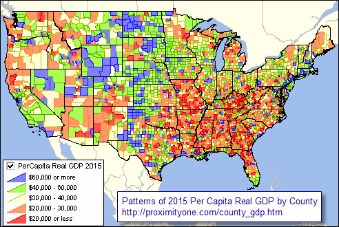
Patterns of 2021 Per Capita Personal Income by County

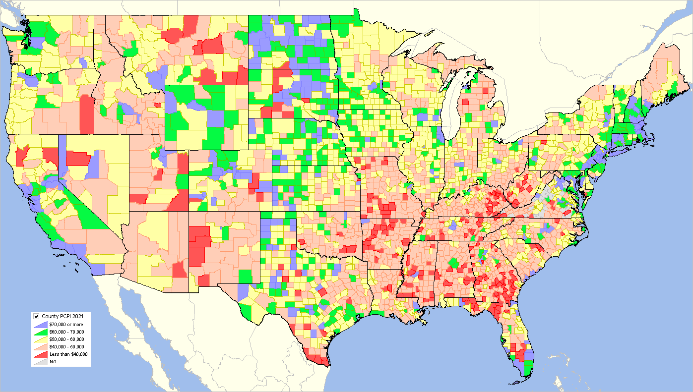
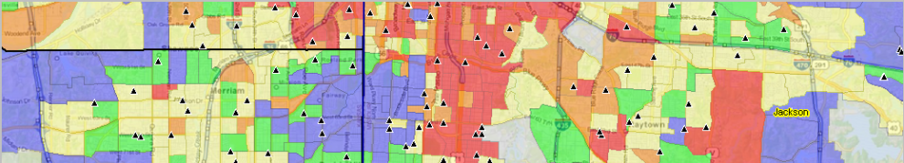
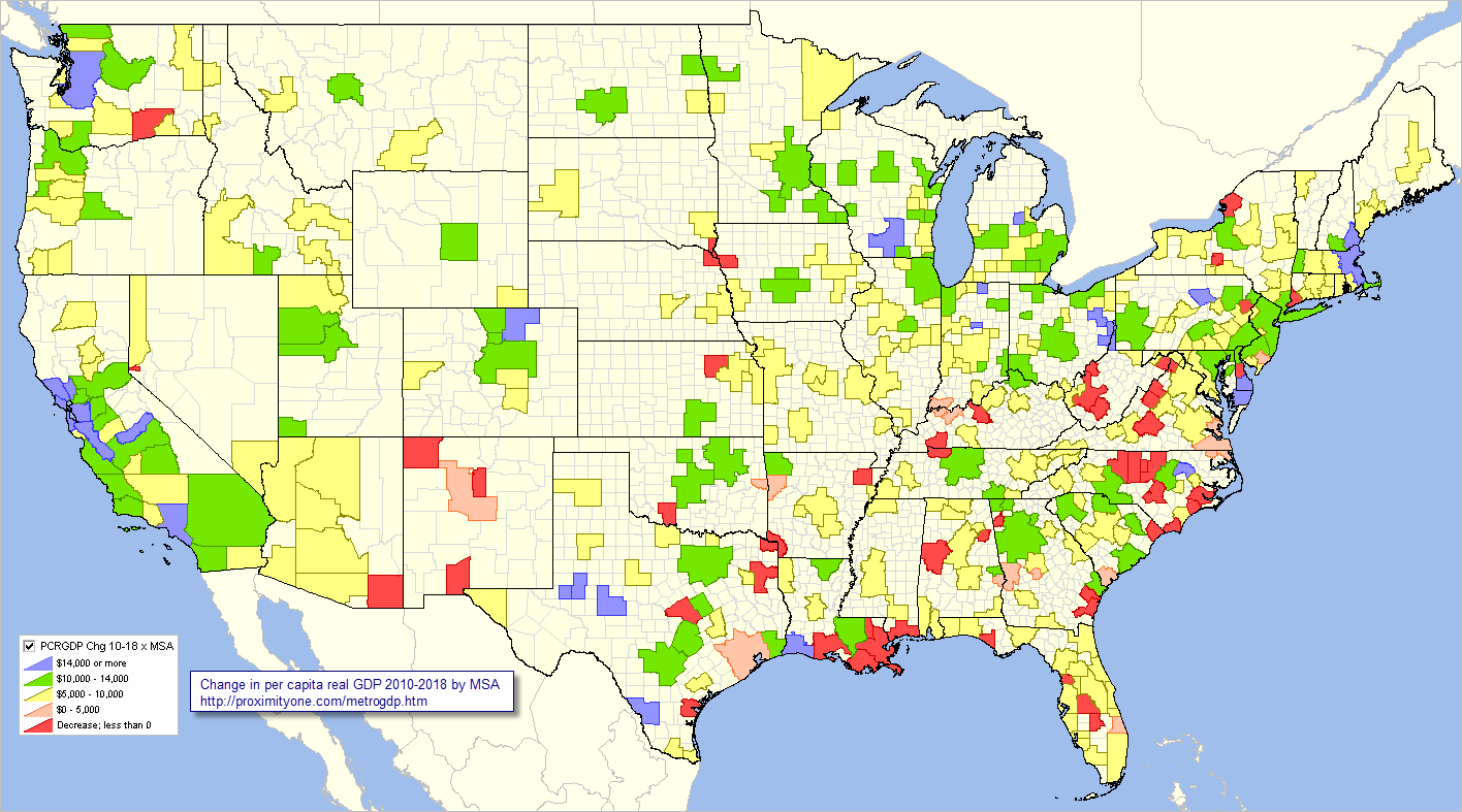
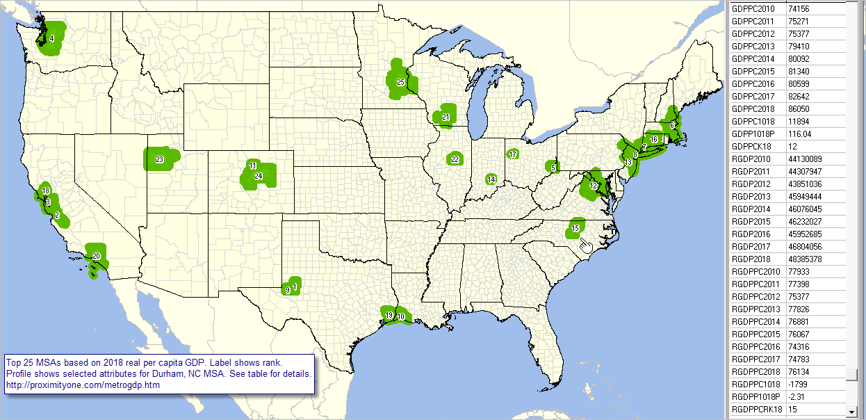
.. click graphic for larger view
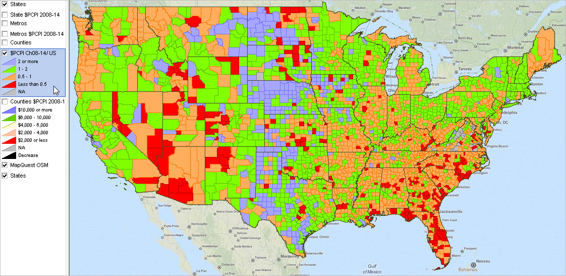
.. use VDA Web GIS for Web-based interactive viewing/analytics.
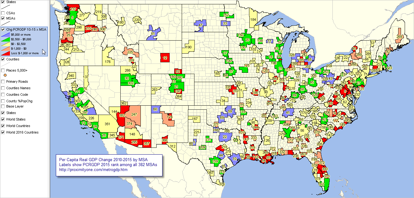
.. see this more detailed analytical framework for analytics using VDA Desktop.

Importance of these Data
How is the regional economy doing? How is it trending? What policies might be changed to improve personal economic well-being? Answers to these and similar questions are why knowing about personal income and its derivation, components is important — to residents, businesses and governments. While median household income is often considered the best measure of buying power for an area, it is not the best measure of personal or household economic well-being. PCPI and the Regional Economic Information System provides insights and answers to these questions.

U.S. Change in PCPI
In U.S. metropolitan areas, PCPI increased 7.3 percent in 2021, up from 6.0 percent in 2020. In U.S. nonmetropolitan areas, PCPI increased 7.5 percent, down from 7.9 percent.

Regional Economic Information System
PCPI is a small part of the broader Regional Economic Information System (REIS). The following links show examples of detailed tables for Harris County, TX comparing 2019 and 2021 developed using the ProximityOne REIS package. Develop these profiles for any county for your selected year 1970 through 2021.
  • Personal Income by Major Source
  • Earnings by Source & Sector
  • Employment by Type & Sector
  • Transfer Payments
  • Economic Profile
  • Farm Income & Expenditures

About VDA GIS
VDA Web GIS is a decision-making information resource designed to help stakeholders create and apply insight. Use VDA Web GIS with only a Web browser; nothing to install; GIS experience not required. VDA Web GIS has been developed and is maintained by Warren Glimpse, ProximityOne (Alexandria, VA) and Takashi Hamilton, Tsukasa Consulting (Osaka, Japan).

About the Author
Warren Glimpse is former senior Census Bureau statistician responsible for national scope statistical programs and innovative data access and use operations. He is also the former associate director of the U.S. Office of Federal Statistical Policy and Standards for data access and use. He has more than 20 years of experience in the private sector developing data resources and tools for integration and analysis of geographic, demographic, economic and business data. Join Warren on LinkedIn.

Examining How Metro GDP is Changing

.. which metros had the largest 2018 real GDP? How did they change since 2010? How to they compare on a per capita basis? What about metros of interest to you? Read on …

As an investor, business or stakeholder in a metro, it is important to know how and where the economy is changing … and how one or selected metros relate to the U.S. and other metros. Is metro X changing in a different direction than metro Y? By how much, why and is there a pattern? What does the healthcare sector, for example, contribute to a metro’s gross domestic product (GDP)? How does it compare to peer metros? How is the healthcare industry trending? Metro GDP data can provide insights and answers to these important questions.  See related main Web page.

In 2018, per capita real gross domestic product (GDP) in MSAs ranged from $19,299 (The Villages, FL MSA) to $196,277 (Midland, TX MSA). The percent change in per capita real GDP by metro, 2010 to 2018 ranged from -24% (New Orleans-Metairie, LA MSA) to 126.6% (Midland, TX MSA). Use the interactive table to view these and related data.

Change in Per Capita Real GDP by Metro; 2010-2018
The following graphic shows patterns of change in per capita real GDP by metro (MSA) from 2010 to 2018. Label shows 2018 rank of the metro among all 384 MSAs based on 2018 per capita real GDP. Click graphic for larger view. Expand browser to full window for best quality view.

— view created using ProximityOne CV XE GIS and associated GIS project

Top 25 Metros (MSAs) based on 2018 per capita real GDP
The following graphic shows the top 25 metros (MSAs) based on 2018 per capita real GDP labeled with rank. Click graphic for larger view. Expand browser to full window for best quality view.

— view created using ProximityOne CV XE GIS and associated GIS project
 
Using the Interactive Table – 10 largest metros based on 2018 real GDP
— insights into comparative analytics and trends.
— view, rank, compare districts based on your criteria.
— example, which metros have the largest 2018 real GDP?
Use the interactive table to examine GDP characteristics and trends of metros. The following view illustrates use of the table. This view shows use a query to show the ten metros ranked on 2018 real GDP. Click graphic for larger view.

Try using the interactive table to examine metros of interest.

Demographic-Economic Analytics Web Sessions
Join me in a Demographics Analytics Lab session to discuss more details about accessing and using wide-ranging demographic-economic data and data analytics. Learn more about using these data for areas and applications of interest.

About the Author
— Warren Glimpse is former senior Census Bureau statistician responsible for innovative data access and use operations. He is also the former associate director of the U.S. Office of Federal Statistical Policy and Standards for data access and use. He has more than 20 years of experience in the private sector developing data resources and tools for integration and analysis of geographic, demographic, economic and business data. Contact Warren. Join Warren on LinkedIn.

State of the States: 2019

.. the State of the States reports and information service provide insights into demographic, economic & business characteristics.  Unique in their composition,  updated daily/weekly, the reports summarize what’s changing where & when and assessing what’s ahead. It organizes disparate Federal statistical data and presents those data in an organized, consumable manner. A resource to help determine how change might affect you, it is an indispensable resource for investors, leaders, policymakers, researchers and decision-makers. See State of the States main section for more information.  Your briefing notes, organized by state.

Some details .. the U.S. economy is slowing, dragged down by trade tensions and weak growth overseas. But there are few signs that the decade-long expansion is on the verge of stalling out. Real Gross Domestic Product (RGDP), the broadest measure of goods and services produced in the economy, rose at a 2.1 percent annual rate in 2019Q2, down from 3.1 percent in 2019Q1, according to preliminary data released by the Bureau of Economic Analysis on 7/26/19.

But what about the states, and what about related measures? In Texas, the 2019Q1 change from 2018Q4 was 5.1 percent annual rate. Texas ranked 2nd among all states. The 2019Q2 state GDP will be posted in section 6.5 on Nov. 7, 2019 (see in scheduled updates). How does Texas compare to other states and the U.S.  Answers are organized in the reports.  Create insights. Share with others.

Part of a multi-dimensional information resource, the state of the states report has been derived from the Situation & Outlook (S&O) database, updated daily. ProximityOne uses the historical S&O database to develop current demographic-economic estimate and projections.

View the U.S. or a State Report .. click a link
.. illustrative reports .. see more about report structure & options in report.
United States
Alabama
Alaska
Arizona
Arkansas
California
Colorado
Connecticut
Delaware
District of Columbia
Florida
Georgia
Hawaii
Idaho
Illinois
Indiana
Iowa
Kansas
Kentucky
Louisiana
Maine
Maryland
Massachusetts
Michigan
Minnesota
Mississippi
Missouri
Montana
Nebraska
Nevada
New Hampshire
New Jersey
New Mexico
New York
North Carolina
North Dakota
Ohio
Oklahoma
Oregon
Pennsylvania
Rhode Island
South Carolina
South Dakota
Tennessee
Texas
Utah
Vermont
Virginia
Washington
West Virginia
Wisconsin

Demographic Analytics Web Sessions
Join me in a Demographics Analytics Lab session to discuss more details about accessing and using wide-ranging demographic-economic data and data analytics. Learn more about using these data for areas and applications of interest.

About the Author
— Warren Glimpse is former senior Census Bureau statistician responsible for innovative data access and use operations. He is also the former associate director of the U.S. Office of Federal Statistical Policy and Standards for data access and use. He has more than 20 years of experience in the private sector developing data resources and tools for integration and analysis of geographic, demographic, economic and business data. Contact Warren. Join Warren on LinkedIn.

Examining County Gross Domestic Product

.. what is the annual per capita real-valued output of counties of interest? How is this measure trending? Why is this important? This section reviews tools and data to examine county-level Gross Domestic Product (GDP) trends and patterns. The first ever county-level GDP estimates to be developed as a part of the official U.S. national scope GDP estimates were released in December 2018. The county GDP estimates join the county-level personal income by major source, both now part of the Regional Economic Information System (REIS). See more detail about topics reviewed in this post in the related County GDP web section.

Patterns of Real Per Capita GDP by County
The graphic below shows patterns of per capita real GDP, 2015, by county.

– View developed using CV XE GIS and related GIS project.
– create custom views; add your own data, using the GIS project.

Gross Domestic Product (GDP) by county is a measure of the value of production that occurs within the geographic boundaries of a county. It can be computed as the sum of the value added originating from each of the industries in a county.

Example … use this interactive table to see that 2015 Los Angeles County, CA total real GDP of $656 billion was just slightly larger that than of New York County, NY (Manhattan) at $630 billion. Yet, the total 2015 population of Los Angeles County of 10.1 million is 6 times larger than that of New York County of 1.6 million — see about steps. GDP provides very different size measures, and economic insights, compared to population.

In 2015, real (inflation adjusted) Gross Domestic Product (GDP) increased in 1,931 counties, decreased in 1,159, and was unchanged in 23. Real GDP ranged from $4.6 million in Loving County, TX to $656.0 billion in Los Angeles County, CA.

This post is focused on U.S. national scope county level estimates of Gross Domestic Product (GDP) annually 2012 through 2015. This marks the first time county level GDP estimates have been developed, a part of the Regional Economic Information System (REIS). Use the interactive table to rank, compare, query counties based on per capita GDP, current GDP, real GDP by type of industry. Use the related GIS project to develop thematic map views such as the one shown below. See more about these data.

Current Annual Estimates & Projections
ProximityOne uses these and related data to develop and analyze annual Situation & Outlook demographic-economic estimates and projections. GDP items included in the table below are included in the “annual 5-year” projections as shown in the schedule of release dates; next release April 18, 2019 and quarterly.

Examining County GDP Using GIS Tools
Use the County REIS GIS project. Make your own maps; select different item to map; modify colors, labels. Zoom in views of selected states shown below. Graphics open in a new page; expand browser window for best view. Patterns: see highlighted layer in legend to left of map; MSAs bold brown boundaries with white shortname label
counties labeled with name and 2015 per capita real GDP
.. Arizona .. Alabama .. California .. Colorado .. Iowa .. Georgia .. Kansas .. Missouri
.. New York .. Nevada .. North Carolina .. South Carolina .. Nevada .. Texas .. Utah .. Vermont

Using the County GDP Interactive Table
The graphic below illustrates use of the interactive table. Tools below the table have been used to view only per capita real GDP for all sectors (total sources) and for county with total population between 50,000 and 60,000. Counties were then ranked on 2015 per capita real GDP (rightmost column).

– click graphic for larger view.

Using County GDP: Data Analytics Web Sessions
Join me in a Data Analytics Lab session to discuss more details about accessing and using wide-ranging demographic-economic data and data analytics. Learn more about using these data for areas and applications of interest.

About the Author
— Warren Glimpse is former senior Census Bureau statistician responsible for innovative data access and use operations. He is also the former associate director of the U.S. Office of Federal Statistical Policy and Standards for data access and use. He has more than 20 years of experience in the private sector developing data resources and tools for integration and analysis of geographic, demographic, economic and business data. Contact Warren. Join Warren on LinkedIn.

Assessing Why and How the Regional Economy is Changing

.. data, tools and insights .. which counties are experiencing the fastest economic growth? by what economic component? what does this look like on a per capita level? how might county economic change impact you? Use our county level annual estimates and projections to 2030 to get answers to these and related questions. Get started with the interactive table that contains a selection of these data for all counties and states.

Visual Analysis of Per Capita Personal Income Patterns
The following map shows changing patterns of economic prosperity, U.S. by county, based on percent change in per capita personal income, 2010 to 2017. Create variations of this view — this view uses a layer in the “US1.GIS” GIS project installed by default with all versions of the CV XE GIS software.
– click graphic for larger view.
– view developed with CV XE GIS software.

Measuring the economy and change. One important part of this is Personal Income and components of change. Personal income is the income available to persons for consumption expenditures, taxes, interest payments, transfer payments to governments and the rest of the world, or for saving. Use the interactive table to examine characteristics of counties and regions of interest; how they rank and compare. The table provides access to 31 personal income related summary measures — the interactive table shows data for one of eight related subject matter groups. See more about the scope of subject matter descriptions.

Assessing How the Economy is Changing and How it Compares
The U.S. Per Capita Personal income (PCPI) increased from $40,545 in 2010 to $51,640 in 2017 — a change of $11,095 (27.4%). Compare the U.S. PCPI (or for any area) to a state or county of interest using the table. For example, Harris County, TX (Houston) .. click the Find GeoID button below the table .. increased from $45,783 in 2010 to $53,188 in 2017 — a change of $7,405 (16.2%).

Economic Profile; 2010-2017 & Change — An Example
The following graphic shows and example of the economic profile for Harris County, TX (Houston). Access a similar profile for any county or state.

Data Analytics Web Sessions
Join me in a Data Analytics Lab session to discuss more details about accessing and using wide-ranging demographic-economic data and data analytics. Learn more about using these data for areas and applications of interest.

About the Author
— Warren Glimpse is former senior Census Bureau statistician responsible for innovative data access and use operations. He is also the former associate director of the U.S. Office of Federal Statistical Policy and Standards for data access and use. He has more than 20 years of experience in the private sector developing data resources and tools for integration and analysis of geographic, demographic, economic and business data. Contact Warren. Join Warren on LinkedIn.

Important Upcoming Data Releases: September 2017

.. monthly updates on recent & upcoming data analytics tools & resources .. this section provides a monthly update on important new data developments and applications/developments to further their use in data analytics. A focus of this section is on new or revised geographic, demographic and economic data. Most of these data are used to develop and update ProximityOne census tract-level up demographic-economic projections to 2022 and county-level up population by single year of age projections to 2060. See about September projection updates below on this page. This section is organized into recent past data updates and upcoming (month ahead) data releases and may be updated to reflect new or extended details. See related news and updates:
• What’s New daily updates
• Situation & Outlook Calendar

See related Web section.

Recent Past Data Releases/Access

U.S. by Census Tract 2017 HMDA Low & Moderate Income (FFIEC)
• Release date — 8/17; next update — mid 2018
• 2017 annual HMDA data — covers all income levels not only LMI
• New 2017 HMDA data
• See more information – access data.

U.S. by County Population by Single Year of Age (NCHS)
• Release date — 8/22/17; next update — mid 2018
• 2010 through 2016 annual population by single year of age
• New 2016 data extending annual series 2010 forward
• See more information – access updates.

Housing Price Index (FHFA)
• Release date — 8/22/17; next update — 11/28/17
• Quarterly HPI
• New 2017Q2 data extending quarterly time series.
• See more information – access updates.

Quarterly Gross Domestic Product by State (BEA)
• Release date — 9/20/17; next update — 11/21/17
• Quarterly GDP by Industry
• New 2017Q1 data extending quarterly time series.
• See more information – access data.

Upcoming Data Releases/Access 

2017 TIGER Digital Map Database (Census)
• Expected ~ 9/7/17
• Topologically Integrated Geographic Encoding & Referencing (TIGER) data.
• Geographic data; predominately shapefiles.
.. intersection to intersection road segment geography and attributes.
• New 2017 GIS/mapping shapefiles for use with wide-ranging data
.. including with Census 2010, ACS 2016 & other subject matter.
• See more information – updates to access summarized in that section.

Census of Employment and Wages (BLS/CEW)
• Release date — 9/6/17; next update — 12/5/17
• AKA ES-202 data — establishments, employment & wages by NAICS code/type of business
• U.S. by county.
• New 2017Q1 data extending quarterly time series.
• See more information.

2016 American Community Survey 1-year estimates (Census/ACS)
• Release date — 9/14/17
• Wide-ranging demographic-economic data for areas having population 65,000+
.. all states, CDs, PUMAs, MSAs and larger cities/CBSAs/school districts/counties (817 of 3142)
• New 2016 estimates.
• See more information – updates to access summarized in that section.

SY 2015-16 Annual School & School District Characteristics (NCES)
• Expected ~ 9/14/17
• National school school & school district characteristics.
• New 2015-16 school year administratively reported data.
• Schools … see more information – access updates.
• School District … see more information – access updates.

2016 Annual Gross Domestic Product by Metro (BEA)
• Release date — 9/20/17
• GDP by Industry by Metro
• New 2016 data extending time series
• See more information – access updates.

Census Tract Estimates and Projections to 2022 — ProximityOne
• Release data ~ 9/27/17
• National census tract and higher level geography demographic-economic updates
• Annual estimates & projections; 2010 through 2022
• Updated to reflect/integrate data released through 9/2017 as summarized above   • See more information.

County Population by Single Year of Age Projections to 2060 — ProximityOne
• Release data ~ 9/27/17
• National county and higher level geography demographic updates
• Annual estimates & projections; 2010 through 2060
• Updated to reflect/integrate data released through 9/2017 as summarized above.   • See more information.

Notes [goto top]
– BEA – Bureau of Economic Analysis
– BLS – Bureau of Labor Statistics
– Census – Census Bureau
– FFIEC – Federal Financial Institutions Examination Council
– FHFA – Federal Housing Finance Agency
– NCES – National Center for Education Statistics
– NCHS – National Center for Health Statistics

Join me in a Data Analytics Lab session to discuss more details about accessing and using wide-ranging demographic-economic data and data analytics. Learn more about using these data for areas and applications of interest.

About the Author
— Warren Glimpse is former senior Census Bureau statistician responsible for innovative data access and use operations. He is also the former associate director of the U.S. Office of Federal Statistical Policy and Standards for data access and use. He has more than 20 years of experience in the private sector developing data resources and tools for integration and analysis of geographic, demographic, economic and business data. Contact Warren. Join Warren on LinkedIn.

Regional Economic Information System: Annual Updates

.. which counties are experiencing the fastest economic growth? by what economic component? what does this look like on a per capita level?

.. access & analyze economic characteristics and patterns by county and state .. annual time series 1969 through 2015 with projections.  Personal income is the income available to persons for consumption expenditures, taxes, interest payments, transfer payments to governments and the rest of the world, or for saving. Use the interactive table to examine characteristics of counties and regions of interest. The table provides access to 31 personal income related summary measures. These data are a selection of a broader set of annual time series data from the Regional Economic Information System (REIS). REIS is a part of the ProximityOne State & Regional Income & Product Accounts (SRIPA) and Situation & Outlook (S&O) featuring current (2016) estimates and demographic-economic projections. Go to table.

Visual Analysis of Per Capita Personal Income Patterns
The following map shows the Houston metro (view profile) with bold brown boundary. Counties are labeled with county name and 2014 per capita personal income.

Click graphic for larger view. View developed with CV XE GIS software.

Per Capita Personal Income Change 2008-2014 by County
.. relative to U.S 2008-2014 change

Click graphic for larger view. View developed with CV XE GIS software.

Interactive Analysis – County or State Profiles
The following graphic illustrate use of the interactive table to view an economic profile for Harris County, TX. Use the table to examine characteristics of any county or state. Click graphic for larger view.

Interactive Analysis
– comparing per capita personal income across counties
The next graphics illustrates use of the interactive table to rank/compare per capita personal income across counties. Rank/compare states. Choose any of the economic profile items. Click graphic for larger view.

Join me in a Data Analytics Lab session to discuss more details about accessing and using wide-ranging demographic-economic data and data analytics. Learn more about using these data for areas and applications of interest.

About the Author
— Warren Glimpse is former senior Census Bureau statistician responsible for innovative data access and use operations. He is also the former associate director of the U.S. Office of Federal Statistical Policy and Standards for data access and use. He has more than 20 years of experience in the private sector developing data resources and tools for integration and analysis of geographic, demographic, economic and business data. Contact Warren. Join Warren on LinkedIn.

Metropolitan Area Gross Domestic Product: Trends & Updates

… data and analytical tools to examine Metro GDP patterns and trends.  As a policy-maker, investor, business, advisor or stakeholder, it is important to know how and where the metro economy is changing … and how one or selected metros relate to the U.S. and other metros. Is metro X changing in a different direction than metro Y? By how much, why and is there a pattern? What does the healthcare sector, for example, contribute to a metro’s gross domestic product (GDP)? How does it compare to peer metros? How is the healthcare industry trending? Metro GDP data can provide insights and answers to these important questions. Developing insights using metro GDP data — an example. See related Web section for more detail.

Change in Per Capita Real GDP by Metro, 2010-2015
The following graphic shows patterns of change in per capita real GDP by metro from 2010 to 2015. The orange and red fill patterns show metros experiencing a decrease in per capita real GDP over the period. Click graphic for larger view that shows the 2015 rank of the metro among all 382 MSAs based on 2015 per capita real GDP.

— view created using CV XE GIS and associated MetroGDP GIS Project

282 metropolitan statistical areas, of the total 382, experienced an increase in real Gross Domestic Product (GDP) between 2010 and 2015. Growth was led by growth in professional and business services; wholesale and retail trade; and finance, insurance, real estate, rental and leasing, Collectively, real GDP for U. S. metropolitan areas increased 2.5 percent in 2015 after increasing 2.3 percent in 2014. Use the interactive table and GIS project/datasets described in this section to view/analyze patterns and characteristics in metros of interest.

Illustrative GDP by Sector Trend Profiles
Real GDP by sector profiles are available for the U.S. and each state and MSA. The Metro GDP data are part of the State & Regional Income & Product Accounts (SRIPA). The following profiles illustrate these data for metros, states and the U.S.

Atlanta, GA MSA
Charlotte, NC-SC MSA
Chicago, IL MSA
Columbia, MO MSA
Houston, TX MSA
Phoenix, AZ MSA
United States
Missouri
Texas

Metro Situation & Outlook Reports
View Metro GDP Characteristics section in the Metropolitan Area Situation & Outlook Reports, providing the same scope of data as in the table below integrated with other data. See example for the Dallas, TX MSA. GDP tells an important but small part of the broader metro demographic-economic characteristics. Most metros have sub-county areas experiencing growth or activity sometimes masked when looking at the entire metro. Click a metro (metro GDP estimated for MSAs only) link in the table at upper right to view the GDP estimate in context of related subject matter.

Interactive Analysis
The following graphic shows an illustrative view of the interactive MetroGDP table. This view shows California MSAs ranked in descending order on percent change in per capita real GDP from 2010 to 2015 (ranked on far right column). Use the table to examine characteristics of metros in regions of interest. Click graphic for larger view.

Join me in a Data Analytics Lab session to discuss more details about accessing and using wide-ranging demographic-economic data and data analytics. Learn more about using these data for areas and applications of interest.

About the Author
— Warren Glimpse is former senior Census Bureau statistician responsible for innovative data access and use operations. He is also the former associate director of the U.S. Office of Federal Statistical Policy and Standards for data access and use. He has more than 20 years of experience in the private sector developing data resources and tools for integration and analysis of geographic, demographic, economic and business data. Contact Warren. Join Warren on LinkedIn.

Metro by Metro: What $100 Buys

.. data and tools to examine the purchasing power of the incomes in different metros and states … this section reviews how you can access to data on what $100 buys by state and metro. Examine patterns of what $100 buys by year, 2008-2014, for all items and by type of goods & services category. Use the interactive table to view, rank, compare the Buying Power Index for each/all states and metros (MSAs). See the main Web page for more details.

What $100 Buys by Metro: 2014
The following graphic shows patterns of 2014 all items buying power of $100 by metro (MSAs). The color patterns/intervals are shown in the inset legend. Click graphic for larger view. Expand browser to full window for best quality view. Use GIS tools to develop thematic pattern maps for a range of data and criteria.

.. view developed using the CV XE GIS software.
.. click map for larger view and details.

Varying prices by region can be normalized using Regional Price Parities (RPP). The RPP is a weighted average of the price level of goods and services for the average consumer in one geographic region compared to all other regions in the U.S. See more about RPP measures. Using the RPP data, what $100 will buy can be determined by state and metro for the categories of all goods and services, goods, services-rents and other services. See about RPP goods and services types.

In the Boston metro, $100 buys about 90.7 percent of all items goods and services due to the high prices there. $100 in Boston seems more like $90.70 compared to the national average. In the Jefferson City, MO metro, the opposite is true. $100 buys all items goods and services due to lower prices in that metro. $100 in the Jefferson City, MO metro is the equivalent of $121.65 of all items goods and services compared to the national price levels.
• the Boston metro all items buying power index is 90.70
• the Jefferson City, MO metro all items buying power index is 121.65

Interactive Table – Top 10 Metros
The following graphic illustrates use of the Buying Power Index interactive table. This graphic shows the 10 metros that have the all items highest Buying Power Index. Use the interactive table to view/examine areas of interest.

– click graphic for larger view.

Join me in a Data Analytics Lab session to discuss more details about accessing and using wide-ranging demographic-economic data and data analytics. Learn more about using these data for areas and applications of interest.

About the Author
— Warren Glimpse is former senior Census Bureau statistician responsible for innovative data access and use operations. He is also the former associate director of the U.S. Office of Federal Statistical Policy and Standards for data access and use. He has more than 20 years of experience in the private sector developing data resources and tools for integration and analysis of geographic, demographic, economic and business data. Contact Warren. Join Warren on LinkedIn.

Real Purchasing Power by State & Metro

.. how does the real purchasing power in metros of interest compare to other metros? Use data and tools reviewed here to examine the purchasing power of the incomes in different metros and states … this section provides access to regional price parities (RPPs) estimates developed compare regions within the U.S. RPPs are regional price levels expressed as a percentage of the overall national price level for a given year. The price level is determined by the average prices paid by consumers for the mix of goods and services consumed in each region. See about these data. See example about using RPPs below in this section.

• Use the interactive table to view, rank, compare the RPPs
.. for all states and metropolitan statistical areas (MSAs).
• Use GIS tools described here to develop RPP thematic pattern maps.
.. add your own data & geography, select different HPI measures or criteria.
.. zoom to different geographic extents, label and modify colors as desired.

Patterns of Regional Price Parities by Metro: 2014
The following graphic shows patterns of 2014 all items Regional Price Parities by metro (MSAs). The color patterns/intervals are shown in the inset legend. In additional views (below this graphic) metros are labeled with the 2014 all items RPP. Click graphic for larger view. Expand browser to full window for best quality view. Use the GIS tools described here to develop thematic pattern maps for a range of data and criteria.

.. view developed using the CV XE GIS software.
.. click map for larger view and details.

Additional Views — install GIS project (see steps here) and create your own custom maps
Georgia & Region
Missouri & Region
Texas & Region

Using the RPP — Illustrative Examples
1. Comparing real purchasing power:
  — Houston, TX metro compared to Waco, TX metro.
The the all items RPP for the Houston metro in 2014 was 100.3 while the all items RPP for the Waco, TX metro in 2014 was 91.5. (from RPP table). On average, prices are 0.3 percent higher and 8.5 percent lower than the U.S. average for the Houston metro and the Waco metro, respectively. The per capita personal income (PCPI) for the Houston metro in 2014 was $54,820 and the per capita personal income for the Waco metro was $35,340 (get from the table at http://proximityone.com/reis.htm). The RPP-adjusted PCPI values are $53,223 ($54,820/1.03) and $38,622 ($35,340/0.915), respectively. The gap between the purchasing power of the two metro PCPIs is reduced when adjusted by their respective RPPs.

2. Comparing real purchasing power:
  — Washington, DC metro compared to Columbia, MO metro.
• Washington, DC metro 2014 all items RPP: is 119.4 (from RPP table); 2014 PCPI: $62,975 (from this table)
• Columbia, MO metro 2014 all items RPP: 93.0 (from RPP table); 2014 PCPI: $41,418 (from this table)
• The RPP-adjusted PCPI values are $52,742 ($62,975/1.194) and $44,535 ($41,418/0.93), respectively.

Using the RPP Interactive Table
Use the interactive table to examine the RPP by state and metro. The following graphic illustrates use of the table to show the 10 metros having the highest 2014 all items RPP. Click graphic for larger view. Examine metros and states of interest with more detail using tools below the table.

Join me in a Data Analytics Lab session to discuss more details about accessing and using wide-ranging demographic-economic data and data analytics. Learn more about using these data for areas and applications of interest.

About the Author
— Warren Glimpse is former senior Census Bureau statistician responsible for innovative data access and use operations. He is also the former associate director of the U.S. Office of Federal Statistical Policy and Standards for data access and use. He has more than 20 years of experience in the private sector developing data resources and tools for integration and analysis of geographic, demographic, economic and business data. Contact Warren. Join Warren on LinkedIn.