… did you know? Of the total 3,144 counties in the United States, 48 have more than 1 million residents as of 2023. Learn which counties, where they are and how/why they are changing. Use tools and methods described in this section to learn about how and why your counties of interest are changing. This is one of a series on the topic of county population dynamics. Click the Follow button to receive update notices.
Largest, Fast Growing Counties
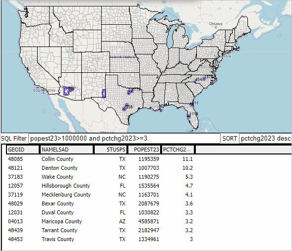
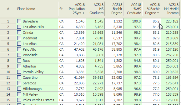
The following graphic shows the largest 10 counties, experiencing 3% or more growth from 2020 to 2023, based on the latest official population estimates. Counties are ranked based on the population percent change 2020 to 2023. Collin County, TX, in the Dallas metro, leads the group with an 11.3% gain. You can create similar but different views/analytics using the OVDAW online tool described below. Click graphic for larger view.
Why these Data are Important
These data are official Federal county statistics. They are used by the Federal, state and local governments in a wide range of application areas. These data are used by Federal agencies to analyze, administer programs, develop other data. The Bureau of Economic Analysis will use these data to produce Personal Income by County and Metropolitan Area, 2023 (November) and Real Personal Consumption Expenditures by State and Real Personal Income by State and Metropolitan Area, 2023 (December), among others. They are used within the Census Bureau as controls for statistical survey estimates. They are the population county components used to develop corresponding CBSA/metro data. They are used as measure of how, why and by how much county population is changing. They provide insights into, for example, where a business might open a new business based in part on changing population. The components of population change tell us yet other things .. reviewed in upcoming blogs.
Start Using Open VDA Web GIS (OVDAW)
Nothing to install, no registration, no fee.
Start creating maps and analyzing data.
• Click here to Start Open VDA Web GIS
• Click here to Learn More About Using OVDAW
More About Population & Components of Change
These “population and components of change” annual data 2020 through 2023 are an annually updated time series enabling stakeholders to examine trends and perform wide-ranging analyses. The 2020-2023 data are model-based estimates developed by the Census Bureau. ProximityOne uses these and related data to develop projections annually through 2060.
Components of change include births, deaths and migration. Estimates and projections are developed using the population identity:
P[t] = P[t-1] + B[t,t-1] + D[t,t-1] + M[t,t-1]
Population for the year t are determined by adding the population last year to births (B), subtracting deaths (D) and adding net migration (M) during the year. The components are determined using separate equations in the model.
About VDA GIS
Use VDA GIS tools to meet wide-ranging mapping needs and geospatial analysis. VDA Desktop GIS and VDA Web GIS have similar features that can be used separately or together. Each is a decision-making information resource designed to help stakeholders create and apply insight. VDA Web GIS is access/used with only a Web browser; nothing to install; GIS experience not required. VDA Desktop GIS is installed on a Windows computer and provides a broader range of capabilities compared to VDA Web GIS. VDA GIS resources have been developed and are maintained by Warren Glimpse, ProximityOne (Alexandria, VA) and Takashi Hamilton, Tsukasa Consulting (Osaka, Japan).
Data Analytics Web Sessions
Join us in the every Tuesday, Thursday Data Analytics Web Sessions. See how you can use VDA Web GIS and access different subject matter for related geography. Get your geographic, demographic, data access & use questions answered. Discuss applications with others.
About the Author
Warren Glimpse is former senior Census Bureau statistician responsible for national scope statistical programs and innovative data access and use operations. He is also the former associate director of the U.S. Office of Federal Statistical Policy and Standards for data access and use. He has more than 20 years of experience in the private sector developing data resources and tools for integration and analysis of geographic, demographic, economic and business data. Join Warren on LinkedIn.


You must be logged in to post a comment.