.. data and tools to analyze characteristics and patterns of census tract geography with a focus on low and moderate income. See related Web page for more detail.
Of the total 75,883 census tracts for which low and moderate income data were tabulated in the HMDA 2017 data, 6,023 (8.7%) were low income, 16,873 (24.5%) were moderate income, 32,509 (47.1%) were middle income and 19,159 (27.8%) were upper income. See more about these classifications. Find out about your tracts/neighborhoods of interest and how they compare to others using data and tools provided in this section.
Analysis of the low, moderate, middle, and upper income of the population and households by small area geography is important to housing market stakeholders, lenders, investors, cities/neighborhoods and others. Low and moderate income data by block group and census tract are used for compliance, eligibility determination and program performance in many Federal programs and agencies.
• Use the interactive table below to view, query, compare, sort census tracts.
• Use tract estimates & projections to examine changing characteristics.
– extended demographic-economic measures, annual 2010-2022
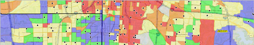
Low & Moderate Income by Census Tract
The following view shows census tracts designated as low and moderate income (orange fill pattern) in the the Houston, TX MSA (bold brown boundary) area. These are tracts having income level with codes 1 and 2 in the interactive table. A wide range of market insights can be created zoom-in views for counties, cities and neighborhoods and linking these with other data. Make variations of this view using ProximityOne data and tools described in this section.

– View developed using CV XE GIS and related GIS project.
View similar maps for these areas:
.. Atlanta metro
.. Chicago, IL metro
.. Dallas, TX metro
.. Knoxville, TN metro
.. with drill-down views for Knoxville city
.. Los Angeles, CA metro
.. San Francisco, CA metro
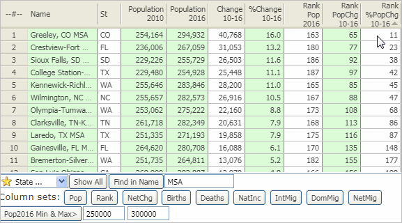
Using the Interactive Table
– Examining LMI Tracts in Your Metro
Use the interactive table to view, query, sort compare tracts based on various demographic and LMI characteristitcs. The following graphic illustrates how the table can be used to view low and moderate income tracts for the Charlotte, NC-SC metro.
– click ShowAll button below table.
– enter a CBSA code in the edit box at right of Find CBSA LMI>.
– click the Find CBSA LMI button.
Resulting display of Charlotte metro LMI tracts only.

– click graphic for larger view.
Join me in a Data Analytics Lab session to discuss more details about accessing and using wide-ranging demographic-economic data and data analytics. Learn more about using these data for areas and applications of interest.
About the Author
— Warren Glimpse is former senior Census Bureau statistician responsible for innovative data access and use operations. He is also the former associate director of the U.S. Office of Federal Statistical Policy and Standards for data access and use. He has more than 20 years of experience in the private sector developing data resources and tools for integration and analysis of geographic, demographic, economic and business data. Contact Warren. Join Warren on LinkedIn.