Category Archives: TX Fort Bend County

Data Analytics & API Applications

Possibly the most well known APIs (Application Programming Interface) are the Google APIs. Among these, the Google Maps API, or its use, might be the most familiar. See about integrating political/statistical geography and Google Maps API. This section reviews different types of APIs.

Data Analytics and APIs
API technology/tools play an important role in accessing and integrating geographic, demographic and economic data. APIs offer two types of benefits. For Web-based applications, APIs provide the ability for on-the-fly access to selected demographic-economic buried in otherwise large datasets that typically otherwise involve downloading and preprocessing. A second important benefit/use is to extract data from those same datasets, reconfigure the structure of the data retrieved by API and create a new dataset structure that lends itself to analytical applications.

ProximityOne Data Analytics sessions review purpose, scope, strengths, advantages & limitations of APIs described in this section. Topics included in the related Web section include:
Federal Geographic-Demographic-Economic Data Access Using APIs
REST APIs
Federal Communications Commission
Bureau of the Census … much more than Census
Bureau of Economic Analysis
Bureau of Labor Statistics
Data Access & Analytics Applications
There are hundreds more APIs available from Federal agencies and wide-ranging sources.

Using APis and GIS: Visualizing Patterns; Geospatial Analysis
The following graphic has been developed first using API tools to create the underlying datasets. While the source data used in this application could have been downloaded and processed in legacy manner, the API tools provide on-the-fly development of the data in a structure required by the GIS software. These data are then integrated into shapefiles for use with the GIS software. Once the datasets are developed, they can be used in a myriad of application, GIS and otherwise.

Patterns of Male Hispanic Population Age 5 Years by ZIP Code
— Houston, TX Area


• Click graphic for larger view with ZIP Code labels and more detail.
• The graphic shows patterns of the Male Hispanic population 5 years of age as of Census 2010.
• The view illustrates how single year of age by gender by race/origin can be visually analyzed.
• See more about these data and single year of age demographics

Examples and More Detail
See the corresponding Web section on Data Analytics & Using APIs. Many See application examples are shown there.

About the Author
— Warren Glimpse is former senior Census Bureau statistician responsible for innovative data access and use operations. He is also the former associate director of the U.S. Office of Federal Statistical Policy and Standards for data access and use. He has more than 20 years of experience in the private sector developing data resources and tools for integration and analysis of geographic, demographic, economic and business data.

USA TODAY County Diversity Analyses: 1960-2060

.. USA TODAY uses ProximityOne county demographic projections to 2060 to analyze patterns of diversity. See main story.  See related Web section.

The USA TODAY Diversity Index shows diversity has surged in the last 50 years and is expected to continue rising. The U.S. index rose from 20 in 1960 to 55 in 2010. Driven by changing attitudes and a record wave of immigration, the pace of change varies widely, sometimes even in adjacent counties.

The diversity index measures the degree of racial and ethnic diversity of the population. The percentage of each race (White, Black, American Indian/Alaska Native, Asian, Native Hawaiian) and Hispanic origin/ethnicity are used to calculate the chance that any two people are from different groups. The index ranges from 0 (no diversity) to 100 (highest diversity).

From USA TODAY main story … “USA TODAY used Census data to calculate the chance that two random people are different by race or ethnicity and came up with a Diversity Index to place every county on a scale of 0 to 100. The nationwide USA TODAY Diversity Index hit 55 in 2010, up sharply from 20 in 1960 and 40 as recently as 1990. In South Orange, the index is 59.

This is just the beginning. Barring catastrophe or a door-slam on immigration, the Diversity Index is on track to top 70 by 2060, according to a USA TODAY analysis of population projections by ProximityOne of Alexandria, Va. That means there will be less than a 1-in-3 chance that the next person you meet will share your race or ethnicity, whatever it is: white, black, American Indian, Asian, Native Hawaiian or Hispanic.

As people from varying cultures and races come together or collide, local governments and other institutions deal with a host of new issues, from conflicts over spending and diverse hiring to violence in the streets and language barriers.”

USA TODAY Analyses of ProximityOne Projections to 2060
• Main story — Second immigration wave lifts diversity to record high
• Interactive mapping: Mapping the USA’s Diversity: 1960-2060
About ProximityOne projections used in the USA TODAY analyses

ProximityOne Neighborhood Diversity Analyses

Mapping Diversity Patterns

Click graphic for larger view.
Credits: Paul Overberg, USA TODAY Amanda Astey, Sarah Frostenson, Anthony DeBarros, Gannett Digital
Source: USA TODAY analysis of data from Census Bureau; NHGIS, University of Minnesota; ProximityOne, Alexandria, VA

Viewing National Diversity Patterns by Race/Origin Charts

Click graphic for larger view.
Credits: Paul Overberg, USA TODAY Amanda Astey, Sarah Frostenson, Anthony DeBarros, Gannett Digital
Source: USA TODAY analysis of data from Census Bureau; NHGIS, University of Minnesota; ProximityOne, Alexandria, VA

Viewing Change by State: 1960 – 2010 – 2060

Click graphic for larger view.
Source: USA TODAY analysis of data from Census Bureau; NHGIS, University of Minnesota; ProximityOne, Alexandria, VA

Get the Diversity Profile for Your County
Visit the main story. Scroll down to the interactive section shown below, illustrating the chart and data for Maricopa County, AZ and Arizona. Key in a county name of interest to view the chart and data for that location.

Maricopa County, AZ Diversity Patterns

Click graphic for larger view.
Credits: Tory Hargo, Paul Overberg, Mitchell Thorson, USA TODAY
Source: USA TODAY analysis of data from Census Bureau; NHGIS, University of Minnesota; ProximityOne, Alexandria, VA

Support Using these Resources
Learn more about demographic economic data and related analytical tools. Join us in a Decision-Making Information Web session. There is no fee for these one-hour Web sessions. Each informal session is focused on a specific topic. The open structure also provides for Q&A and discussion of application issues of interest to participants.

ProximityOne User Group
Join the ProximityOne User Group to keep up-to-date with new developments relating to children’s demographics and school district decision-making information resources. Receive updates and access to tools and resources available only to members. Use this form to join the User Group. There is no fee.

Making Custom Congressional District Maps

.. using GIS resources to create custom congressional district maps and visually analyze urban-rural patterns …

Houston Area Texas CD 22 Intersects 3 Counties

Semi-transparent layer shows TX22 by county.
Overlayed on urban areas — orange fill patern.
See details about above map below.

Maps of the 113th congressional districts are widely available in many shapes and forms. See the CD Gallery to view patterns of economic prosperity by neighborhood for each/every 113th congressional district. Flexibly associating a congressional district boundary with related geography and subject matter requires special tools — as reviewed in this section and available to members of the ProximityOne UserGroup.

Creating congressional district maps is often specific to a particular analysis, zoom-view, labeling, combination of different geographies or other considerations. While there are no estimates of unemployment by congressional district, using GIS tools it is possible to view/geospatially analyze patterns of unemployment within a congressional district by county, census tract, block group and other geography.

Create Your Own Custom Congressional District Maps
This section reviews tools that you can use to flexibly develop your own maps that show U.S. 113th Congressional Districts of interest using Geographic Information System (GIS) tools. The GIS resources enable you to view/show the congressional district boundaries in context with roads, landmarks and other geography. Flexibly add labels. Create pattern views. Add your own data. Metro maps can be saved as a graphic and used in any manner. There are no fees to use resources described in this section.

See additional details about topics covered here in this Web page.

Examining Congressional Districts & Urban/Rural Patterns
GIS resources reviewed in this section enable you to make a map of any congressional district using the U.S. by congressional district shapefile. A second layer shows the U.S. by urban area. By using these layers in combination, you can examine urban/rural patterns by congressional district. A third layer uses the U.S. by congressional district by county shapefile. By using this layer, pattern analysis can focus on a particular part of a congressional district contained within a county as illustrated by a map view below (see #2. Houston Area; Congressional District by County). The 113th CD urban/rural mapping makes use of the latest latest smoothed boundary shapefiles (July 2014).

113th Congressional District Urban/Rural Patterns Chicago Area
 — create similar map view for any area

• Congressional districts: black boundaries with CD code/number.
• Urban areas: orange fill pattern.
• It is easy to see which congressional districts are 100% urban.

Steps to Develop Custom Congressional District Maps (requires Windows computer with Internet connection)
1. Install the ProximityOne CV XE GIS
… run the CV XE GIS installer
… take all defaults during installation
2. Download the U.S. 113th Congressional Districts GIS project fileset
… requires ProximityOne User Group ID (join now, no fee)
… unzip U.S. CD113 Urban Rural GIS project files to local folder c:\cd113_urbanrural
3. Open the c:\cd113_urbanrural\cd113_urbanrural_chicago.gis project
… after completing the above steps, click File>Open>Dialog
… open the file named c:\cd113_urbanrural\cd113_urbanrural_chicago.gis
4. Done. The start-up view is shown above with additional instructions.

Using the CD 113 Urban/Rural Maps Projects
There are three GIS project files included with the ZIP file. Each GIS project (*.gis) includes the same set of layers/shapefiles. Only attributes of layers set by the CV XE GIS Layer Editor differ.
1. cd113_urbanrural1.gis
2. cd113_urbanrural2.gis
3. cd113_urbanrural_chicago.gis

See this Web page for details on how to modify a layer appearance (queries, labels, zoom-view, etc.)

1. Houston Area — cd113_urbanrural1.gis
When the c:\cd113_urbanrural\cd113_urbanrural1.gis is opened, the view shown below appears.
This project illustrates use of the query “GEOID=’4822′” placed on the CD113 layer displays only the congressional district Texas 22.

2. Houston Area; Congressional District by County — cd113_urbanrural2.gis
When the c:\cd113_urbanrural\cd113_urbanrural2.gis is opened, the view shown below appears.
This project illustrates use of three queries placed on the CD113 by county layer, resulting in the displays of congressional district Texas 22 by county (three color patterns).
1. query 1: CD113FP=’22’ and countyfp=’039′
2. query 2: CD113FP=’22’ and countyfp=’201′
3. query 3: CD113FP=’22’ and countyfp=’157′

3. Chicago Area — cd113_urbanrural_chicago.gis
When the c:\cd113_urbanrural\cd113_urbanrural_chicago.gis is opened, the view shown below appears.
In this project, no queries are placed on any layer.

Saving/Publishing a Map View
When you have a view that you want to save, click the Save to Image button on the toolbar. You will then be prompted for the folder and filename. Once the graphic has been saved to a folder it can be used just as any other graphic.

Saving, Closing and Opening Projects
If CV XE GIS is closed with no changes made to the project settings are saved. Reopening the project will create the same start-up view as shown above. Repeat the steps to create views for other cities.

If you have made adjustments to the project and want to save it, to be reopened later with the same view, use File>SaveAs to save a new project name. It is recommended that you do not save the project with the same name as you will not be able to recall the original start-up view.

Additional Views
Phoenix area

Los Angeles area

Houston area

Support & DMI Web Sessions
Learn more about using resources described in this section. Join us in a Decision-Making Information Web session. There is no fee for these one-hour Web sessions. Each informal session is focused on a specific topic. The open structure also provides for Q&A and discussion of application issues of interest to participants. We can address your specific questions about using congressional district and urban area demographic economic data and related applications.

County Population Projections 2020

.. examining county demographic trends 2010-2020: population estimates & projections by age in structured profiles.

Find out about the recent past and expected future demographic trends and patterns in your county(s) of interest. Examine the distribution of the population by 5 year age cohort, other age groups and by year.

This section reviews how you can access and use ProximityOne national scope county annual demographic estimates and projections for the period 2010 through 2020. These estimates and projections are a part of the ProximityOne Situation & Outlook program. Estimates and projections are developed using county simultaneous equation models. See methodology.

Visual Trend Analysis
The graphic below shows projected population change 2010 to 2020 by county for the south central U.S. Use CV XE GIS with ready-to-use GIS project for collaboration and visual analysis.

Click graphic for larger view of U.S. with color legend details.

User Group Access
Members of the ProximityOne User Group may access any of the total population county level profiles shown in the interactive table in the corresponding Outlook 2020 web section.  Join the User Group now, there is no fee.

Sample County Profile
The graphic shown below illustrates the projections profile structure for Jackson County, MO. Descriptive stubs at left show the age group. Columns show the estimates and projections (only a few columns appear in the graphic).

Related Demographic-Economic Projections
More about ProximityOne demographic-economic estimates and projections:
• Outlook 2018 | Outlook 2030 | Outlook 2060 | Quarterly 3 year
• integrated multi-sourced Situation & Outlook demographic-economic data

County Demographic Estimates & Projections Interactive Table
The graphic shown below illustrates structure/use of the interactive table. Click graphic to open the table (http://proximityone.com/outlook2020.htm). Navigate to a county of interest in the table. Clicking a link shown in the table opens a new page showing demographic patterns and trends for that county. All links require a userid and password. Members of the ProximityOne User Group may use their userid and password to view the Total population profile. Access to other profiles is available on a fee basis.

Terms of Use. Estimates and projections described in this section and in related files are proprietary to ProximityOne. The data may be used in any manner without further authorization except that the data may not be redistributed. There is no warranty or guarantee of any type. The user is solely responsible for any use.

Support & DMI Web Sessions
Learn more about using resources described in this section. Join us in a Decision-Making Information Web session. There is no fee for these Web sessions. Each informal session is focused on a specific topic. The open structure also provides for Q&A and discussion of application issues of interest to participants. We can address your specific questions about using demographic economic data and related applications.

Fastest Growing Metros & Counties

Examining how and where the U.S. is changing … the Houston-The Woodlands-Sugar Land, TX Metro had the largest population growth from 2012 to 2013 among all metros. The Houston metro Harris County had the largest population growth among all counties for the same period. These data are based on the latest official population estimates and components of change data released by the Census Bureau in March 2014.

Use data access tools described in this section to examine patterns and characteristics of demographic change by county and metro for the U.S. Use the interactive tools to flexibly examine counties, metros and metros by county. Examine annual change in population by component of population change (births, deaths, domestic migration and international migration). View metros of interest by county components and how each county contributes to the make-up and change for specific metros.

Visual Analysis using GIS Resources
Examine patterns and trends using Geographic Information System (GIS) resources. Download the GIS project with ready-to-use analytical views; add your data and modify views to meet specific subject matter and geographic interests. These GIS resources are available to members of the ProximityOne User GroupJoin now, there is no fee.

Population Percent Change by County, 2010-2013
CTYPOP2013 GIS project start-up view.

Click graphic for larger view and details.

Net Migration by County, 2013
CTYPOP2013TX GIS project start-up view; illustrates visual analysis of net migration by county for 2013 (mid-2012-mid-2013); uses same project files as CTYPOP2013; only query and zoom settings differ.

Click graphic for larger view and details.

Interactive Table
Use the interactive table (separate Web section) to examine counties, metros and metros by county. Examine annual change in population by component of population change (births, deaths, domestic migration and international migration). The next two graphics are screenshots of the table. Develop your own similar rankings for states of interest (use filter selection below table).

Top 10 Metros Ranked on Population Growth 2012-2013
Ranked in descending order on far right column in graphic.

Click graphic for larger view and details.

Top 10 Counties Ranked on Population Growth 2012-2013
Ranked in descending order on far right column in graphic.

Click graphic for larger view and details.

To view states and regions of interest, use the interactive table. The table contains a row/record for each county and metro. As each row contains the metro code, you can query on a metro code of interest to see how component counties compare. Use the filter operations below the table to select one state, one metro, all counties, or all metros. Each row provides annual data 2010 through 2013 for the population, components of change and several rate measures.

Support & DMI Web Sessions
Learn more about using resources described in this section. Join us in a Decision-Making Information Web session. There is no fee for these one-hour Web sessions. Each informal session is focused on a specific topic. The open structure also provides for Q&A and discussion of application issues of interest to participants. We can address your specific questions about using metro and county demographic economic data and related applications.


2013 Metros: Houston, TX

Goto ProximityOne  94% of the U.S. population live in metropolitan areas.  Metropolitan areas are comprised of one or more contiguous counties having a high degree of economic and social integration. This section is one in a continuing series of posts focused on a specific metropolitan area — this one on the Houston-The Woodlands-Sugar Land, TX MSA.   This section illustrates how relevant Decision-Making Information (DMI) resources can be brought together to examine patterns and change and develop insights.  The data, tools and methods can be applied to any metro. About metros.

Focus on Houston-The Woodlands-Sugar Land, TX MSA
A thumbnail … in 2012, the Houston-The Woodlands-Sugar Land, TX MSA had a per capita personal income (PCPI) of $51,004. This PCPI ranked 23rd in the United States and was 117 percent of the national average, $43,735. The 2012 PCPI reflected an increase of 4.5 percent from 2011. The 2011-2012 national change was 3.4 percent. In 2002 the PCPI of the Houston MSA was $34,696 and ranked 37th in the United States. The 2002-2012 compound annual growth rate of PCPI was 3.9 percent. The compound annual growth rate for the nation was 3.2 percent.  These data are based in part on the Regional Economic Information System (REIS).  More detail from REIS for the Houston metro at the end of this section.

Geography of the Houston MSA
The geography of the Houston-The Woodlands-Sugar Land, TX MSA is shown in the graphic below.  The green boundary shows the 2013 vintage metro, black boundary/hatch pattern shows the 2010 vintage boundary, counties labeled. San Jacinto County is no longer a part of the metro.

houstonmsa

Changing Metro Structures Reflect Demographic Dynamics
Click here
to view a profile for the 2013 vintage Houston metro. Use this interactive table to view demographic attributes of these counties and rank/compare with other counties.

The Census 2010 population of the 2013 vintage metro is 5,920,416 (6th largest MSA) compared to the 2012 estimate of 6,177,035 (5th largest MSA). See interactive table to examine other metros in a similar manner.

Demographic-Economic Characteristics
View selected ACS 2012 demographic-economic characteristics for the Houston metro (2010 vintage) in this interactive table.  Examine this metro in context of peer metros; e.g., similarly sized metros.  In 2012, the Houston metro had a median household income of $55,910, percent high school graduates 81.1%, percent college graduates 29.6% and 16.4% in poverty.

Houston Demographic-Economic Profiles
Use the APIGateway to access detailed ACS 2012 demographic-economic profiles.  A partial view of the Houston 2010 metro DE-3 economic characteristics profile is shown below.  Install the no fee CV XE tools on your PC to view extended profiles for Houston or any metro. See U.S. ACS 2012 demographic-economic profiles.  Viewing graphic with gesture/zoom enabled device suggested.  

Houston 2010 vintage MSA Economic Characteristics
cbsa26420de3

Houston Metro Gross Domestic Product
View selected Houston 2013 vintage metro Gross Domestic Product (GDP) patterns in this interactive table.  The Houston metro 2012 real per capita GDP is estimated to be $62,438 ($385,683M real GDP/6,177,035 population).

Examining Longer-Term Demographic Historical Change
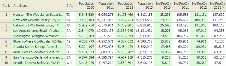
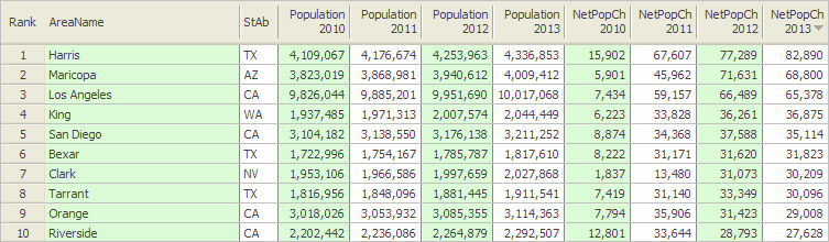
— Use this interactive table to view, rank, compare Census 2000 and Census 2010 population for Census 2010 vintage metros (all metros).
— Use this interactive table to view, rank, compare 2013 vintage metros (all metros) — Census 2000, Census 2010, 2012 estimates population and related data.

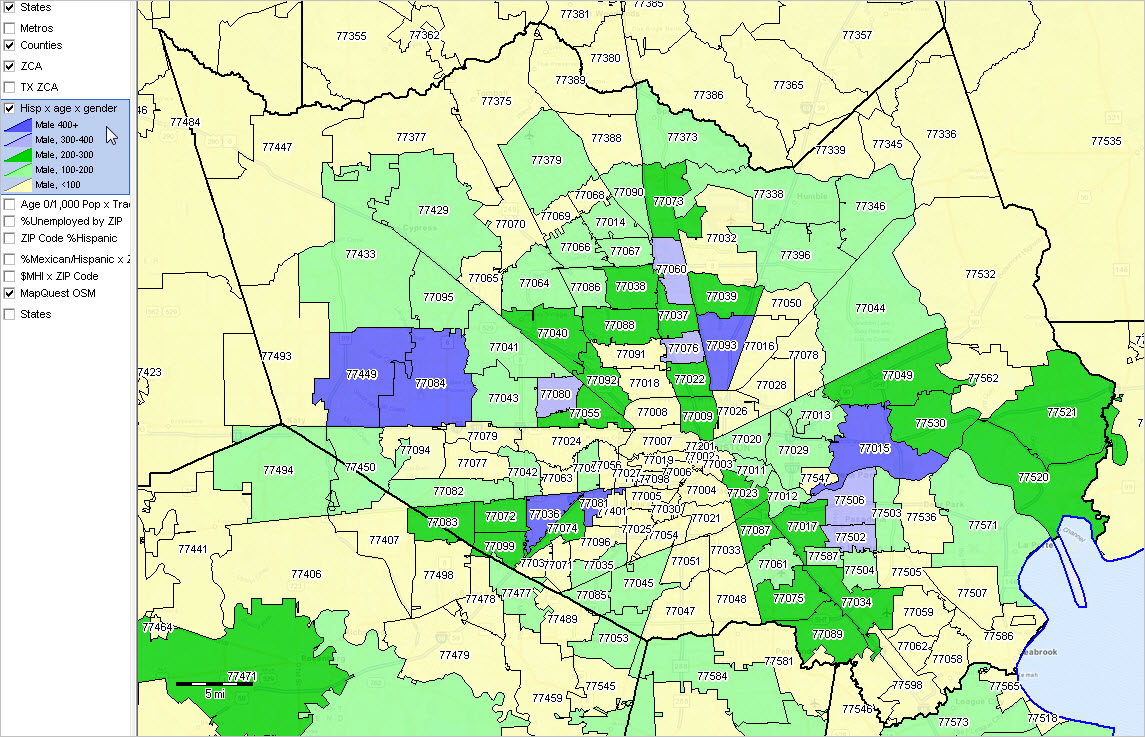
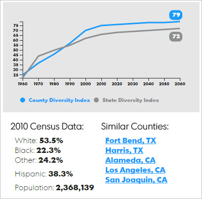
Houston Metro by County Population Projections to 2060
The graphic presented below shows county population projections to 2060 for the 2013 vintage metro.  Use this interactive table to view similar projections for all counties.  The metro population is projected to increase to 2.8 million by 2030 and to 3.4 million by 2060 based based on current trends and model assumptions. Viewing graphic with gesture/zoom enabled device suggested.

Houston Metro Population Projections by County to 2060
cbsa26420projections

Thematic Maps & Visual Analysis
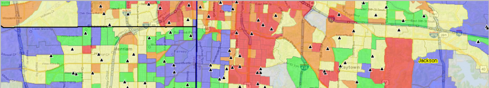
The graphic below shows the 2013 vintage metro (bold boundary) counties labeled with county name and county per capita personal income (PCPI).  The legend shows the change in PCPI from 2008 to 2012.
cbsa16740ctypcpi

The above graphic illustrates the power of using visual analysis tools (CV XE GIS).  These data are from the  Regional Economic Information System (REIS) introduced earlier in this section.  Use the links shown below to examine much more detail from REIS at the metro and county level.  A thematic pattern map could be developed for any one of these items.  The REIS data are annual time series starting in 1970 and continue to 2012.  Click a link to view a sample profile spreadsheet for Harris County, TX and the Houston MSA for 2011 and 2012.
• Personal income, per capita personal income, and population (CA1-3)
• Personal income summary (CA04)
• Personal income and earnings by industry (CA05, CA05N)
• Compensation of employees by industry (CA06, CA06N)
• Economic profiles (CA30)
• Gross flow of earnings (CA91)

Join us in an Upcoming Decision-Making Information Webinar
We will review topics and data used in this section in the upcoming webinar “Metropolitan Area Geographic-Demographic-Economic Characteristics & Trends” on January 9, 2014.  This is one of many topics covered in the DMI Webinars (see more).  Register here (one hour, no fee).

About Metropolitan Areas
By definition, metropolitan areas are comprised of one or more contiguous counties. Metropolitan areas are not single cities and typically include many cities. Metropolitan areas contain urban and rural areas and often have large expanses of rural territory. A business and demographic-economic synergy exists within each metro; metros often interact with adjacent metros. The demographic-economic makeup of metros vary widely and change often.

2013 vintage metropolitan areas include approximately 94 percent of the U.S. population — 85 percent in metropolitan statistical areas (MSAs) and 9 percent in micropolitan statistical areas (MISAs). Of 3,143 counties in the United States, 1,167 are in the 381 MSAs in the U.S. and 641 counties are in the 536 MISAs (1,335 counties are in non-metro areas).