Monthly Archives: May 2019

County Housing Patterns & Trends

.. at a time when “housing costs are going through the roof” and “affordable housing” are topics widely in play, current housing data at the county level are essential for business and public policy planning. In this section, new Census Bureau U.S. by county 2018 housing unit estimates are viewed .. and tools to access and use these data.

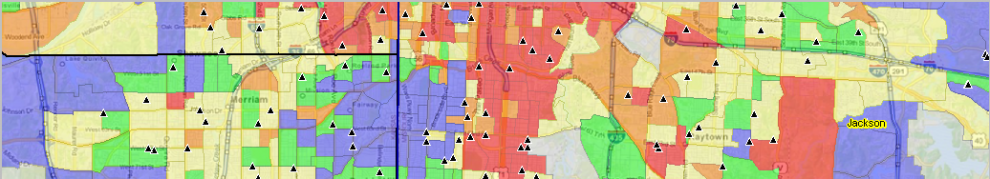
Patterns of Housing Unit Percent Change by County: 2010-2018
The graphic below shows patterns of county housing unit percent change from 2010 to 2018. Click graphic for larger view showing more detail.

– view developed using CV XE GIS software and associated GIS project.
– create similar maps for counties/areas using CV XE GIS & associated GIS project.

This section reviews the new 2018 county housing unit estimates (released May 2019) and tools and applications to analyze them. See more about topics covered here in this related Web section.

The U.S. housing stock grew by more than 1.15 million from 2017 to 2018, reaching over 138.5 million units. The growth rate of 0.8 percent from 2017 to 2018. The national housing stock increased by 6.7 million units (5.1 percent) between 7/1/2010 and 7/1/2018. But housing stock change was far from even as shown in the graphic presented above.

Total housing units are the “tip of the iceberg” to examine housing market characteristics. Yet, there are no other Federal statistical data for any other housing attribute for every county more recent than circa mid-2015. Those data are from the American Community Survey 5-year estimates for the period 2013-2017 — data going on 4 years old. For example, there are no Federal statistical data for all counties for the 2018 number of households or vacant units … let alone measures that would enable computing the size and location of affordable housing, one of many important housing market attributes. Use related 2018 and projected housing market data developed by ProximityOne available as part of the Situation & Outlook demographic-economic estimates and projections. Examine these data in context with other geographic and market characteristics in the metro Situation & Outlook reports.

Using the Interactive Table
Use the interactive table to view, rank, compare states and counties based on number of units annually 2010 to 2018 and related measures. Compare counties among metros or states .. or peer groups based on size. Here are two examples of using the table.

Largest Counties based on 2018 Housing Units
.. ranked on 2018 housing units .. click for larger view

Counties with 10,000 or more 2018 Housing Units
.. ranked on percent change 2010-2018 .. click for larger view

Data Analytics Web Sessions
See these applications live/demoed. Run the applications on your own computer.
Join me in a Data Analytics Lab session to discuss more details about accessing and using wide-ranging demographic-economic data and data analytics. Learn more about using these data for areas and applications of interest.

About the Author
— Warren Glimpse is former senior Census Bureau statistician responsible for innovative data access and use operations. He is also the former associate director of the U.S. Office of Federal Statistical Policy and Standards for data access and use. He has more than 20 years of experience in the private sector developing data resources and tools for integration and analysis of geographic, demographic, economic and business data. Contact Warren. Join Warren on LinkedIn.

Examining Economic Well-Being by Metro

.. examining the state of economic well-being: 2008-2017 .. expanding insights through data analytics .. tools and data to examine how and where the U.S. by metropolitan area real personal income is changing.  Real per capita personal income (RPCPI) is the best single measure of personal economic-well being. By examining RPCPI trends over a period, stakeholders can better determine if the area in improving, stable or declining. Still, RPCPI is but one important measure among many others, such as the Regional Price Parities (RPP). Use the interactive table, and related GIS tools, to examine these and other real personal income measures for the Nation’s 383 Metropolitan Statistical Areas (MSAs). See related Web section for more detail.

Based on data released by the Bureau of Economic Analysis in May 2019, see about in statistical release dates, real state personal income grew 2.6 percent in 2017, after increasing 1.5 percent in 2016. Real state personal income is a state’s current-dollar personal income adjusted by the state’s regional price parity and the national personal consumption expenditures price index. Across metropolitan areas, the percent change ranged from 14.8 percent in Midland, MI to -5.9 percent in Enid, OK

Visually Examining Patterns of Economic Well-Being
Geographic Information Systems (GIS) tools provide a powerful to explore these data. The following graphic shows a view of real per capita personal income (RPCPI), 2017, for Texas MSAs. Color patterns for levels of RPCPI are shown in the inset legend. MSAs are labeled with the 2017 RPCPI rank among all U.S. MSAs. Click graphic for larger view; expand browser window for best quality view. The larger view shows MSAs labeled with short name and a mini-profile for Harris County (pointer).

.. view developed with ProximityOne CV XE GIS and related GIS project.

Using the Interactive table
The interactive table (click link to view/use) includes a row for the U.S., U.S. nonmetro area and each Metropolitan Statistical Area (383). Each row provides a 2008-17 annual time series for four items (and derived items): real per capita personal income, regional prices parities-all items, total real personal income, implicit regional price deflator.

The following graphic shows these areas ranked on RPCPI in 2017. See rightmost column rank. Click graphic for larger view. Midland, TX MSA has the 4th highest 2017 RPCPI (shown in blue; also shown in blue in the map graphic above). But … that metro experienced a decrease of 12.1 percent over the period 2010-2017 .. and down from a high RPCPI of $115,069 in 2014. The dynamics of the oil industry!

Data Analytics Web Sessions
See these applications live/demoed. Run the applications on your own computer.
Join me in a Data Analytics Lab session to discuss more details about accessing and using wide-ranging demographic-economic data and data analytics. Learn more about using these data for areas and applications of interest.

About the Author
— Warren Glimpse is former senior Census Bureau statistician responsible for innovative data access and use operations. He is also the former associate director of the U.S. Office of Federal Statistical Policy and Standards for data access and use. He has more than 20 years of experience in the private sector developing data resources and tools for integration and analysis of geographic, demographic, economic and business data. Contact Warren. Join Warren on LinkedIn.