Category Archives: NC Gastonia

America’s Cities: Demographic-Economic Characteristics Annual Update

.. tools and data to interactively examine demographic-economic characteristics of America’s 29,321 cities/places .. understanding demographic-economic characteristics of cities and places is essential for business development, market analysis, planning, economic development, program management and general awareness of patterns and trends. This section provides access to data and tools to examine characteristics of all cities/places in the U.S. This annual update includes data for 29,321 cities/places based on ACS 2015 data.

Accessing the Data; Using Interactive Tables
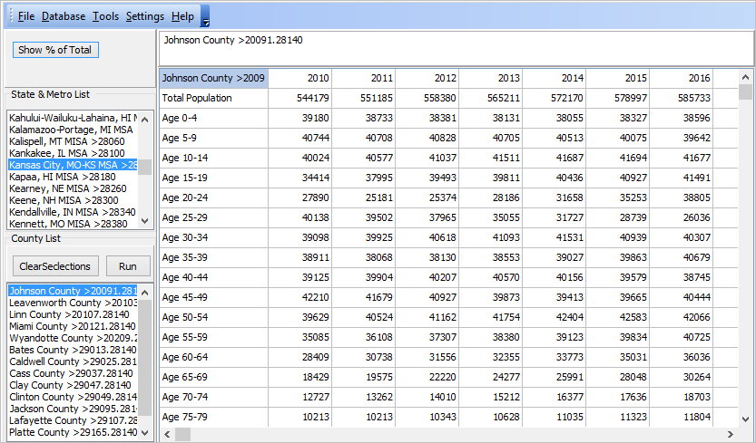
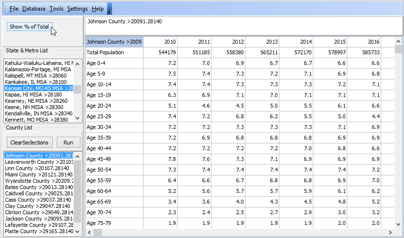
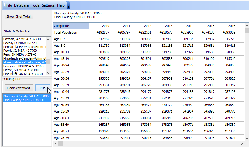
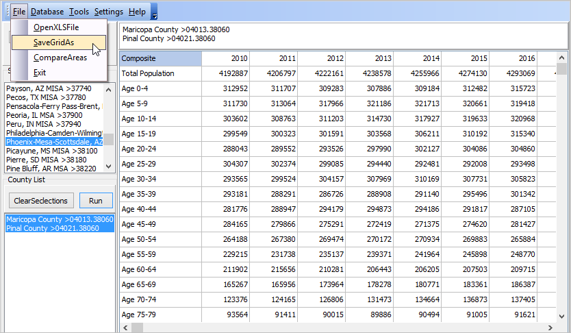
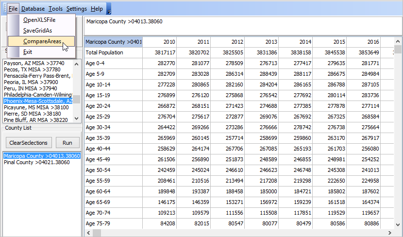
Each of the four links below opens a new page providing access to U.S. by city/place interactive tables — by type of subject matter. Use tools and usage notes below table to select operations to perform queries, sort and select columns.
General Demographics
Social Characteristics
Economic Characteristics
Housing Characteristics

How the the Tables/Data Can be Used
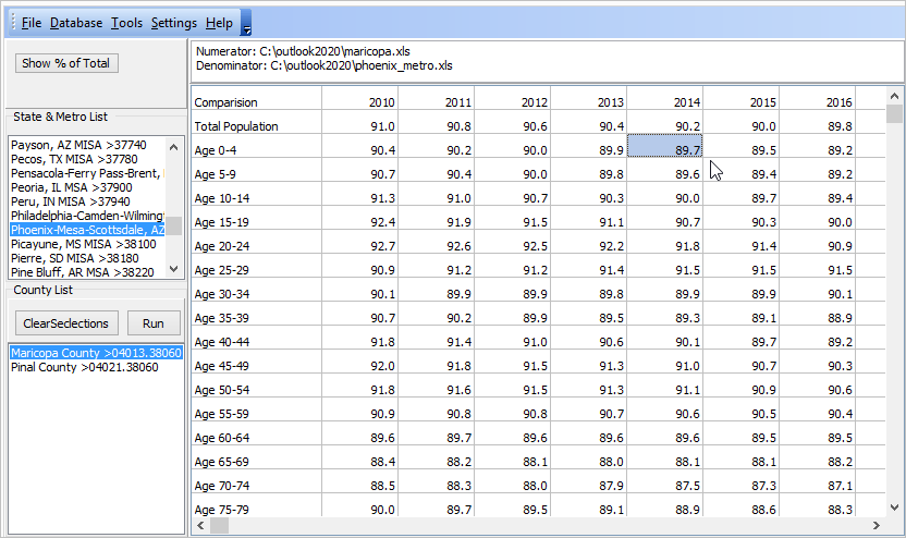
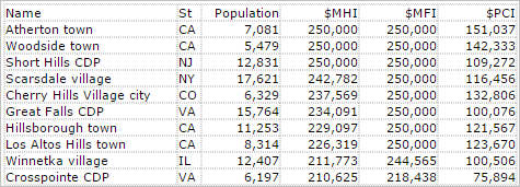
The following table shows data derived from the Economic Characteristics table. The top 10 cities/places having the highest median household income ($MHI) are shown. The table also shows population, median family income ($MFI) and per capita income ($PCI). The $250,000 value is a cap; the actual value is $250,000 or higher. Use the interactive tables to create similar views for states of interest. Use the button below the table to select/view cities within a selected metro. Compare attributes of cities of interest to a peer group based on population size.

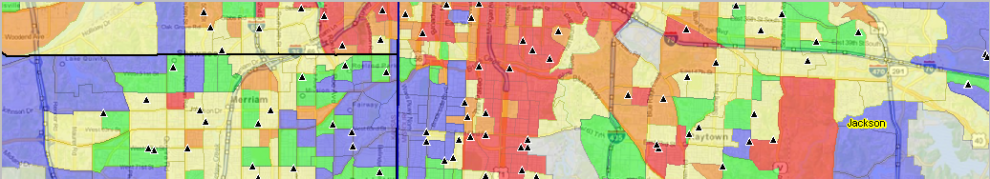
Visual Analysis of City/Place Population Patterns
Use GIS resources to visually examine city/place demographic-economic patterns. The following view shows patterns of population percent change by city in the Charlotte, NC-SC metro area.

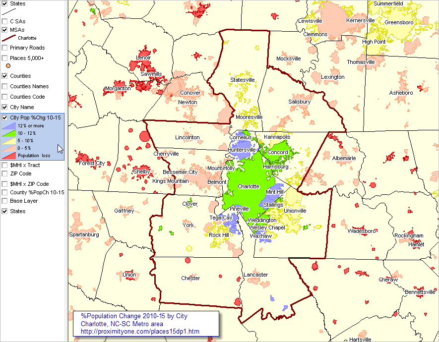
… view developed using the CV XE GIS software.
… click map for larger view and details.

Related Data
Cities/Places Main Section
Citie Population Estimates & Trends, 2010-15

More About Using These Data
Using ACS 1-year and 5-year data

Join me in a Data Analytics Lab session to discuss more details about accessing and using wide-ranging demographic-economic data and data analytics. Learn more about using these data for areas and applications of interest.

About the Author
— Warren Glimpse is former senior Census Bureau statistician responsible for innovative data access and use operations. He is also the former associate director of the U.S. Office of Federal Statistical Policy and Standards for data access and use. He has more than 20 years of experience in the private sector developing data resources and tools for integration and analysis of geographic, demographic, economic and business data. Contact Warren. Join Warren on LinkedIn.

Monthly Local Area Employment Situation; 2015-2016

.. this update on the monthly and over-the-year (August 2015-August 2016) change in the local area employment situation shows general improvement. Yet many areas continue to face challenges due to both oil prices, the energy situation and other factors.  This section provides access to interactive data and GIS/mapping tools that enable viewing and analysis of the monthly labor market characteristics and trends by county and metro for the U.S. See the related Web section for more detail. The civilian labor force, employment, unemployment and unemployment rate are estimated monthly with only a two month lag between the reference date and the data access date (e.g., August 2016 data are available in October 2016).

Unemployment Rate by County – August 2016
The following graphic shows the unemployment rate for each county.

— view created using CV XE GIS and associated LAES GIS Project
— click graphic for larger showing legend details.

As shown in the illustrative interactive table view below, seven of the ten MSAs having the highest August 2016 unemployment rate were in California. Use the table to examine characteristics of counties and metros in regions of interest. As apparent from the monthly patterns shown in the table, some areas are impacted by season factors, but others are not.

View Labor Market Characteristics section in the Metropolitan Area Situation & Outlook Reports, providing the same scope of data as in the table below integrated with other data. See example for the Dallas, TX MSA.

The LAES data and this section are updated monthly. The LAES data, and their their extension, are part of the ProximityOne Situation & Outlook database and information system. ProximityOne extends the LAES data in several ways including monthly update projections of the employment situation one year ahead.

Interactive Analysis
The following graphic shows an illustrative view of the interactive LAES table. Seven of the ten MSAs having the highest August 2016 unemployment rate were in California (ranked on far right column in descending order). Use the table to examine characteristics of counties and metros in regions of interest. Click graphic for larger view.

Join me in a Data Analytics Lab session to discuss more details about accessing and using wide-ranging demographic-economic data and data analytics. Learn more about using these data for areas and applications of interest.

About the Author
— Warren Glimpse is former senior Census Bureau statistician responsible for innovative data access and use operations. He is also the former associate director of the U.S. Office of Federal Statistical Policy and Standards for data access and use. He has more than 20 years of experience in the private sector developing data resources and tools for integration and analysis of geographic, demographic, economic and business data. Contact Warren. Join Warren on LinkedIn.

New Residential Construction by County

.. what’s happening in the north Dallas metro? .. a lot, take a look at the patterns of new residential construction for Collin and Denton counties using data and tools presented in this section. Examine new residential construction, leading economic indicator, for counties and regions of interest to you anywhere in the U.S. Use of the Regional Demographic-Economic Modeling System (RDEMS) to examine patterns of residential construction in context of related wide-ranging, multi-sourced data.

This section provides a summary of new housing units authorized by building permits for new residential construction for each/all counties. Use data analytics tools and data described here analyze these data and related housing issues.
• interactive data analytics – details/access
• use GIS project/datasets – details/access
• access individual county profiles – details/access

Patterns of New Authorized Residential Units by County
The following graphic shows the 2015 per capita value of total units authorized by county. The four largest Texas metros are shown with bold brown boundaries.
See about subject matter included in datasets.

View created with CV XE GIS. Click graphic for larger view.

Additional views with counties labeled with name, 2015 housing units and 2015 total new housing units authorized.
Charlotte, NC-SC metro by county
Dallas, TX metro by county
Houston, TX metro by county

Leading Economic Indicator
Building permit data (housing units authorized by building permits for new residential construction) are economic leading indicators. Investors and housing developers use these data to examine the characteristics and trends in new residential housing development. The short time lag between the data reference date and data access date, 1-2 months, makes this set of indicators important in assessing the current situation and patterns during the past year or more. The national scope coverage and geographic granularity (state, metro, county and city) enable comparison among types of areas and peer groups. Finance and real estate professional and researchers examine building permit patterns to develop strategic insights. Government and policy makers use these data to get a pulse on markets and changing patterns to administer programs and operations. See more about these data below in this section.

New residential construction begins with building permits. Overall U.S. housing starts are approximately 2.5% less than permits issued (22.5% less for multi-family units). Completions are approximately 4% less than starts (7.5% less for multi-family units). During the past year-plus, “residential fixed investment” has been approximately $500 billion and remained steady at 3.1% of real Gross Domestic Product.

Access Individual County Profiles
The following graphic illustrates use of the Regional Demographic-Economic Modeling System (RDEMS) to access the HSG1 Housing Units & New Residential Construction tables for a selected county. Click graphic for larger view.

Mecklenburg County, NC [37119] located in the Charlotte, NC-SC metro

Add a link to your Web page for areas of interest: The URL structure for Mecklenburg County is:
http://proximityone.com/rdems/1/rdems37119hsg1.htm
– more in general, substitute the county state+county FIPS code (37119 in this case) to access a county of interest.

Using the Interactive Table
The interactive table includes a row for each county. Column structure and content are described below the table.
• Click the StCty link to view the housing unit/new construction profile.
• Select a metro to examine component counties

The following graphic illustrtaes use of the table to examine characteristics of the Dallas metro counties. Click graphic for larger view.

Join me in a Data Analytics Lab session to discuss more details about accessing and using wide-ranging demographic-economic data and data analytics. Learn more about using these data for areas and applications of interest.

About the Author
— Warren Glimpse is former senior Census Bureau statistician responsible for innovative data access and use operations. He is also the former associate director of the U.S. Office of Federal Statistical Policy and Standards for data access and use. He has more than 20 years of experience in the private sector developing data resources and tools for integration and analysis of geographic, demographic, economic and business data. Contact Warren. Join Warren on LinkedIn.

Census Tract-City Relationship Table

.. what census tracts are located in cities of interest? What are their codes? Conversely, do you have census tract codes and need to know corresponding city(s)? Get answers here.

This section provides access to an interactive table useful to examine relationships among Census 2010 census tracts, cities/places, and counties. Many cities and counties that might be experiencing demographic-economic decline will often have bright spots that are groups of a few or many census tracts. Census tracts are important sub-county geography in data analytics. See the related section on census data analytics. See more about census tracts and data analytics below in this section.

Relating Census Tracts to Cities & Counties
Census tracts are sub-county areas and nest coterminously within counties. The 6-character tract code is unique within county. For cities 10,000 and larger, there are some number of whole census tracts within the city. But around the perimeter of cities, census tracts will often be partly within and partly outside of the city. The following graphic shows the relationship of tracts, cities and counties in the Plano city area (green fill pattern) located mostly in Collin County within the Dallas metro. Click graphic for larger view, more detail and legend color/data intervals. This map illustrates the geographic level of detail available using census tract demographics and the relative ease to gain insights using geospatial data analytics tools.

– View developed using CV XE GIS and related GIS project.

Using the Interactive Relationship Table
A small part of Plano is located in Denton county (see north-south bold red-brown boundary). Tract 021627 (see pointer) is located in Denton County and includes a part of Plano. To determine what geography tract 021627 intersects, click the Tract> button below the interactive table shown below. See that the tract is contained in parts of 4 cities.

Census Tract to City/Place & County Equivalence Table
The following graphic illustrates use of the interactive table to view/examine the relationship between census tract 48121021627 (in Denton County, TX) and the city of Plano, TX. Click graphic for larger view.

The above view was developed using the interactive table:
– click the ShowAll button
– click the FindTract button (preset to locate this tract).

Click the ShowAll button and enter a city/place (case-sensitive) name of interest to view the set of intersecting tracts. See the table usage notes below the table in the related Web page. We review operation of the table in the Data Analytics Web sessions.

Join me in a Data Analytics Lab session to discuss more details about accessing and using wide-ranging demographic-economic data and data analytics. Learn more about using these data for areas and applications of interest.

About the Author
— Warren Glimpse is former senior Census Bureau statistician responsible for innovative data access and use operations. He is also the former associate director of the U.S. Office of Federal Statistical Policy and Standards for data access and use. He has more than 20 years of experience in the private sector developing data resources and tools for integration and analysis of geographic, demographic, economic and business data. Contact Warren. Join Warren on LinkedIn.

Metro Situation & Outlook Reports Updated

.. how are metros of interest changing? The Metro Situation & Outlook Reports provide the premier integrated, multi-sourced demographic-economic overview for individual metropolitan areas.

Largest 25 Metros Based on 2015 Population
Click graphic for larger view with names. Expand browser window for best view. Label shows metro rank among all 917 metros based on 2015 population.

– View developed using CV XE GIS and related GIS project.

The no fee report for each metro was updated today with the annually updated population and population components of change. Use this interactive table to view, query, rank metros. Examine total population annually 2010 to 2015 and rankings.

Click on a link in the interactive table to view the integrated, multi-sourced demographic-economic Situation & Outlook report for that metro. See this example for the Charlotte-Concord-Gastonia, NC-SC MSA. The metro report provides drill-down demographic-economic attributes of metro component areas including counties, cities and school districts.

Join me in a Data Analytics Lab session to discuss more details about accessing and using wide-ranging demographic-economic data and data analytics. Learn more about using these data for areas and applications of interest.

About the Author
— Warren Glimpse is former senior Census Bureau statistician responsible for innovative data access and use operations. He is also the former associate director of the U.S. Office of Federal Statistical Policy and Standards for data access and use. He has more than 20 years of experience in the private sector developing data resources and tools for integration and analysis of geographic, demographic, economic and business data. Contact Warren. Join Warren on LinkedIn.

Outlook2020 Trend Analysis

.. how will the population distribution by age in one county compare to another county, metro or region between 2010 and 2020?  This section reviews how you can perform such analyses using the no fee  Outlook2020 Trend Analysis Windows-based tools.  The Outlook2020 software accesses Web-based Outlook 2020 U.S. by county annual demographic estimates and projections, 2010 through 2020. The Outlook 2020 estimates and projections are part of the Situation & Outlook database and information system.

Analytical Features
Outlook2020 Trend Analysis operations and analytical features include:
  1. display estimates and projections in a grid.
2. show annual age-cohort population data as a percent of total population.
3. save the grid display of population or percent data as an Excel file.
4. select two or more counties and aggregate the data for the composite area.
5. create percentage views and save to Excel just like for a single county.
— features 4 and 5 enable aggregation of data to a metro or region.
6. use a metro listbox to automatically select all metro counties.
7. compare any one area with another area, optionally multi-county.
8. all U.S. counties and all metros are supported.

Start-up View
Start Outlook2020 using the desktop icon. The start-up view appears as shown below. The start-up view illustrates one of the basic features of the application. Johnson County, KS is selected in the lower left listbox. When this selection is run (dbl-click the county name), the total population by age profile is displayed in the grid. The leftmost column shows age group. The remaining columns show annual population estimates and projections to 2020. The year is shown in the top cell of the column.

Click graphic for larger view.

Percent of Total by Year
Click the “Show % of Total” button to view cells as a percent of total population.

Click graphic for larger view.

Select/Sum all Counties in a Metro
In this view, the Phoenix, AZ metro is dbl-clicked in metro listbox. The two component counties are displayed in the lower/county listbox. Multi-selecting both counties, the Run button is clicked. The grid refreshes with the sum of both counties, or the metro total. Perform a similar application for any metro.
Click graphic for larger view.

Saving Grid to Excel File — the Metro (any multi-county region)
In this view, the File>SaveGridAs feature is used to save the current grid cells to an Excel file. The file was saved as c:\outlook2020\phoenix_metro.xls; it will be used in a comparative analysis reviewed below.
Click graphic for larger view.

Grid to Excel File — a Metro Component County
In this view, the File>SaveGridAs feature is used to save the current grid cells to an Excel file. Maricopa County is dbl-clicked; the grid populates with population values for this one county. The file was saved as c:\outlook2020\maricopa.xls; it will be used in a comparative analysis reviewed below.
Click graphic for larger view.

Comparative Analysis
What part of the Phoenix metro is comprised by Maricopa County? The File>Comparative Analysis feature is used to compare Maricopa County (the numerator by cell) to the Phoenix metro (the denominator by cell). The following view shows that Maricopa County comprises 89.7 percent of the Phoenix metro population ages 0-4 years. The percent of this age group accounted for this county as a percent of total metro is slowly declining since 2010. Smaller Pinal County has a relatively increasing rate for this age group.

Click graphic for larger view.

More About Analyses & Insights
Questions that can be answered with this tool …
• what part of the Kansas City metro is comprised by the Missouri counties?
• in total population? as a percent of metro?
• how is this projected to trend 2010 through 2020?
• what do these analyses suggest about trends by age cohort by county for metro?

User Group Access
Members of the ProximityOne User Group may install the Outlook2020 software and perform operations described in this section. Join the User Group now, there is no fee. See Outlook2020 installation notes

Support & DMI Web Sessions
Learn more about using resources described in this section. Join us in a Decision-Making Information Web session. There is no fee for these one-hour Web sessions. Each informal session is focused on a specific topic. The open structure also provides for Q&A and discussion of application issues of interest to participants. We can address specific questions about using metro and county demographic economic data and related applications.

See more about topics covered here in the corresponding Outlook2020 Web section.