Tag Archives: Data Science

Finding & Viewing a Census Tract

.. this section reviews how you can locate a census tract, neighborhood area, for an address or location. Do this with Open VDA Web GIS (OVDAW) with only a browser and Internet connection. No registration, no login, nothing to install. Start OVDAW .. an interactive map appears in a new window. There is no warranty for any aspect of this or related sections. The user is solely responsible for any use made of this or related sections, tools, data.

After the map view shows, enter a ZIP code, location or address in the Search bar and press enter.
.. to illustrate, enter 85258 (a ZIP code in Scottsdale, AZ) and press enter.
A zoom-in then shows a blue triangle marker at the location.
.. in the legend panel at left, click checkbox on for each of these layers:
– ZIP Codes Label (displays ZIP Code area labels/codes in map)
– ZIP Codes (displays ZIP Code area red boundaries in map)
– Tracts Label (displays Tract code and black tract boundaries in map)
.. navigate to preferred view (e.g., pan or zoom in/out)
.. use a screen capture tool to capture view meeting application objective

Pointer in graphic shows ZIP code 85258 with several tracts intersecting the 85258 ZIP code red boundary.

Or .. skip the settings and simply click the marker.
.. the tract area shows as cross-hatched.
.. the tract code and demographic profile shows in lower left panel.
.. optionally click the HTML button below profile panel to view profile as HMTL table.

ZIP Code- Census Tract Equivalence Table
Use this interactive table to view what census tracts intersect with a ZIP code or what ZIP codes intersect with a census tract. Use buttons below the table.

Updates on using VDAGIS with ZIP code and census tract data will be included in forthcoming Blogs. Don’t miss out! Click Follow in button at upper right.

About VDA GIS
Use VDA GIS tools to meet wide-ranging mapping needs and geospatial analysis. VDA Desktop GIS and VDA Web GIS have similar features that can be used separately or together. Each is a decision-making information resource designed to help stakeholders create and apply insight. VDA Web GIS is access/used with only a Web browser; nothing to install; GIS experience not required. VDA Desktop GIS is installed on a Windows computer and provides a broader range of capabilities compared to VDA Web GIS. VDA GIS resources have been developed and are maintained by Warren Glimpse, ProximityOne (Alexandria, VA) and Takashi Hamilton, Tsukasa Consulting (Osaka, Japan).

Data Analytics Web Sessions
Join us in the every Tuesday, Thursday Data Analytics Web Sessions. See how you can use VDA Web GIS and access different subject matter for related geography. Get your geographic, demographic, data access & use questions answered. Discuss applications with others.

About the Author
Warren Glimpse is former senior Census Bureau statistician responsible for national scope statistical programs and innovative data access and use operations. He is also the former associate director of the U.S. Office of Federal Statistical Policy and Standards for data access and use. He has more than 20 years of experience in the private sector developing data resources and tools for integration and analysis of geographic, demographic, economic and business data. Join Warren on LinkedIn.

Effective Comparative Analysis

There is no one best method of examining/analyzing different geographic areas based on demographic-economic characteristics. In this section three methods are compared, each having its own strengths and weaknesses. These methods are among yet others that can be reviewed in future posts.

Comparative analysis methods reviewed here are:
• Geographic maps
• Side by side comparative analysis
• Spreadsheets

In this post, these methods are compared in context of examining characteristics of school districts. But we use these same methods to examine cities, counties, census tracts, ZIP codes, legislative districts … among many other geographies. Applications reviewed here are for the Atlanta, GA school district and Fulton County, GA school district.

Geographic maps — Lay of the Land
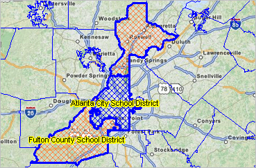
Maps provide the relative geographic view — the lay of the land — typically not available via tabular display of data. The following view shows the district boundary (bold blue boundary). Click graphic for larger and more detailed view. Fulton County school district is the two separate sections shown as orange crosshatch pattern; Atlanta school district is shown as blue crosshatch pattern. Fulton County, defined as the county subdivision of Georgia, covers the same ground as the combination of Atlanta and Fulton County school districts. These geographic relationships cannot be effectively understood without maps.

Views developed using ProximityOne CV XE GIS software.

Side by side comparative analysis profiles
How do measures of economic prosperity compare between the districts? educational attainment?  Linguistic isolation?  Compare/contrast demographic-economic characteristics of the areas using four side-by-side comparative analysis profiles (CAPs):
General Demographics
Social Characteristics
Economic Characteristics
Housing Characteristics
One example — click the Economic Characteristics link.  The side by side profile appears.  On the new page, the CAP view, scroll down to “INCOME & BENEFITS ” and items E051.  Here the distribution of households by household income can be viewed; easily comparing patterns between the areas.  Easily select and compare among multiple measures. It can be seen that the Atlanta school district median household income (MHI) is $46,146 compared to Fulton County school district MHI of $68,238 — but at the same time the dollar and percent distribution of households by income can be effectively compared.

Examine other side-by-side CAPs of interest.  These insights cannot be gained from the maps alone.  Yet the side-by-side CAPs still are not able to show how these districts relate to other Georgia districts (or other geography such as counties).  Consider the role of the spreadsheet interactive tables.

View other school district comparative analysis profiles.

Spreadsheets — interactive tables
Spreadsheets reviewed here are in context of Web-based spreadsheets/interactive tables. The interactive tables enable query, ranking and comparison of these same subject matter across all school districts in Georgia. Use the Web-based interactive tables to view, rank, compare data shown in the above profiles for other districts.
General Demographics
Social Characteristics
Economic Characteristics
Housing Characteristics
One example — click the Economic Characteristics link.  The interactive table appears (wait for table to populate).  On the new page, select Georgia (below table). Next click $MHI button below table. Next click/dblclick the column header E062 to sort in descending order. The following view appears:

Here it can be seen that Fulton has the 6th highest $MHI among all Georgia school districts. Scroll down in the table to see that the Atlanta $MHI is 47th among the Georgia 188 school district areas. Click the ShowAll button to reset or view the start-up view. See additional usage details on the interactive table page.

Recap
Each of these comparative analysis methods has its own advantages and limitations. Ideally they are used in combination. Each of the methods can also be extended. For example, the maps can be structured to show thematic patterns of subject matter in addition to reference maps only. Or show related geographies not depicted in the basic reference map.

Subject Matter
The “weakest link” in effective comparative analysis may be the selection/availability of the subject matter. Are these the right (scope of subject matter) data to examine the issues of interest? … most current data? … trend data required? … accuracy of the data? .. what are the alternatives — and the cost of alternative data?